
And The Verdict Is…
Yesterday, thanks to Melody, we all got to enjoy looking at variations of the “eye” in the big gable of the Cross House.
Should it be left all green?
Should some wall color be added?
Should more wall color be added?
Oh! What to do? What to do!
Y’all were all over the place! Some liked option #1, some #2, and some #3. I was leaning to #2.
This morning it was raining so I could not do any painting, but the afternoon was lovely and painting resumed.
I also made a decision.
Wanna see?
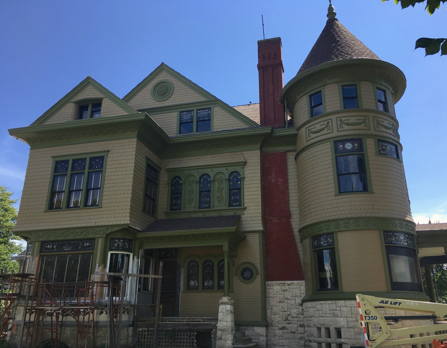
I decided on option #1: Leave. It. Alone.
Today, I liked the all-green eye more than I did yesterday. I am still 100% lovin’ the green swags on the tower but, curiously, only lovin’ the green eye like 80%. Something is not quite right about it. But what?
My big concern is making the house too fussy, too cartoonish. The house is looking really elegant and I am highly cautious of messing with this.
Also, there is a fine line between productive pondering and obsession and today I decided to stay on the side of the former. So, for now, I am going to table the eye pondering. Maybe a few months from now some brilliant idea will pop into my head about how to perfect the eye, or maybe you will say: “Hey, Ross. What about…?”

27 Comments
Leave a Comment
Your email address will NEVER be made public or shared, and you may use a screen name if you wish.
While pondering, please consider a bit of black, like the sash. Might work. Just a subtle line???
I agree with MO: See the black window sashing? could you do something with black on the Great Eye? A long view back from the picture gives me an imbalance of thin black lines up there.
AGREED a subtle black line to match the sashes and make it pop.
PS. More like the round window on the first floor.
I was just thinking the same thing! Rather than using the lighter shade, use the darker one to make the acanthus leaf motif stand out a bit more. It would balance the telephone closet window nicely.
I was also about to post the same thing – it just struck me this morning, looking at the photo in this post, that the ‘eye’ could be more visually linked to the windows, and adding a bit of black somewhere in the middle would do that.
Time for another photoshop experiment!
Love the garlands on the tower & I am happy w whatever rocks your boat!!!! Workmanshp on the house is impeccable & Cross House looks incredible!!
I KNEW it!
I’m so glad! I think you’re making the right choice, and of course you can always make a different choice later.
I actually think the whole band containing the swags should be green, though. It would carry the second floor curved cornice around the tower. To me, picking out the details in contrasting colours looks too “painted lady”.
In a previous post, your idea was photo-shopped.
It looked ghastly. Really! It cut the tower in two.
I agree. The curved tower is a prominent feature and painting the garlands a solid color would look like a cigar band. I don’t know if they would’ve painted it that way in the 1890’s, but the way you did it works.
I once thought the same about a solid green band, Kit, but when I saw the Photoshopped version of it, I realized it was too much. The cornice is a lot narrower than the band. The solid green band around the tower looked an extra wide belt on a chunky body.
Victorians can get cartoony so quickly, can’t they? However, I think you’ve done a brilliant job here. It’s very well-balanced. As much as I love the idea of painting the detail a different color, in reality, having it all the same color looks best.
That’s all just my humble opinion, mind you 🙂
I would leave it as is, but if you do want to do something black would look better than the wall colour
I would love to see the thin band around the brooch painted black.
I hope someone can photoshop some black eyeliner on the Cross House Eye rare that so many would come up with that same idea (I had the same thought!), might be just what thethis beautiful lady needs!
I say leave it be, less is more. It’s not a window, it doesn’t have a sash so why black? Why bring out details with any other color when the lovely broach is not treated that way on the non-window part. I think if you do anything more it would detract from the all the beautiful stained glass windows. Just my two cents.
P.S. I do like the garlands!
Exactly what I was thinking.
I am glad. Once you start picking out details with contrasting colors, you’ve started down a slippery slope. When my dad retired, he got bored and started ordering after-market chrome trim for his pickup from the JC Whitney catalog. The first couple of additions were nice, but by the time he started buying the flexible self-adhesive chrome trim, we had to do an intervention. Mom took away his MasterCard, and things got really nasty for a while…I’d hate to see that happen to you and your house 🙂
Thanks for the great story, Mike!
Echo NonaK “less is more” & I think the contrasting garlands were the only touch that works beautifully & ties an all together ensemble!
Always nice to hear everyone’s lovely ideas!!!!
I’m glad to hear you went with option one! I personally think the green looks lovely.
I can’t figure out how to search for the tinted post card that you thought was not the original colors of the house, but then I thought you said they were. The little hovering image in the category header makes it look like the swags were painted and the brooch was painted.
Yay, Ross! This was definitely the best choice. Looks great. Thank goodness for photoshop!
I can’t wait to see it on my walk tonight.
Hello Ross. I’m rereading the whole blog for the…third time? Third or fourth. Coming across this again, could you JUST the outer portion the wall color? Not behind the leaves, but just that second strip that was suggested. Just to give it a little bit of contrast. It really looks lovely.