
Ross Is Thinking Of Doing WHAT????????
So, as y’all know I have been slowing moving ahead with the Octagon Suite. Hopefully, hopefully, the suite can be safely available to guests in the latter part of 2021. Hopefully.
After spending 385 years thinking of only shingles, it has been great fun to think about pretty things for the Octagon Suite. For several weeks now I have been pondering the walls of the bedroom. Should I do stencils like I did in the Parlor? Or maybe wallpaper like I will be doing in the Long Bedroom?
Stenciling is really time consuming so I have been gravitating to wallpaper.
NOTE: The bedroom will have its lost picture rail recreated about 20-inches below the ceiling. So, any wallpaper will not be full height.
Because I am, well, me, doing something…ahh…normal in the bedroom is not an option. So, this discounts 99.9% of all wallpapers out there. I am though attracted to abbynormal wallpapers.
Today, I happened upon a paper with grabbed the air out of my lungs. It was so astonishing, so gobsmacking, so abbynormal that I, of course, loved it!
But, some background first:
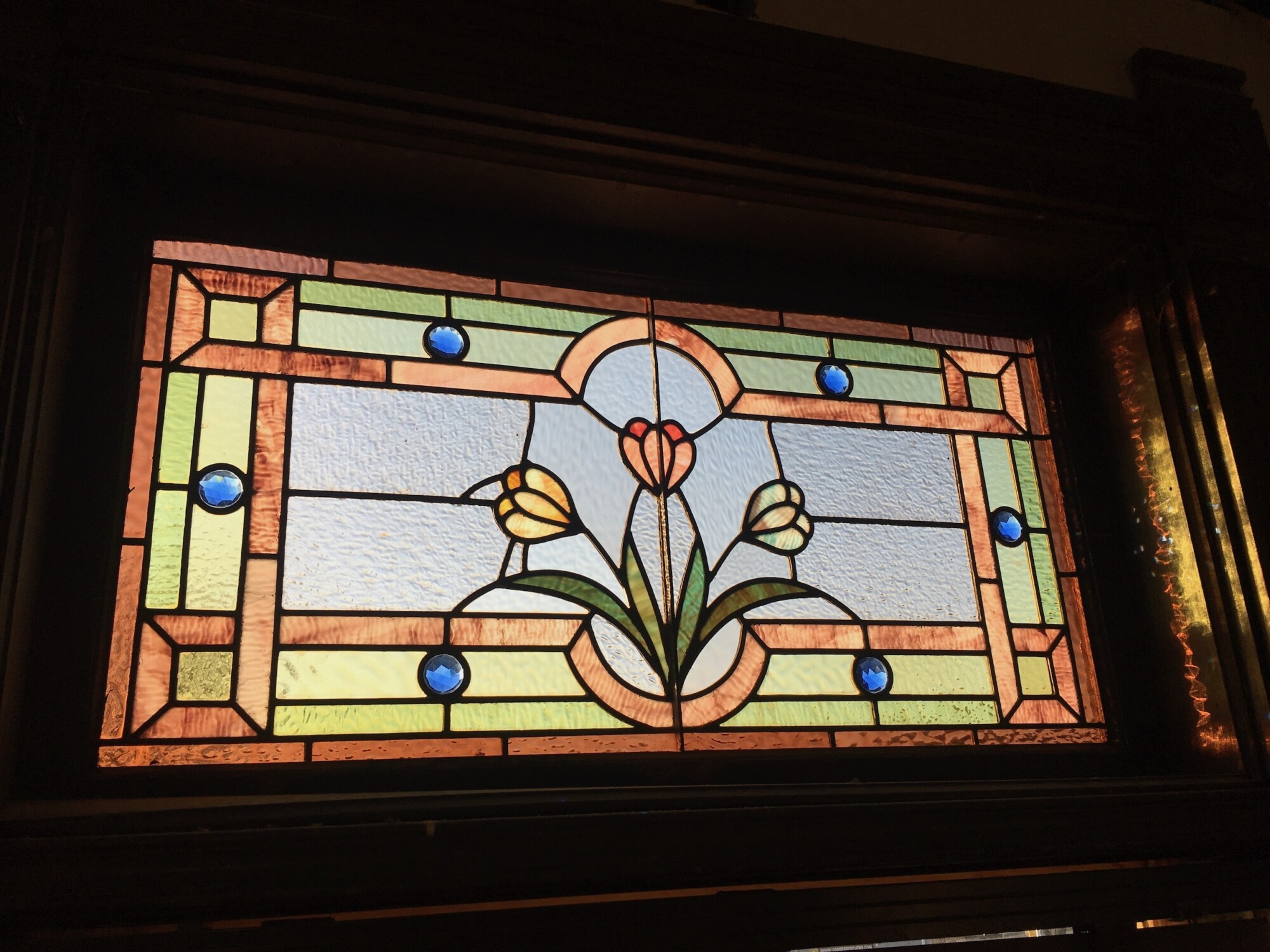
Of paramount importance are the triple stained-glass windows. Whatever I choose should complement them. You are looking at tulips. These are the only tulips in the house. I would love to know why the architect of the house, Charles Squires, chose tulips as the motif for the master bedroom. Did Susan Cross love tulips?
So, I Googled “Tulip wallpaper”. Most of resulted were either meh or actually ugly. But (drum roll, please), one captured my special attention.
Scroll down to see this special one.
NOTE: Make sure you are sitting down. Make sure your seatbelt is fastened.

TULIPS!

For scale.
Can I actually get away with so crazy a choice?
Can I????????
Methinks…yes.
The paper looks great with the stained-glass. Tulips!!!!!!!! The colors!

The paper looks great with the curtains already in house.

The paper looks great with the sconces already in house.

The paper looks great with the night tables I have ordered. I had hesitated on the tables because I did not like the gray tops but…
…there is plenty of gray in the paper!

The hesitation: The paper is pricey: $125 a roll. Compare this to the Long Bedroom paper at $25 a roll. However, I will not need that many rolls as there are three window, a 5-foot-wide pocket door, and a mantel/overmantel.
Well…I think I am gonna go for it.
When guests walk into the Octagon Suite I want them to be gobsmacked. I want them to experience shock. But then…I want them to…smile. “I love this!”
I have no interest in providing normal. There is soooooooo much of that in the world.
Rather, I wish to offer…abbynormal.
While the paper is intense, it will be mitigated by the very elegant oak bedroom set, the green curtains, a plain blue duvet cover, and the mantel/overmantel.
My other hesitation is:
- What to do with the frieze (above the picture rail)?
- What do do with the ceiling?
To honor 1894, the frieze and ceiling should have a pattern. But, what in the world would work with the over-the-top tulip wallpaper?
That heat you suddenly feel? That is my brain, furiously pondering.

55 Comments
Leave a Comment
Your email address will NEVER be made public or shared, and you may use a screen name if you wish.
Beautiful!
Hello from France! This one is a bit too much for me. I like something more… smooth for sleeping. I see this in a bathroom, a hall, or a walking closet. If I would be a guest in your home, I would be in your bedroom (totally in love with this black and silver wallpaper!). But I do like all the others fournitures. Doesn’t help you, sorry!
Perhaps a linear design with thin green lines to pull in the stems from the wallpaper and coordinate with the drapes? On a background color from the flowers? I think it will be lovely because there won’t be that much showing due to the windows, drapes, mantel, big headboard, pocket doors, and big dresser.
POLKA DOTS.
Feel free to ignore that suggestion 🙂
Yep, too much for me too, but you have explained your decision well….so, I would paint the frieze and ceiling a paler version of the exact green of the tulip stems. The curtains I do like with the wallpaper and windows. Nay to a blue duvet.
I have noticed that when shopping I find, sometimes, that I have veered in the direction of one color. Everything in my cart is the same color. And you have obviously decided on black being your unifying color! Years ago I read a decorator’s interview where he said that every room needs a touch of black!
With the exception of my current master bedroom in my little 1954 ranch, my previous master bedroom in “the big house” was usually decorated in over-the-top, large scaled prints that I loved, but I am sure some of my friends thought “Woe sister”!!!
Also, what color is the tile on the fireplace surround in the octagon room? Baby blue? Dusty blue? I can’t remember.
O.k. the blue tile is in the round bedroom. The pale green freeze and ceiling will look great with the fireplace in the octagon room and oak furniture. Just paint on the freeze and ceiling. No crazy pattern. Let the wallpaper speak for itself. IMO
Ross, are you set on tulips? Because to me, the flowers in the glass appear to be crocus. Don’t get me wrong 🌷 I love the tulip wallpaper! Before you commit, maybe check out the shape of a crocus.
I see crocus too!
Gadzooks! I think you are right, Kim!
So glad i always thought they were crocus!
According to “The Language of Flowers” published in the 1800s, yellow tulips mean hopeless love. Crocus (depending on type) mean cheerfulness, youthful gladness, or abuse not. Hidden flower meanings were fashionable in Victorian times so perhaps the Crosses would have considered that when choosing the flowers for the window.
Oh! What fabulous information, Christy! Thank you!
I LOVE THIS. So much. I can’t wait to see it finished!
I think I might lean towards a black duvet cover. To allow the woodwork of the furniture and the wallpaper to pop even more. But that’s unsolicited advice from someone who loves to decorate with black and thinks that more is more is more and YES PLEASE MORE.
Me, too, Amy!
Truth be told…..always. Astounding paper! Yet I think it distracts from the simplicity of the window….like the window would be lost in such a floral flourish. To me, the shocking paper robs from the window. Just keeping it real, for my taste.
Sharon, a lot of people voiced the same concern about my decorating choices for the parlor.
Yet, when all was completed, the five stained-glass windows popped even more! When the walls were white primer, the glass was soooooooo not complemented. But, with rich colors and patterns now in place? Again, the windows POP
My favorite thing in the window is the blue gems. I’d be tempted to play with that color in my paper choice.
I love the blue gems, too, Sharon!
They will not be overlooked!
I like the paper, but I agree with Linda – pale green on the frieze and ceiling.
I am all for it, just not with the particular one you like. There is a tulip wallpaper, a Victorian original, that was designed by William Morris. I love the style of his designs. I think it would be smashing in your house and even if you wouldn’t buy them, look them up online. I think his designs are particularly suited to your house. Also, look up his design ‘Chrysanthemun’, one that popped into my mind as also very suited to your house.
Michael, I also very much like William Morris papers. However, while such papers were widely available when the Cross House was built, they were (if I understand correctly) on the wane. So, too, with anything in the Eastlake style.
If the Cross House was, say, built in 1885, I would be open to Morris and Eastlake.
The Cross House was quite advanced when built and I try to keep that in mind when making choices.
Bradbury also has stunning papers but nothing, curiously, from the 1890s.
With such a large pattern, there will be a lot of waste in those $125 rolls.
j/s 😉
I say windmills and wooden shoes for the frieze! 🙂 Or maybe perhaps a quote to circle the room in the frieze like this poem from Emily Dickinson:
The Tulip
She slept beneath a tree
Remembered but by me.
I touched her cradle mute;
She recognized the foot,
Put on her carmine suit, —
And see!
To my knowledge, having a wall fill-pattern *AND* a frieze *AND* a busy ceiling pattern in *EVERY* room, (especially in secondary rooms like bedrooms), is akin to the horror that you’ve expressed comes when someone installs mansion-grade light fixtures that don’t “match the budget” of a modest house. It’s been noted before that although the Cross House is large, it is not the most finely finished, high end home ever built. Save all that heavy layering business for the principal rooms on the ground floor. The bedrooms all would have had a picture rail, sure – but I sincerely doubt that they would have had busy busy busy friezes and ceiling patterns. You could perhaps use a color from the wallpaper in a solid band for the frieze and apply a translucent metallic/iridescent glaze over it to dress it up a bit. It would be appropriate to do a lot of layering in the sitting room of the suite, but in a bedroom, ah – methinks no.
I feel like I have to follow up with saying that I LOVE the bold, overscaled pattern you’ve chosen…just don’t get carried away. Trying to stack so many patterns on top of one another will take away from the beauty of a wallpaper that already commands the room.
I feel like you’d end up with a maze of rooms that look like these, which are near the point of migraine inducing.
Cody, Cody, Cody. O ye, of little faith!
I have every confidence that I can decorate the room without inducing migraines!
Yes, Ross!! No offense, Cody, but i definitely agree with Ross.
I mean , have you seen the pictures of the parlor/living room on the first floor?!? The one with the portrait of Pete. I NEVER wouldve thought of that combo, but it truly looks modern Victorian and is a true modern interpretation of what the Victorians actually did!
Im comforted by what some consider TOO busy!, or as you say , migraine inducing. That kind of busy actually makes me feel secure, comforted AND cozy. Ross, you definitely have that eye!! I mean , what I’ve seen so far in the more finished rooms looks like a very upscale modern European hotel. But, again, Cody, no offense. Everyones taste us different and counts!
Ok, while you may disagree Cody, THAT house is and has been truly restored Victorian. And sooo, stunning. I think Ross hasnt gone that far but has taken a modern twist on the same concept. Just my opinion. Dont hate me. Lol.
I disagree very much, but I definitely don’t hate you. We’re all entitled to our own opinions. The couple that last decorated the Lebold mansion owned a decorating/wallpaper business, and they used the house as a sounding board for their creative interests, and the approach they took was authentic…on steroids. Only a handful of rooms on the ground floor in ANY grand house would have had a dado, AND a wall fill, AND a multi-layered frieze, AND a busy ceiling. Rooms with that many patterns did exist, but that is not how every room in a home was treated. Certainly, bedrooms would not have had a ceiling incorporating several layers of papers. That kind of treatment was usually only reserved for principal rooms, or only in one bedroom at most. At best, a small scaled, metallic ceiling fill paper and a medallion would have been the appropriate norm for a bedroom ceiling in a Kansas upper middle class mansion. Even though it is what I have studied in pursuit of a degree in interior design, by no means am I a stickler for museum accuracy, nor am I suggesting Ross adhere to those principles. Modern people don’t function well in truly authentic rooms. They turn out stiff, fussy, and overly formal.
I’ve followed Ross since before the beginning of this blog, when he was still just a commenter on OHD, *considering* buying the Cross House. We’ve been internet and FaceTime acquaintances since 2013. To my memory I’ve never commented on the finished parlor, and I have a confession…dear Ross, I cannot say that it is not well done, because it is, but I liked it much better before you implemented the french faux paneled look. I LOVED the way it looked before then. There, I said it! They coaxed it out of me!
On the whole, the only real way in which Ross and I differ is that I would be more inclined to use more earth tones rather than the bolder colors he favors. My preference for interiors could be best described as “moody”, while I would describe Ross’s spaces as “vibrant” or “vivacious”.
Cody, we all love you here!
Cody, the second-floor stair hall had a pattern wallpaper, a pattern frieze paper, and a pattern ceiling paper. Bits of each are extant.
The bedrooms, perhaps, all had the same although their respective patterns would have likely been quite simple.
I concede that the stair hall is a principal space.
I love the way you play with scale, but have you seen this one?
They are even larger, but on a ivory background, but still would have that magical eat me/drink me quality.
By the way the flowers are parrot tulips.
Love, love, love the tulip paper. It wouldn’t work for me in a room with fewer windows, but the light in that room is fantastic.
How about textured wall and ceiling paper for both the area over the frieze and the ceiling. I’d use the same paper on both to balance the powerful effect of the wallpaper. Perhaps something in the off white/blush of the tulips with red stripes.
By the way I believe that those frilly tulips are called parrot tulips if you are looking for some for the garden too.
I think a wide ribbon would do well as a freize. You could custom make it using various ribbons stacked – Satin would look great but would not be able to be glued I do not think, as glue would bleed through. Wrapping it around cardboard and gluing on the back would work. Inexpensive posterboard from a dollar store might do the trick…. I can not wait to see your bedroom finished.
Certainly stunning and a very bold choice… but… if you’re wanting to match the stained glass, think crocuses perhaps. Comme ça:
Here.
Here.
Not that either of these papers are THE one – I would never presume. Just thinking there are more botanically correct options 😉
What tremendous progress to be looking at wallpaper and duvets, putting shingles and windowsills behind!
Cynthia, I was looking at the second one a few hours ago!
Alas, the color way is not right for the room.
The first one isn’t quite the same, lacking the ovoid background shape.
Wow. Arent those more Art Nouveau? Rather than 1896? Still stunning though! Cool!
Ross, I love the tulip wallpaper. Not as much as I LOVE the paper for the Long Bedroom but I can see your vision for this room. I agree with Linda A. about painting the frieze a lighter green. I might also add something kinda’ blingy as a trim above the picture rail, such as an ornate molding painted gold or a small stencil border. I, too am a big fan of decorating with black and faithful to a true Victorian spirit – the more the better! (Cody H, I’m surprised at you!)
Absolutely Fabulous!!! Luv it! Again, modern Victorian! Ill say it again, add crystal drops to the black sconce shades. But thats just me. . Too much is never enough! (Im totally Victorian at heart! ) 😁🤗
Heres a thought, does the wallpaper come in another colored background? Say a light colored background? You could put that above the picture rail! Maybe? Or too much? Just a thought.
And, just a thought if youre going to play off those blue gems in the windows, as Sharon suggested, what about a BLUE ??? background on the same wallpaper? Hmmmmm….
David, the oversize tulip paper does come in a blue background, but it’s more teal and not a good complement to the blue in the stained-glass.
Yea, kinda thought the blue they would offer would be more a trendy current blue. Dang! Lol. Nice try! Ha ha.
I love the tulip paper, the black background will make the stained glass pop. I agree with some of the others, the frieze and ceiling would look nice painted the same shade as the stems of the tulips, maybe a bit lighter. I also like the green drapes. The wallpaper goes so well with the black sconces. Can’t wait to see the finished octagon room.
Wow! So many comments. I say GO FOR THE TULIPS! They are definitely astounding. I am a fussy art director and I can visualize almost anything, as I am sure you can Ross. But I have been wrong a couple of times so I always paint a good portion of a wall now, or hang a large wall paper sample, and look at it in every light and live with it for while before I actually commit.
I am with Cory on keeping the frieze and the ceiling simple, probably just paint, as a bit of visual relief. But I am sure you can pull it off with pattern if you decide to go that way. Maybe a very small pattern…that reads as a solid..
Can’t wait to see where this goes!
What’s happening with the woodwork in this room? I can see it’s V. dark. Has it been painted? Or is it a similar scenario as in the dining room where the faux painting has darkened with age? Another question, what do the tiles look like around the fireplace?? I know someone else asked as well. It’s hard to get a good overall feeling for the room with vital parts unidentified.
Christine, all the wood has a shellac finish which has darkened with ago. The shellac will be largely removed and the wood will look more like the oak bedroom set.
You can visit all the mantels in the Cross House here.
You know, after adding my comment, I searched octagon room and fell right down rabbit hole of reading lots of posts about just this space. Of course I saw the fireplace posts too. Then I immediately did a search for those tiles that are missing (no luck). I then imagined the room with that tulip wallpaper. There is no blue in the wallpaper although the green is a beautiful compliment to the tiles in both rooms. Will you put that paper also in the sewing room? Personally, I think THAT would be over the top, which, we all know, you’re not afraid of.
A note about a fold out couch, are they comfortable now?? I have never slept well on one. And I think it wise to keep your special antiques in more open spaces. People can be such brutes!
How exhilarating to be thinking about decorating instead of shingles!
Also… KITCHEN PLEASE!!
Lincrusta, There, I said it!
https://www.wallpaperdirect.com/us/products/lincrusta/adelphi-frieze/42242
I have always been a huge fan of lincrusta. And it already exists in the house, so it’s not out of the realm of possibility. It’s so sophisticated.
Oh, my. The Lincrusta would be a perfect fit anywhere in the Cross House. I’ve never been a wallpaper fan, but I could really do some decorating with Lincrusta.
I love dark atmospheres, and in my opinion this wallpaper gives that impression a bit. I really like it and I think bold choices are the best idea.
I LOVE the tulip wallpaper! I hope you installed it, since I am reading this June 3, 2025.