
Being Played By Alchemy
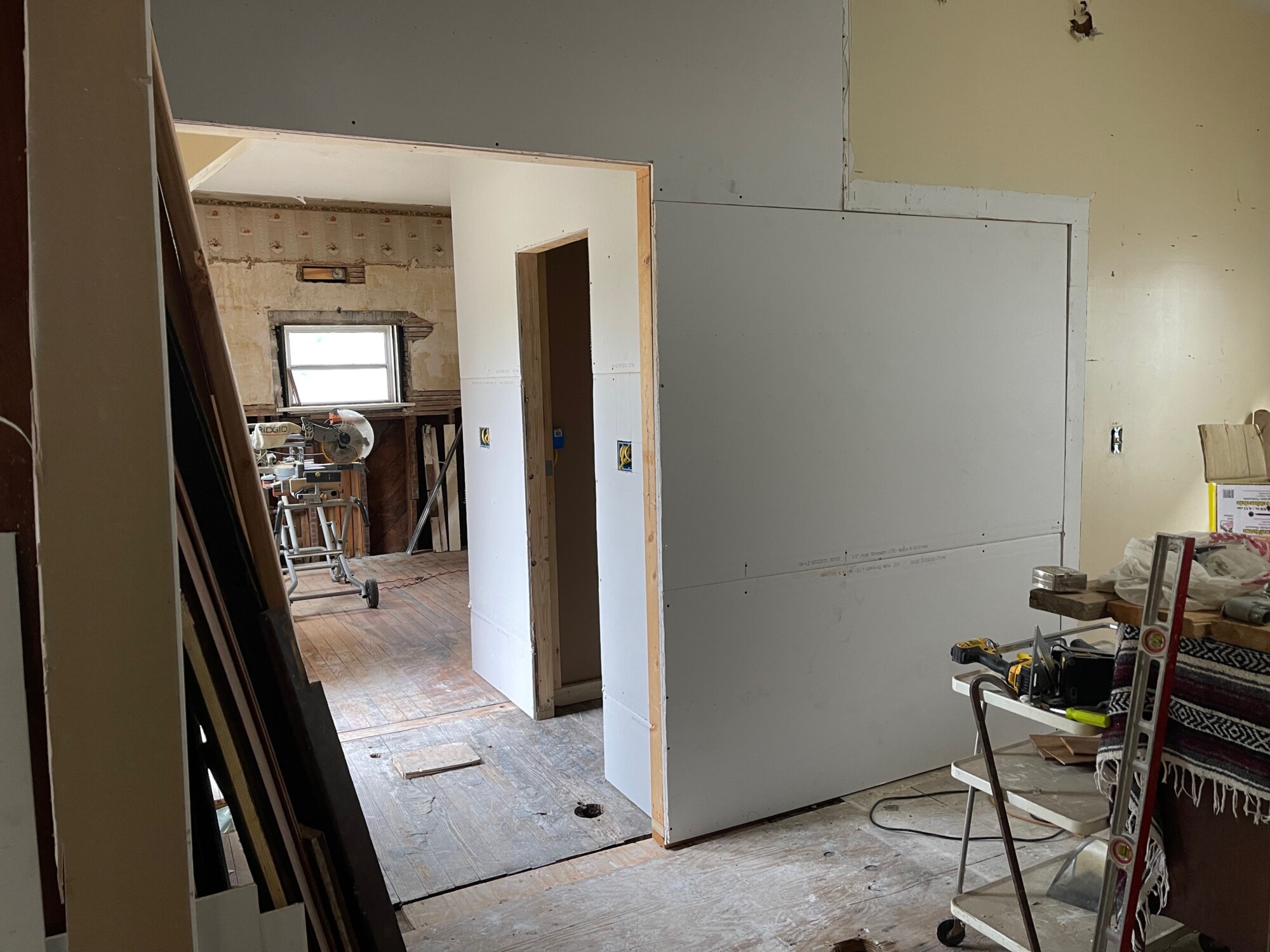
Between the dining room (foreground) and kitchen of the carriage house, I built a pantry.
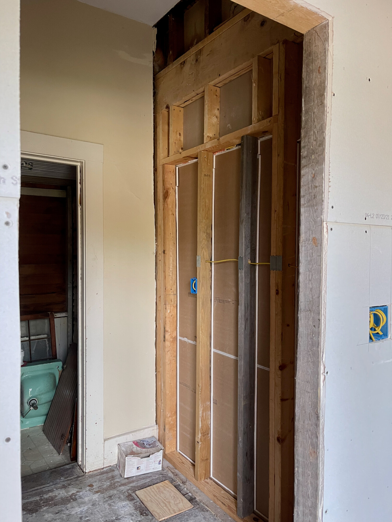
Its west wall is right. The door goes into what is now a full bathroom, in a space that was a porch.
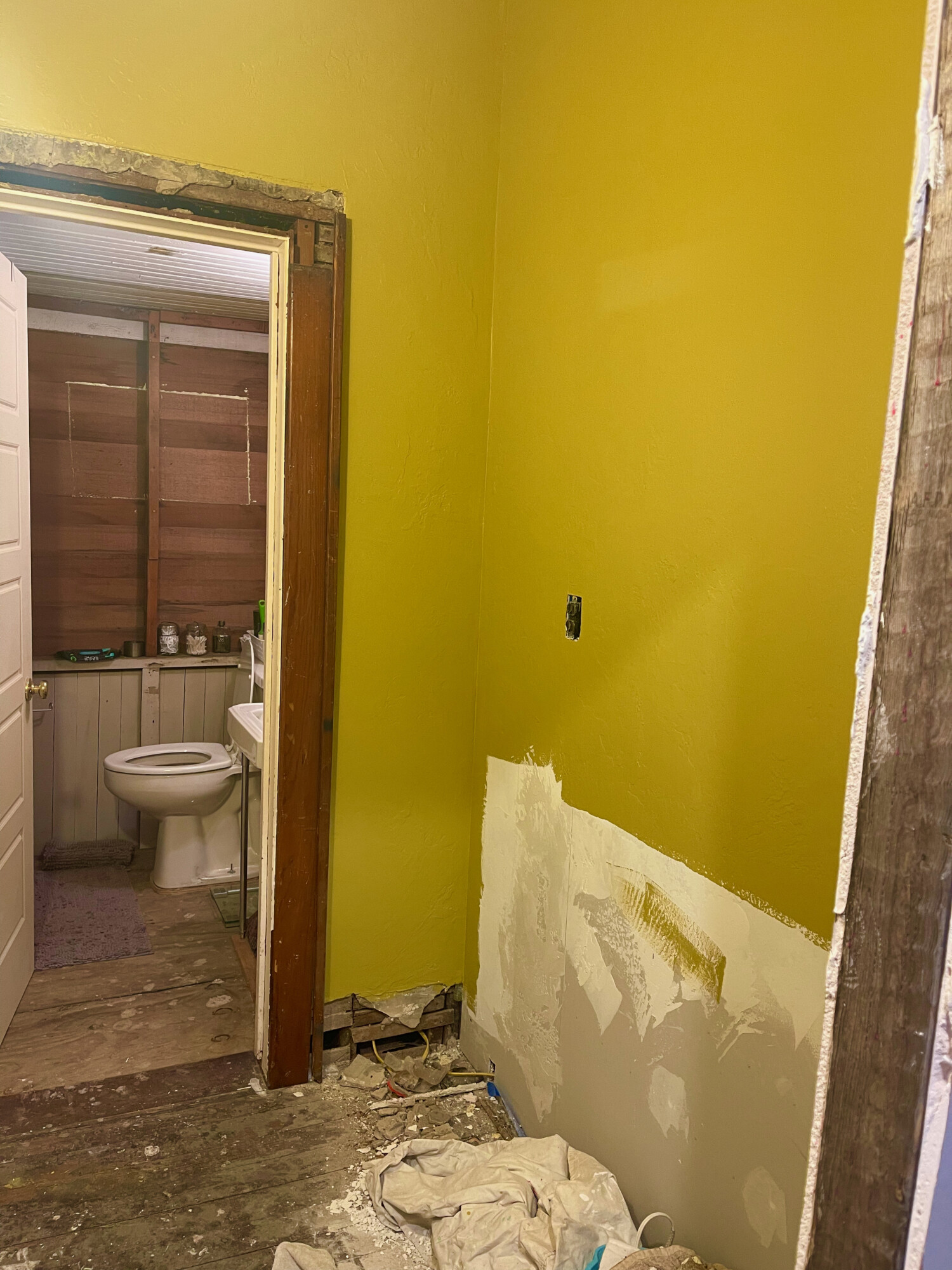
And now sheet-rocked and painted. Note the pine door trim. I will be using this throughout the kitchen, salvaged from a house being demolished. The color is…vivid…

…and not as expected. Methinks I need to revisit the paint store.

11 Comments
Leave a Comment
Your email address will NEVER be made public or shared, and you may use a screen name if you wish.
Startling! The sample chip is a dignified domestic taupe, that which was mixed for you is what, a raging olive? Has to be an error.
Aww. On my phone, the sample is a wonderful warm mustard. The wall paint would most appropriately be named Bile.
Great post title Ross.
Yes it’s kind of a Boy Scout or military color.
As a visual designer, I can visualize almost anything. I’m sure you can as well. But, I do have a hard time with paint colors, and I have learned to buy those little sample cans, paint a section of the wall, and live with the color (or several color variations) on the wall for a few days, and view the color in different light.
The designer’s curse, fussy, fussy, fussy.
Looking forward to where this goes. The pantry is a great addition!
The painted wall seems to match the Alchemy chip, but maybe it doesn’t fit your vision for the room.
The salvaged pine trim looks great!
So, you have to go through the pantry to get to the bathroom?
I rather like it against the wood, but then those are studs, not trim. I also like vivid.
I don’t call that taupe at all. Taupe is cold. Less yellow and more gray. That color is warm. More of an ochre.
The colors aren’t showing much difference on my screen, but so much can change with reflective light in a space. When I got divorced and came home to Mom in my twenties, I painted my bedroom an Ocre color very close to Alchemy. I had dark green furniture and denim drapes and I LOVED it. My Mom hated it. She said she never thought her daughter would move home and paint her room “calf poop yellow”.
Hmm – I like the vivid color for the pantry walls. On my phone screen, the wanky ochre pulls the gold out of the honey pine trim & warms the room. Since the walls will be covered with shelves, it might be nice to throw some bling up & have it peek through the stored goods. Again, my phone screen shows the sample chip to be a warm gold beige, almost a putty color – it’s a nice, warm nutral.
Maybe find out what Cody feels about it? He’ll be the one who sees it when he wants to grab a couple of potatoes.
I agree. My computer and phone have better than usual display and color optics. The paint chip and actual paint are different. The newly painted wall looks like smashy peas with too much butter. I mean, okay if you like the look but seems a bit off.
Sounds like a good idea to revisit the paint store, not flattering.
Yikes green!
Wow! Big difference. That green look is vivid…. Like the paint card. 🙂