
Bad Ross Ponders Columns
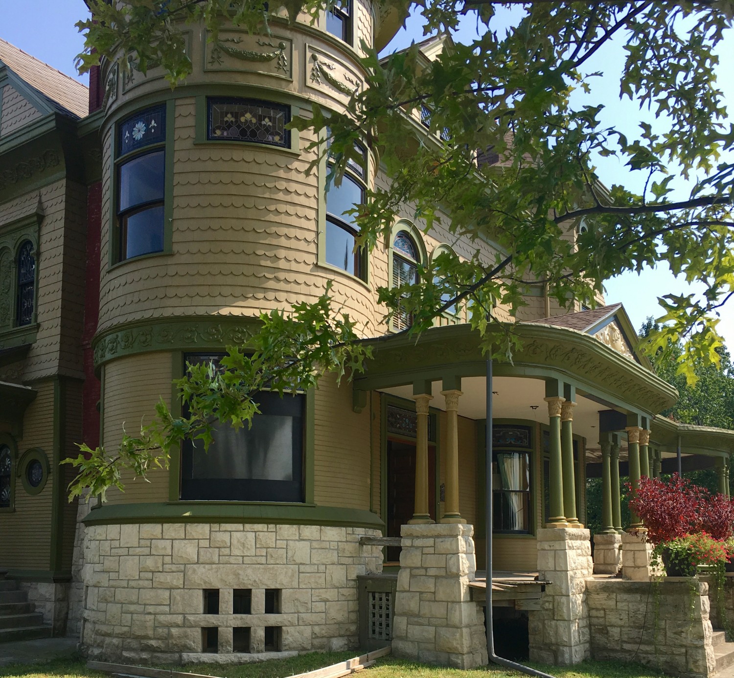
Look what Bad Ross did today.
He changed the color of the columns.
And it’s all Zac’s fault.
Bad Ross. Bad Zac. Obviously a dangerous combination.
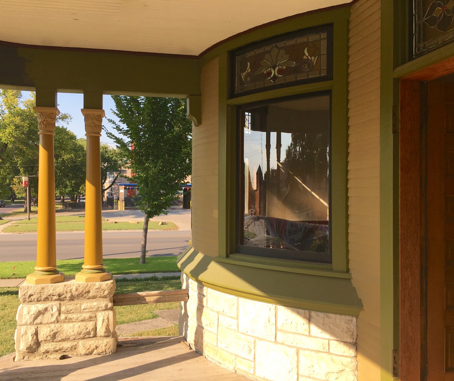
In the afternoon sun the gold columns get VERY gold.
IT ALL BEGAN…
Last week Zac introduced himself and astonished me with a gift of incredible photo-shopped images where he “repainted” the Cross House.
This initiated a down-the-rabbit-hole kinda adventure, and my whole approach to the exterior coloring of the house has shifted.
Zac suggested various alternatives to the colors of the columns, and I liked painting the capitals and bases the new Color #5. You can see the results to the right in the above first image. I think this is MUCH better than having the columns all green. Thank goodness Bad Ross has now overtaken Conservative Ross, right?
Today, Bad Ross was pondering. (This is not actually a recommended process.) And then Bad Ross thought: Hey! I wonder what the column shafts would look like in a dark gold? Sherwin-Williams sconce gold 6398, to be precise?
An hour later this question was manifested.
Originally, the columns were much lighter than the green trim (which is the original trim color). But I tried painting the columns the wall color in 2014 and did not like the results. The pale columns did not look, visually, able to support the heavy roof. And, when you stood before the house, the columns painted the wall color melded into the background wall color.
But dark gold has more visual heft, and is distinct from the wall color.
BUT STILL…
The perfect color scheme is still a bit elusive.
Is gold the right choice? Or are the green columns better?
I like the two-tone bases on the green columns, but think the bases on the gold columns should be solid color #5.
And something needs to happen with what is above the column capitals. Certainly the proposed black pinstripe will help. But maybe…

30 Comments
Leave a Comment
Your email address will NEVER be made public or shared, and you may use a screen name if you wish.
THIS IS WHAT HAPPENS TO AN ARTIST WHO CONTINUOUSLY’S STARES AT HIS OWN WORK….LEAVE ANOUGH ALONE SOMETIMES….(SORRY FOR THE ALL CAPS, IT WAS ON) …work on something else , and revisit mistakes or questions after the hard part is done.
Thank you, Shelly, but this is how I work.
The parlor went through the same process.
I have never known ideal results to happen effortlessly.
Pretty soon you’ll have every column a different color, just to mess with your readers.
And on another note: I know I’m supposed to be looking at paint, but instead, I’m looking at the planters on the front steps. Those colors are fabulous.
“Pretty soon you’ll have every column a different color, just to mess with your readers.”
Barb! You are quite a wicked girl!
Please, come sit by me.
I like her, 😉
Lovely! Something still doesn’t seem quite right to me still, and I think the issue is the capitals. I love the paint scheme from the capitals down. Perhaps paint the capitals on the gold column green with #5 bands below and beneath, to mirror the color of the bases? not sure. I prefer the green ones, but you are certainly on to something with the dark gold.
Thanks, Nathan.
Agreed, it’s all not right yet but I am excited about how the various ingredients will distill into something delicious.
OK that is enough. Go to your local paint store and ask a consultant to come out to your house, take pictures and have it uploaded on a laptop to give you computer images of the paint colors on your exterior. I know Sherwin Williams would be more than helpful and Benj. Moore. They should be able to do this for you for free knowing you are going to purchase paint from their store and the fact you have been a long time customer AND that you are restoring an old house. They more than likely would be more than helpful to you. Just admit you are going nuts over this, you are over your head and all you seee are the different shades of green and tan. Admit you need some help and go to the agents at your store and they will know exactly how to help you.
Mary from Georgia
Dear Mary,
As I responded above, I went through the same process with the parlor. There was some trial/error before the final results were achieved.
For several months now I have been tinkering with the exterior colors, and this process has, so, far, resulted in a more beautiful exterior. I am being ably guided by my brilliant friend Eric, who is a historic house paint consultant with three decades of experience, my friend Patricia, who is a brilliant artist with four decades of experience, and, of late, the impressive suggestions of Zac. In addition, I have four decades of experience in architecture and design. I don’t think Sherwin-Williams can touch this pool of talent!
I am greatly enjoying this creative process and am 100% confident that soon all the various ideas will suddenly distill into…perfection.
Art is not a science.
No no no Gone too far & it does not work. I loved the way you had it. Agree w Barb the planters are lovely.
Agreed. Gold doesn’t work. Green was better. And planters are awesome!
I think you need some blues/greys to add some contrast in cool tones, in strategic places. The house colors are very warm right now, and the gold intensifies the warmth instead of providing contrast.
I keep NRA like ” Bad Ross”
I meant I kinda like Bad Ross
My head is spinning!
And I had to chuckle when reading the Sherwin Williams comment. I knew exactly how your response would go!
If all goes well I plan to be in town over Columbus Day weekend-need to schedule a tour-especially since I couldn’t work it out in June. I am just sitting back enjoying your creative process and can’t wait to see it in person!
Also love be the flower pots!
I am thinking we seem to be going a bit Egyptian here….all that gold and papyrus…..next thing you know there will be the blue lilys. …
Mmmmmmm, blue lilys!
…or the egyptian blue porch ceiling….maybe a bit over the top..(groan)!
You’re too funny Ross! (I mean that in a good way) I must say, I like the green and light gold combination the best. I do like the light and dark gold color next to each other, but just not as much. Since you’re experimenting..
maybe try that combination over on the dining room area you were painting today? Anyway, you know best and I’m sure whatever you decide will look perfect!
OK, repaint them back to green and go back and finish painting the north side. Winter is coming you know. Quit driving everyone crazy.
Sometime you just need a little adult supervision.
True!
I personally don’t care for the columns in gold. For what it is worth, I like the dark olive green with the golden olive highlights.
To me, with the gold the house is beginning to take on a garish “painted lady” appearance.
Just my two cents. Your mileage may vary… and so may your metaphors!
#1. If you are looking for objective input, I personally like the green columns with the bases and capitals in gold, or the #5 color. This makes them stand out, and gives them an elegant look without making them look too light to support the large cornice above.
#2. Whichever you go with, what I like best is the fact that you are getting more confident in trusting your own instincts. In the end (and I’ve preached this since the first time I commented on this blog), this is YOUR house. I appreciate your wanting to pay tribute to the historic narrative, but to do so blindly without allowing yourself some liberties is a cheat to both you and the house. It’s not a museum, it is a home. It should reflect the tastes of the owner, and I think that the owner has pretty impressive tastes.
I agree with Mike.
I do like it a lot, but something is off, or perhaps it isn’t…I don’t really know…
Gold columns run you full circle right back to the “not enough visual weight” conundrum.
I really like the green with gold capitals & bases. I reallly dislike the mostly all gold columns. But obviously your house & your decision!.
Gray. A lighter grey towards taupe. That would bring in the stonework wonderfully.
And on the dormer above that globe? Gold leaf. The only touch of gold. Like a jewel or a glistening eye.