
The Continuing Column Adventure
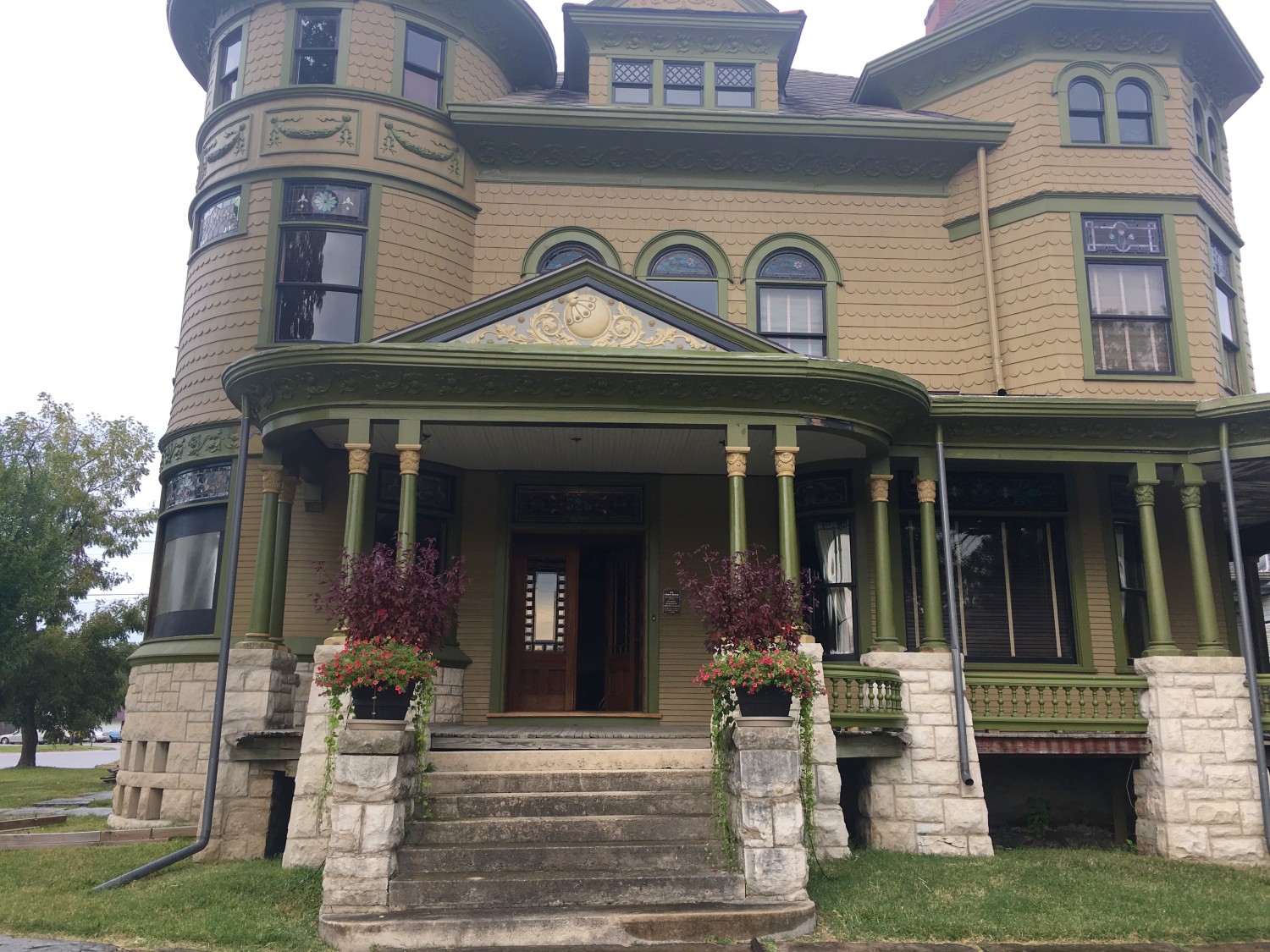
I changed something yesterday. Can you see it?
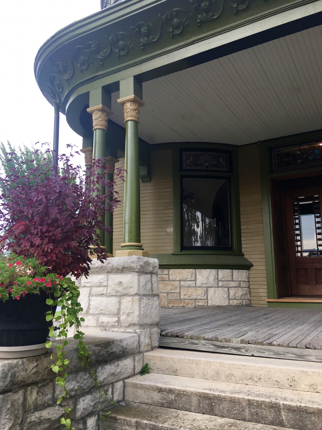
I painted the column shafts in high-gloss polyurethane.
This idea was a stroke of friggin’ genius!
I love love love the results!
I was uneasy with the green columns. So I painted two gold. Oops. That was so not the solution. But without the gold effort I would never have thought of the gloss idea.
The change is subtle, and more apparent in person than in the image. The columns are now richer. Your eye is drawn to them more.
Squee!!!!!!!!
Let’s look again at this picture. See the all-green columns over to the right? I am astonished to realize how dull they were! HOW did I not see this for three years!!!!!!!!

16 Comments
Leave a Comment
Your email address will NEVER be made public or shared, and you may use a screen name if you wish.
They look great!!! I’m so glad that you decided to go with the green columns, they are just…right. They stand out, they have the right amount of presence, they don’t detract from the whole picture…in other words, they do just exactly what they are supposed to do. Right on!!! 🙂
Ditto to Mike’s comment. It becomes more alive and more elegant- LOVE IT!!!
I really do like these. The green columns and gold Capitola ans bases are a really good balance.
This WAS genius Ross! I love the columns like this.
Wow!
Try painting the little buttons on the railing the same color as the Capitolas. The railings seem dull now.
I love this best of all the iterations! I think going two-tone on the columns and painting the bodies high gloss is the way to go.
subtle yet significant 🙂
Is there ANYONE out there like me!!! I am the same age as our Ross but I get exhausted just hearing what he accomplishes in one DAY! I want to know what supplements he is taking!!!! Please let us know what your secret is!!!!
I am so glad you said that- I was thinking something was very wrong with me.
Please delete my comment on the salmon color!!!! I should never express my opinion. I love it that you’re doing what you want to do. AND with all of the other “experts” that you have on this site…….
Probably because you had 48,959,374 other things to look at!
Beautiful!
Spot on Ross!! Like the addition of the gold on the icanthus capitals, with the subtle accent band on the Doric bases. The green on the bodies lends the color balance to carry the weight of the porch mass in scale.
For the porch roof, maybe try a light olive with more blue mixed in, or maybe even the gold. ??
Just some thoughts over here in OH.
Love the gloss & love the gold accents! Beautiful work.
Love the gloss! It’s really coming into focus now.