
A Red Suggestion
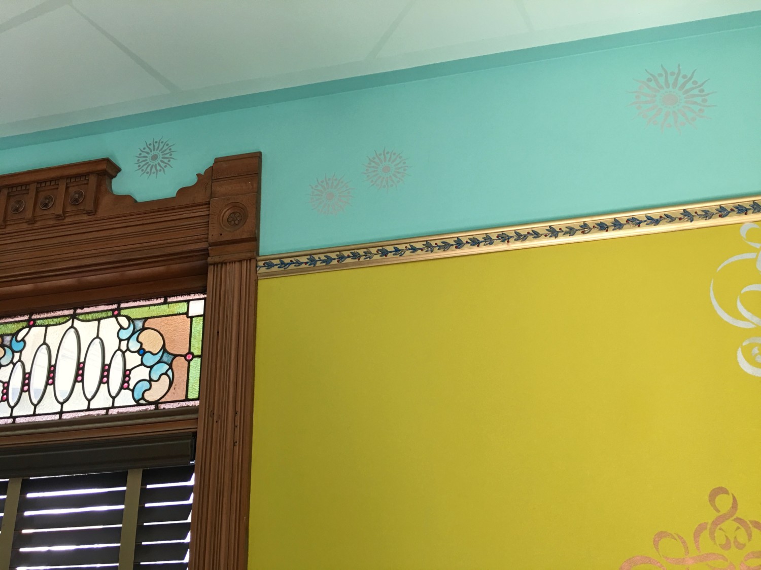
In a previous post, Meike wrote in, curious to know what the berries in the picture rail vine would look like…red. Well, I was also then curious, and today painted them red (click on image to enlarge). And I rather like the effect. It brought a bit more 3-dimension to the vine. Thank you, Meike!

18 Comments
Leave a Reply Cancel Reply
Your email address will NEVER be made public or shared, and you may use a screen name if you wish.
How interesting! I like the 3 dimensional look & adds another element– I especially liked it nearest the stained glass.
You have top-notch followers, Ross! I LOVE the red berries!
I too like the red berries. They should really pop when that red sofa moves in!
You’re right!
I hope that this helps settle the love-hate relationship you have going on with this picture rail! 😉 It just looks right…
Wow. This looks amazing.
I’ve been putting this off, but I really don’t like any of it. I’m a white wall girl myself and all these colors and different patterns confuse me. But I love the windows and wood!!
I also love white rooms, and that is normally my default color choice.
But with something like the Cross House, I think white kinda kills the beauty of the stained-glass and wood trim.
Well, ah, sorry, but I suggested blue… blueberries…
I think it looks better with the red berries, but I’m not shure if I would prefer the leaves in that chartreuse-green … maybe with the edges of the leaves being blueish.
I think I’m a bit more in natural colors.
My oops!
If you need some color, try orange. It is opposit the blue, and since your color palate is light, try a darker shade, like burnt orange. Maybe in some throw pillows or objects de art.
Um… er… (insert clearing of throat sound here) I’m a middle child and used to being overlooked… but I suggested a pop of red, or cranberry or something, and you explained the sofa was wine. I like the berries. Now… just one more kernel of thought… something… not sure what or how… but a tiny bit of that same red up near the oculus? Maybe a velvet cover sort of scrunched onto the shaft of the light fixture? (Maybe too much, maybe too Victorian?) Or perhaps a row of tiny dots around the oculus? Something… just a little something to keep my eyes bouncing up and around. Ya know?
I am also a middle child!
And I will be doing one more thing to the oculus. Please stand by…
The little berries match the red circles in the stained glass also. 🙂
I’m going to concur with Gabi above… I’ve been feeling like it’s just much too… MUCH. My eye doesn’t know where to land. Not gonna lie, I’ve felt for a while that it looked like a teenage girl’s room and now I feel like the picture rail is a Christmas decoration. I think you have FABULOUS ideas but putting ALL of your fabulous ideas in one room is just a little shocking to the senses. I get that you’re trying to accentuate the glass but I think that by going this far, you’re doing the exact opposite of what you mean to and all the BRIGHT COLORS! and PATTERN! and PICTURE RAIL! is swallowing up the beauty of the exact thing you’re trying to feature.
THAT BEING SAID… I’ve also been telling myself “It’s Ross’ house, not everyone likes the same things!” but if you would give some consideration to maybe using more neutral colors in another room, I think you’d be surprised at how amazing your glass will look when THEY are the focal point.
I agree that everything is a bit too much. I especially don’t like the lightening bolts around the light, very distracting!
Hi, Libby!
Lighting bolts were a common theme in the 1890s. That was my inspiration!
I love the red berries!