
Creating a New Kitchen in an Old House. Part Two.
In my previous post on this subject I showed numerous archival images of kitchens from the 1890s through the 1930s.
This post shows new kitchens in old houses.
About twenty years ago, a new look evolved for kitchens. This look is, well, hyper-active. Less is certainly not more. MORE is! MORE! These kitchens have upper cabinets which lurch UP and DOWN and IN and OUT. Same for the lower cabinets. There will be crown molding slathered everywhere, fluted pilasters, carved capitals, carved brackets, can lights abounding, and basically just about every architectural flourish one can imagine all crammed into one room.
People seem to love these kitchens.
They make my head explode.
How about you?
Well, please, will you join me on a tour of the good, and less…good?

An old house with a new kitchen, and a stunner it be. I love the colors, the THICK marble counter, the wall-o-windows, and the I-would-kill-for-it range.
I repeat: I think the above kitchen is a stunner. However, with just a few tweaks, I think it could be even better:
1) The range hood, to me, it is over-detailed. I would have preferred a very simple steel hood, of a kind common in old kitchens. NOTE: I think range hoods should look like appliances rather than cabinets. I feel quite strongly about this!
2) The ceiling can lights. Somebody once called these type lights ceiling acne. That about sums up my thoughts. At least in this kitchen the can fixtures are in two neat lines. Usually they are all over the place. I think can lights have their place; I just rarely see them used effectively.
3) I love the two wall lights, and the chandelier. However, I would have deleted the latter, and chosen instead a matched set of three hanging lights over the marble-topped table. I would also have done under-counter lighting (lights under the upper cabinets, which beautifully illuminate counters), and a pendant over the sink.
3) I would have had the upper cabinets be either only as tall as the window trim, or ALL the way to the ceiling. As it is, the cabinet doors stop short of the ceiling by about 12-inches. I would have made the cabinet doors taller, with one more pane of glass on top of the door panels, to really accentuate the high ceiling. To accomplish this, the crown molding would have to go…
4) …which is no matter as I intensely dislike crown molding in kitchens. Such molding was traditionally used in the “better” rooms like living and dining rooms. See also the two drawings below:
In the kitchen above, this drawing shows how the crown molding is laid out. To me, this is just really busy. You never see crown molding do this in archival images of historic houses. This busyness is something which began about twenty years ago, as part of the More Is More phenomenon. I look forward, breathlessly, to the death of this phenomenon. Also…
…the crown could have been installed as such. In the niches between the cabinets I would have dropped the ceiling to the bottom of the crown. So, if one simply MUST have crown molding in a kitchen, this drawing offers a suggestion of how to create a clean look in keeping with a historic house.

While I have a few quibbles about the first kitchen shown, one can truly appreciate how well done it is by comparison to THIS kitchen. This is the style of kitchen which makes my head explode. There is nowhere for the eye to rest. It could not be any busier. The wall to the left in particular jumps UP and DOWN and IN and OUT. It is like a hyper-active child, and I just want to tranquilize it into submission. Tragically, this kitchen is the NORM for new kitchens in new and old houses.

Here, the owners tried hard to create a kitchen visually appropriate for an old house. But, note how busy the upper cabinets are. They go UP and DOWN and IN and OUT. You will never see this with historic kitchen cabinets.

An original butler’s pantry. No UP and DOWN and IN and OUT. So simple, yet so gorgeous. And most people LOVE this look. Yet, in the adjacent kitchen…

…is this horror. Mind you, this is an expensive house, but somebody installed a cheapest kitchen cabinets. Note how the upper cabinets do not align with the door trim. And, would YOU want your sink 2-inches from your stove? So, with the pantry as the perfect model, why do this? Yet I see this all the time.

This, and the following two images, are of an expensively created custom kitchen in an incredible 1901 house. The rest of the house is a wreck. New owners did major repairs to the roof, built this kitchen…and stopped. The house has been for sale for years now. I love love love the house. The kitchen though I have some issues with. 1) Note how the range protrudes into the room, and has odd angled cabinets adjacent. 2) Why are there narrow walls on each side of the range hood? 3) Why does the range hood have that flourish? 4) Why does the range hood look like a cabinet rather than appliance? Why isn’t it steel?

ISSUES: 1) I dislike black counters, but would only change the island counter to white marble. It would brighten the whole room up. 2) Why do the upper cabinets have glass? You can’t see in them as they are so high. 3) Why is the pantry cabinet so high? It was custom made, so why not have it horizontally align with the upper cabinets? 4) Why are there fluted pilasters to each side of the pantry? 5) See the dishwasher to the left? Why does the cabinet above stick out a few inches, and why is is taller than the adjacent cabinets? Eek! The dreaded UP and DOWN and IN and OUT virus has struck again! 6) While I am glad there is no crown molding on the walls, I dislike the dentil crown on the upper cabinets. I would pull that off and replace it with a simple piece of trim. 7) CAN LIGHTS!!!!!!!! POINTS: The terrazzo floor.

The cabinets on the right are very deep. Then suddenly they are not (left of the ovens). THAT is where I would have put the deep pantry, and thus the whole wall would all be the same depth. Can you picture that? And can you also picture the glass in the upper cabinets being replaced with wood, and the dentil crown being replaced with simple trim? Better? This kitchen typifies a twenty-year trend in kitchen design: too much going on.

This is an interesting kitchen. It could be a fabulous kitchen. ISSUES: 1) Crown molding! And all over the place! 2) See the cabinet to the right? Why doesn’t it align (height-wise) with the door trim to its left? 2) And why don’t the pair of cabinets on each side of the rangetop align with the same door trim? 3) Can lights!!!!!!! 4) Why are there fluted columns to each side of the rangetop? POINTS: 1) Metal range hood!!!!!! 2) The hanging fixtures. NOTE: When I see cabinets which do not align with door/window trim, it appears that somebody thought about cabinet A, then cabinet B, then C, but never thought about how they would look together, and in the room. And they certainly did not take into account any existing trim for doors and windows. In short, such kitchens simply look thoughtless to me.

Not bad! But think how much better if the range were not inexplicably encased in a ceremonial niche. And how much better if the range were topped by a steel range hood? POINTS: 1) The floor. 2) No crown molding on the walls.

This new kitchen (in a 1916 prairie-style house) has became the poster child for How Kitchens Should Be. People LOVE this kitchen, and it has been featured in numerous magazines and books. But when I look at the kitchen I observe two distinct sensibilities. See the top of the upper cabinets? I like pretty much everything below that line. Note the absence of UP and DOWN and IN and OUT. But above that line? The sensibility is on steroids. There is way too much going on. While I understand having stained-glass transom windows above the set of French-doors, why do transoms line whole walls (artificially backlighted)?? Why are there so many ceiling fixtures? Why does the ceiling have so much going on? If you look at the rest of the home, the rooms look nothing like this. I think the rest of the home is gorgeous but the kitchen looks like it belongs in a different house.

This kitchen represent virtually every feature I dislike about the last two decades of kitchen design. Can you spot the many sins?

There ARE some new kitchens I like! This simple kitchen gets it right. POINTS: 1) Upper cabinets align with door and window trim. See how nice the effect is? 2) Steel range hood. 3) No can lights! 4) No crown molding! 5) I like the unabashedly modern stove and range hood. ISSUE: The only thing I would change is to make the island counter wider (making it more comfortable to have a meal).

This image, and the one following, are from a house shown on Old House Dreams. The kitchen looks like it has evolved over the past 80 years, right? That is what I thought, too. But we have been tricked! The kitchen is a new creation by its twenty-eight-year-old owner (28!), Justin. I am particularly charmed by the sink cabinet. It is pink! And it does not fit the wall! But it still nonetheless works, visually, with the rest of the funky kitchen aesthetic.

What I love and appreciate about Justin’s work is that it proves one does not need to spend a fortune to create a kitchen which feels right in an old house.

This is a new kitchen. I know! While I suspect that few buyers would WANT such a kitchen, I love it. The peninsula appears to be of old bits of wood, the refrigerator is tucked behind the tall cabinet (which looks to be made from old doors), and a dishwasher is hiding under the peninsula. Note the utter lack of crown molding!!!!!!!!! And no can lights! ISSUE: I would have a light hanging over the sink and stove.

Another brand new kitchen. Kelly brought this to my attention (see comments below). Thanks, Kelly! This kitchen cost but $12,000. You can read all about it here.

This heart-stopping recreation is in the equally heart-stopping Armour-Stiner House. I did a post on the house.

In 2003, Jack Reed purchased the 1905 Glasner House by Frank Lloyd Wright. The price was $1.5M. The previous owner had just installed a $$$$ kitchen with granite counters and a lot of UP and DOWN and IN and OUT. Reed did not think the new hyper-active kitchen was a complement to the Wright-designed structure. He tore it out. Reed’s architect-designed kitchen cost a lot (Reed spent $2.5M restoring/renovating the house) and it has all the bells & whistles required by high-end buyers, but is a glorious complement to the original structure. My only issue is with the farmhouse-style sink, which breaks the line of the lower cabinets and counter, and is a type sink never seen in 1905.

The Heurtley House, also by Frank Lloyd Wright. Entirely new, and so well done. POINTS: 1) The upper cabinets align with the top of the window trim. 2) Classic subway tile. 3) Most importantly, note the steel range hood, beautifully matching the WOW range!!!!!!!!

I…love…this! I know, my readers will think: Huh?????? But I love modernism, even though I own an 1894 house! This kitchen is in a historic house. The owner, noted interior designer John Saladino, created this stunning modern kitchen. And I could move in tomorrow. Note how the base cabinets are long straight lines. No UP and DOWN and IN and OUT. Note also the can lights above the left counter. This is one of those rare instances where can lights are visually effective.

27 Comments
Leave a Reply Cancel Reply
Your email address will NEVER be made public or shared, and you may use a screen name if you wish.
I really love the 1st kitchen, minus those can lights. Smooth finish cabinets that are given the look of built ins are my favorite, 2nd to stained wood cabinets. I really dislike cabinets that are not all the same height too, grrrrr! Also not a fan of huge tiles in kitchens (that trend seems to be dead, hooray!)
Have you seen this Victorian kitchen?
Looking forward to see what you do with your kitchen!
Thanks for the cool kitchen link, Kelly! I added an image of the kitchen to the post!
I dunno, kitchen 1 is pretty close to perfect for me. Only thing I would want is a ” real ” table to sit and eat at or read the paper.
Betsy, I also love Kitchen #1. I called it a stunner! My issues with it are minor.
I have been trying to decide whether to put an island in my kitchen. I thought I would like a fairly large island but trying to decide whether to keep the sink under the window or put the sink in the island. My ceiling is really high and have thought about different things. Any suggestions?? I see beams in one shown here. I don’t want to lower it.
I just did my kitchen (me and a friend actually did the work) and due to my lack of plumbing skill and cash, I left the sink under the window and built a 6’x4′ island (kitchen is 21’x17′). We love the island, we have 4 bar stools and I use it for preparing meals.
Thanks for your comments Sara Beth. I have thoroughly enjoyed all the posts about vintage kitchens.
You and I have the same feelings about kitchens. I really love old farmhouse kitchens. The house on our family’s farm was built in 1917 and has the floor to ceiling cabinets, all painted. I think that a kitchen should match the style of the butler’s pantry (if there is one). The in/out/up/down thing drives me INSANE! Sink needs to be in front of the window, not in the island. I want an expansive slab of uninterrupted counter space where I can roll out pie dough, have racks and rack of cookies cooling, have a bowl of bread dough rising, and still have a pile of dirty dishes next to the sink (in front of the window). Tiled counter tops are soooo yucky!! Grout absorbs icky-ness! I want a monstrous sized stove, whether new or old, it needs to look good. Metal hood for sure. And the fridge had better not stick out past the counters.
Under cabinet lighting, pendant lights, and maybe a few selectively located pot lights. No track lighting!
In my dream house (a massive Victorian on a farm) my kitchen will also have a woodstove or fireplace, and a daybed. And a rocking chair next to said wood-fire-source-of-warmth for Granny to sit and rock the baby. Braided oval rug at her feet, cat napping in the wood box, socks drying on the rack.
Oh my, that Magic Chef 6300 in the last picture!
I think the 1st kitchen pictured might be a good compromise. But the kitchens pictured (not counting the drawings pictured) #16 #17 #18 are pretty fantasic as well….i think #16 is my favorite. The very modern kitchens pictured make me cringe.
I’m inclined to think that there might have been (smaller) crown molding above the cabinets only in Kitchen 1 since it has wooden soffits to the ceiling. But not in the whole room. Am I wrong about this?
Also, I’m wondering if I compromised too much on my goals to keep my kitchen as plain as possible and avoid recessed lights. Though I thought I’d be ok since I was letting form follow function. Thoughts?
Hi Chad! I did not quite understand your first question.
And can you provide a URL link to your most recent blog post showing your kitchen?
The face frames of the cabinets above the doors are really thick so effectively the kitchen has wooden soffits that are integral to the cabinets bringing them to the ceiling.
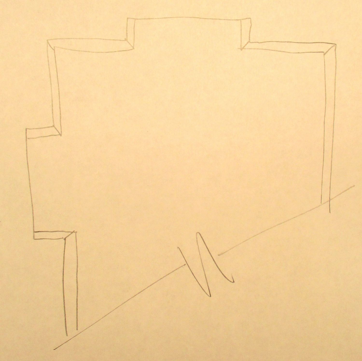
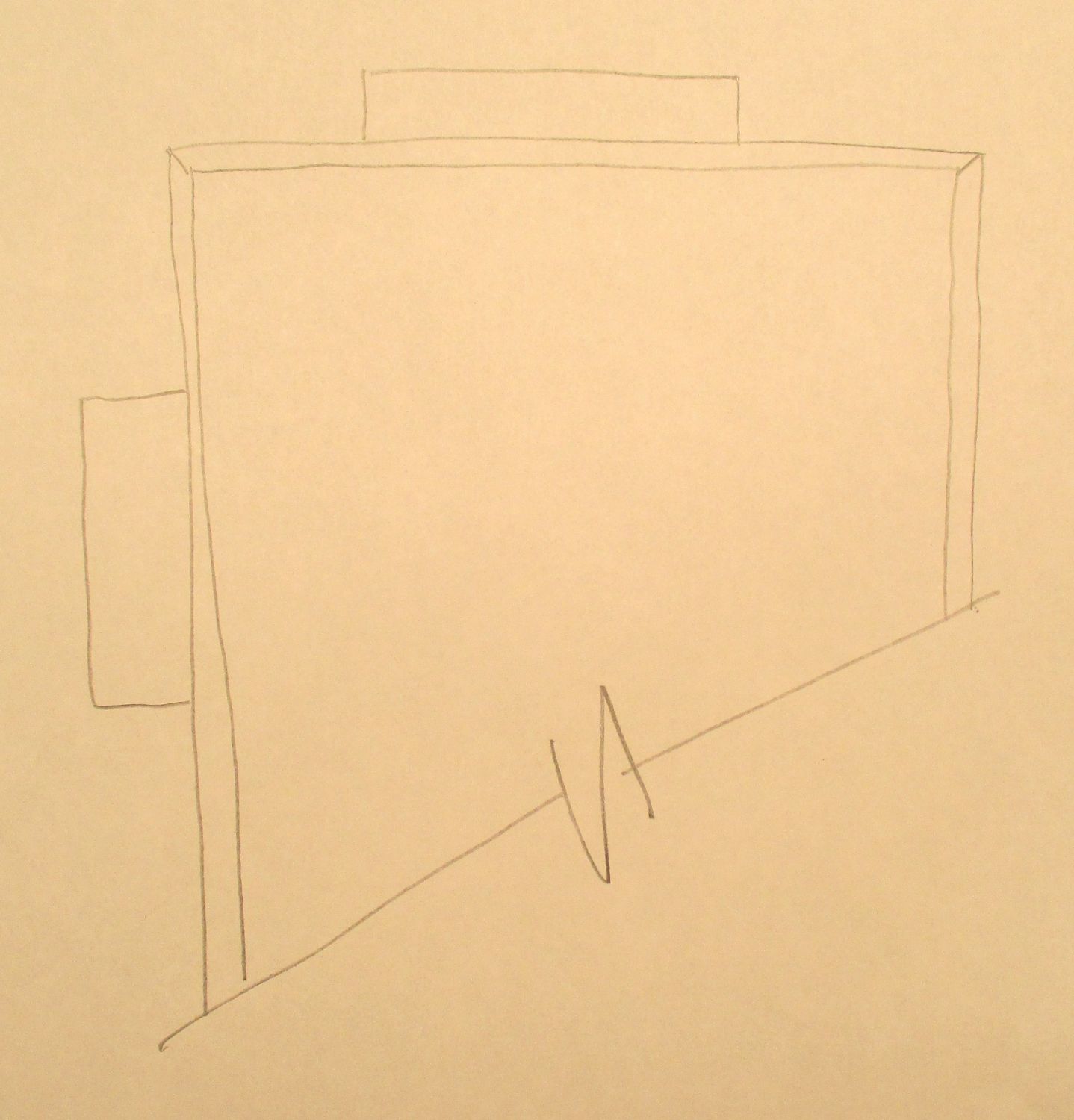
And for mine, I have drywall soffits as seen here.
and my crude elevation for the wall that has some in and out and up and down action is here.
Ahh. Thank you. Yes, I understand that kitchen #1 (above) was wooden soffits. But I would have simply made the doors taller, so they reached to the ceiling. Or I would have made the upper cabinets shorter, so their tops aligned horizontally with the window trim.
I am neither for/against soffits. It all depends.
However, to my HORROR, you will be having some UP and DOWN action!!!!!! Why not simply have all the TALL cabinets on top? Then put the SHORT cabinets below? Or, have all the TALL cabinets on top, with an open shelf below?
Also, you put a niche behind the refrigerator, right? Does this mean the fridge will NOT stick out past the base cabinet? If so, you get points!!!!!
Since I’m eventually having custom doors made, I’m considering just having them made 4 feet tall to avoid the up and down action. Putting the short ones on the bottom is an interesting idea though. That will definitely be in my next sketch. I don’t think I want open shelving on the fridge side.
And yes, that’s the idea with the niche for the fridge. I made the niche as deep as I could, so no promises that it will be flush, but it should at least stick out less.
Renovating a kitchen or bathroom in an old home is a battle between form and function. I am currently renovating my kitchen to better match the 1932 house. I am locked into a small 9′ x 13′ space. I collect vintage appliances, so I picked what I wished to use. I replaced the original damaged tile, duplicated the same pattern, but changing the colors. The house likely had a wall hung cast iron sink. My heart wanted one, but my mind wanted a dishwasher. I chose this for two reasons. The first being that I now can install a mid 1950’s dishwasher to show off and play with. Second, the next owner of the house can install a modern dishwasher without gutting the room again. I also tackled the microwave issue by finding the oldest model I could find, a 1970 Radarange.
There’s no right answer about renovating these two very functional rooms. You have to want to live more like the the people of the time period you are creating. As a single guy, I can get away with a pedestal sink in the bathroom. If I had a wife or children, no way! There are too many curlers, hair dryers and accessory items that women have.
Ross has convinced me to remove the one recessed light I have. I am at his mercy to help find appropriate kitchen lighting.
The Cross House also likely had a sink on two legs. I love this type sink, but probably will not install one and for the same reason you mention: me want a dishwasher! I could put a dishwasher NEXT to the sink, but there is no room.
I would never advocate that kitchens in historic houses ONLY be restored to the date when the house was built. This is why I included the newly-created kitchen by Justin, above. Justin mixed and matched styles and eras, and with very little money created a kitchen which looks good in his historic house.
I have seen 1890s houses with fabulous 1950s kitchens, and I would not dream of removing such a period kitchen although many people would not hesitate to tear it out. Sigh. There is just such a house with just such a kitchen two doors north of the Cross House. When I toured the house and RAVED about the kitchen, the owner was startled. “You are the first person who ever liked this kitchen!” I told her it was a treasure, and had been custom-designed, custom-built, and with no expense spared.
And Travis? That curlers comment is going to get you in trouble!
I love your house! After I found your blog I read it through from the beginning. I have been shopping for an old house myself, and have found your writing to be very informative and inspirational.
I’ll be driving across the country next week, and would love to stop by and see it in person!
Thanks Briana! And keep keep informed as to your progress to Kansas!
I got lost in the post about the “heart-stopping Armour-Stiner House” and all the other related links. Oh My God!
I also really like the first one. I would prefer the crown to be painted the same color as the cabinets. I love crown, but I love cabinets to look like furniture.
Finally someone agrees with the whole up and down and in and out thing. If I mention that to anyone, they generally think I’m nuts. Despite the fact I am about as old as that trend in cabinetry, I think it looks ridiculous.
I can’t defend these up/down/in/out kitchens, but I understand why women like them. A woman’s kitchen is her castle and she wants it to look as complex as possible because complex equals expensive (in her mind). It’s just like the roofline of a Victorian house. The more complex the roofline, the fancier the house is. Columns and ceremonial walls around the range are just like porch columns to her. The range is her focal point and she feels it needs to be celebrated with extra architectural detail and embellishment. When a woman pays a mint for custom cabinetry she wants it to be embellished with dentil moldings, crown moldings, fluted pilasters and carved flourishes. And cabinet makers are happy to indulge such female fantasies if it means more money in their pockets.
I can’t so readily explain can lighting though. I think that has more to do with the modern architect’s irrational fear against shadows and dark interiors. Modern architecture is all about spacious but relatively empty interiors being flooded with light. So all possible surfaces are painted or upholstered white or coated in reflective material like stainless steel, all windows are as large as possible, and visible light sources (sconces and chandeliers) are augmented with invisible wall washers and excessive can lighting which is also relatively invisible. There is the hope that by banishing every possible shadow that the room will be perceived as light, airy and dramatic. But drama depends on contrast so it’s self-defeating to banish every shadow. Things that aren’t important should be obscured by shadow so that spotlights can dramatize those things that are truly important. Modern architecture is like the reader of a poem who shouts the entire piece at the top of his lungs. All drama is lost.
I know plenty of men who also like hyper-kitchens! I never thought the hyper phenomenon was gender specific!
I’m sure you’re right that many men like them too, or at least don’t mind them. Otherwise we wouldn’t see nearly as many as we do. But I do think the market is driven primarily by what women want, not what men want, when it comes to kitchens. To most men, the kitchen is just another room in the house, but to a woman, it’s her home base, her throne room where she reigns supreme.
David, That is a broad generalization about women. I am one who does NOT like to cook and I certainly don’t feel like a queen in the kitchen.
At my house my wife only wants me in HER kitchen when it is time to clean up.
rick