
Inching Along
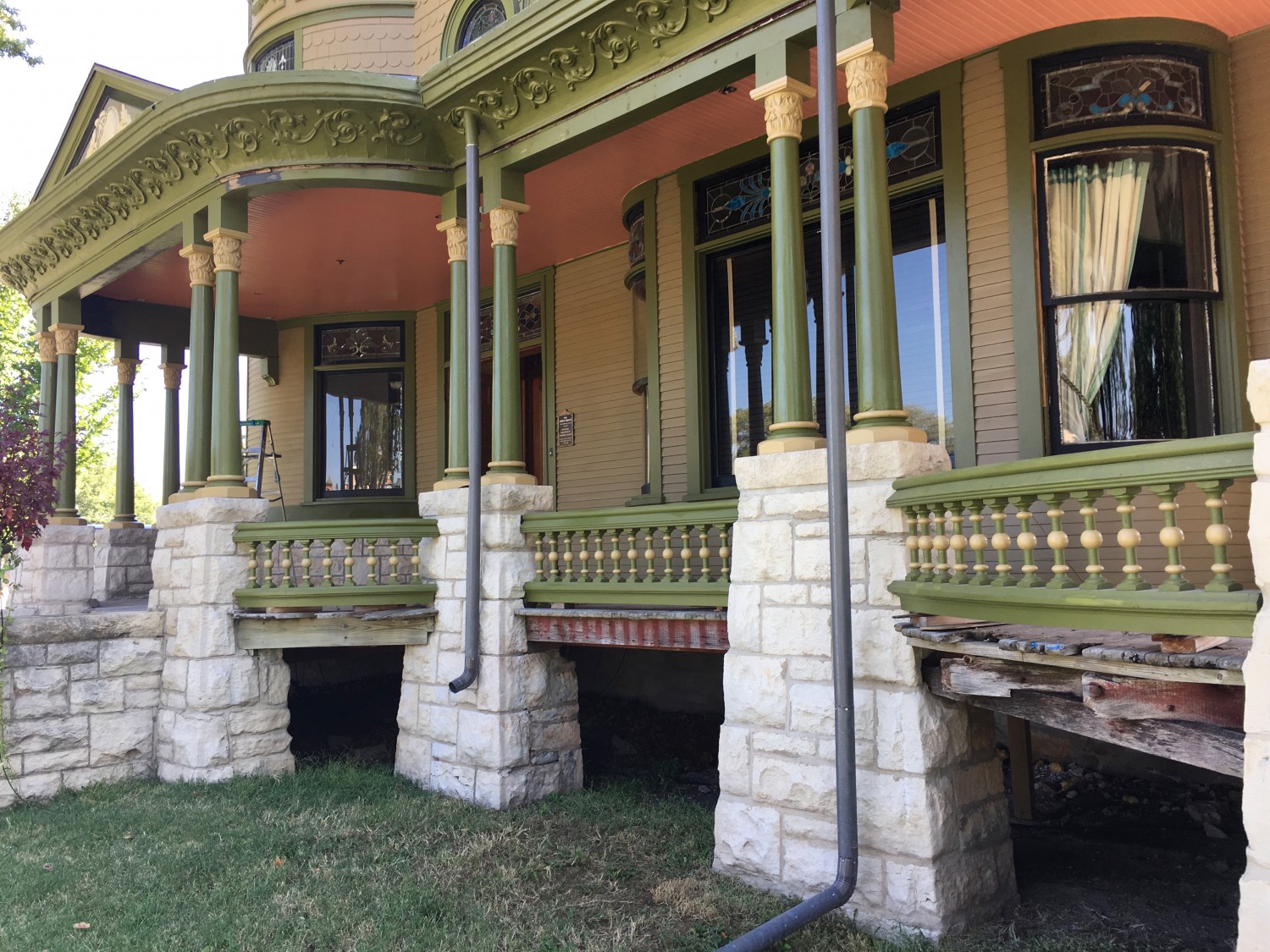
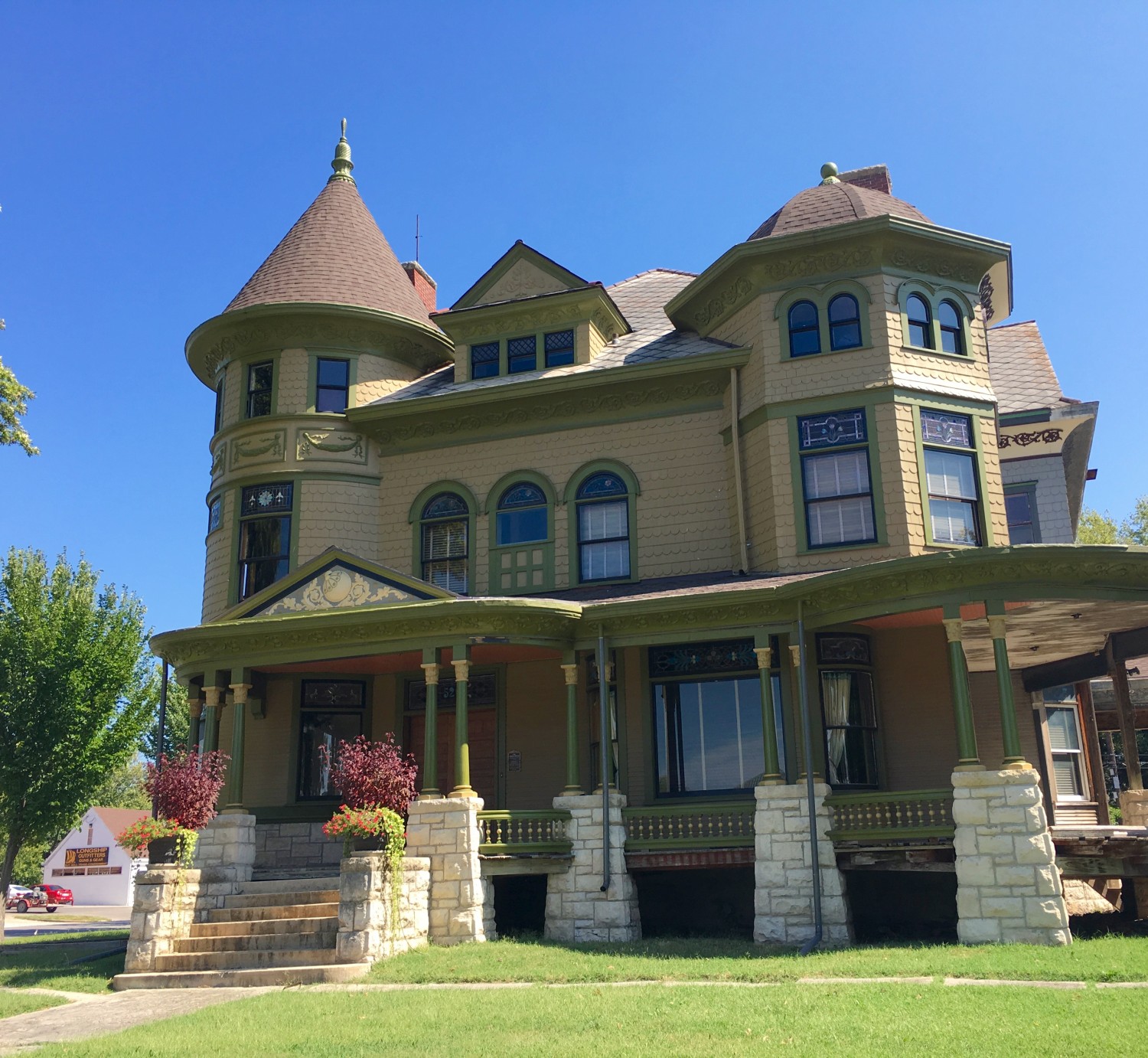
All the west columns are now glossy, and with their bases and capitals painted in color #5. The railings have been detailed, too! I sure wish Ross would hurry up and install some damn lattice! The downspouts are still factory gray because I don’t know what color to paint them. Green? Or maybe the wall color? Black? Sigh.
I plan to start on the pinstripe this weekend!

18 Comments
Leave a Comment
Your email address will NEVER be made public or shared, and you may use a screen name if you wish.
Absolutely gorgeous. I’ll bet your neighbors are jealous.
Looks fantastic, perfection!!
Can a house be “radiant”? It looks wonderfull Ross- It vibrates with personality plus!
How about painting the downspouts to look like weathered copper. Wouldn’t the originals on the house been copper?
Maybe photoshop different ideas for the downspouts to see what fits best. Eric might have ideas or photoshop examples. He seems to have some good ideas.
I am thrilled that you decided to go with the pinstripe, I think doing the whole header in black would have disconnected the porch from the columns. As for the downspouts, what about painting them the colors that are behind them as they descend? Green under the overhand and down the columns, #5 in front of the capitals, and something similar to #5 in front of the limestone foundation? Gutters are functional, and I’ve always thought that they looked best when you don’t see them at all…
One word STUNNING Ross.
oh wow, oh wow, oh wow!
I totally agree with Mike’s comments too.
I would trompe l’oeil the downspouts. Green with stripes of gold where they pass in front of the capitals and bases, beige in front of the stones. But then I’ve always liked a good trompe l’oeil.
Now you’re getting somewhere. 🙂
Wow! Looking good!
I agree with the downspouts blending in with their surroundings. They are not the headliners here – they definitely need to do their job in the background.
Having a hard time imagining them in black – I think that will take attention away from the pinstripe – which is brilliant.
Love the columns, love the railings, and I must say I’m loving the ceiling. I was one of those who was skeptical of the color and, no doubt, would have gone with a safe choice. I’m sure it would have looked perfectly nice, but this is gorgeous! Who knew I liked the color coral? Well done Ross!
(I must confess I dont’t like green in general except plants.)
I like the columns. Not so dull anymore but not at all painted Lady.
For the downspouts I would prefer corroded copper (Stewart McLean) or trompe l’oeil (Mike and others)!
Why do you have those white bars behind the windows? Is it to prevent burglars? I would prefer black ones to blend in…
(Sorry but I’m very good in criticism. I hope You estimate it as positive criticism!)
The “white bars” are the tapes of the blinds.
Oh! Ups!
Maybe stain the “bars” dark (only on the side which is facing outside) ?
Leave the downspouts gray…or paint black like the pinstripe.
Looking good! I think you should paint each section of the downspout to match the color of the surface behind it so they blend in. It will make a huge difference.