
More Colorful Windows!
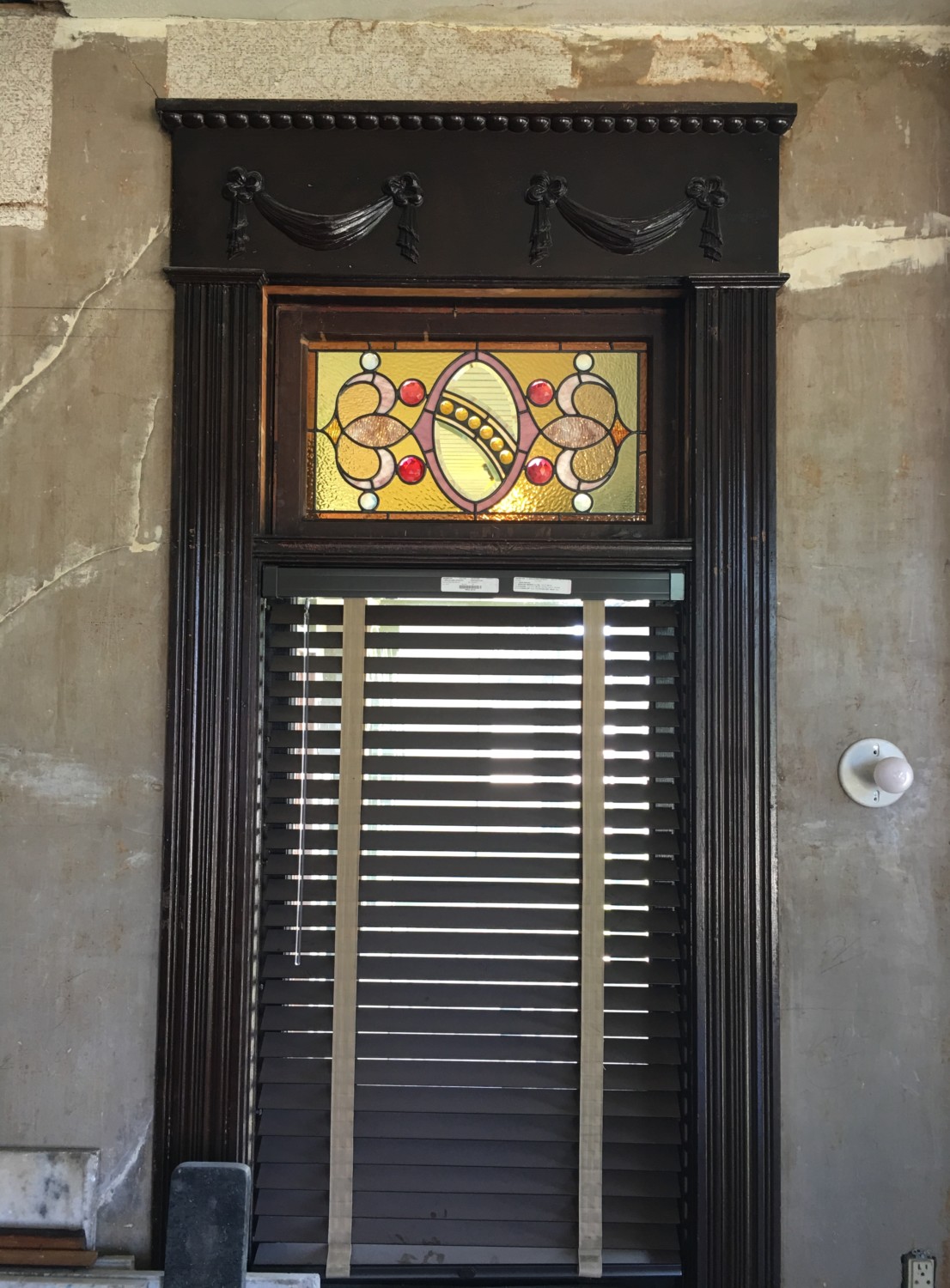
The west stained-glass window in the dining room is back in place after being restored!
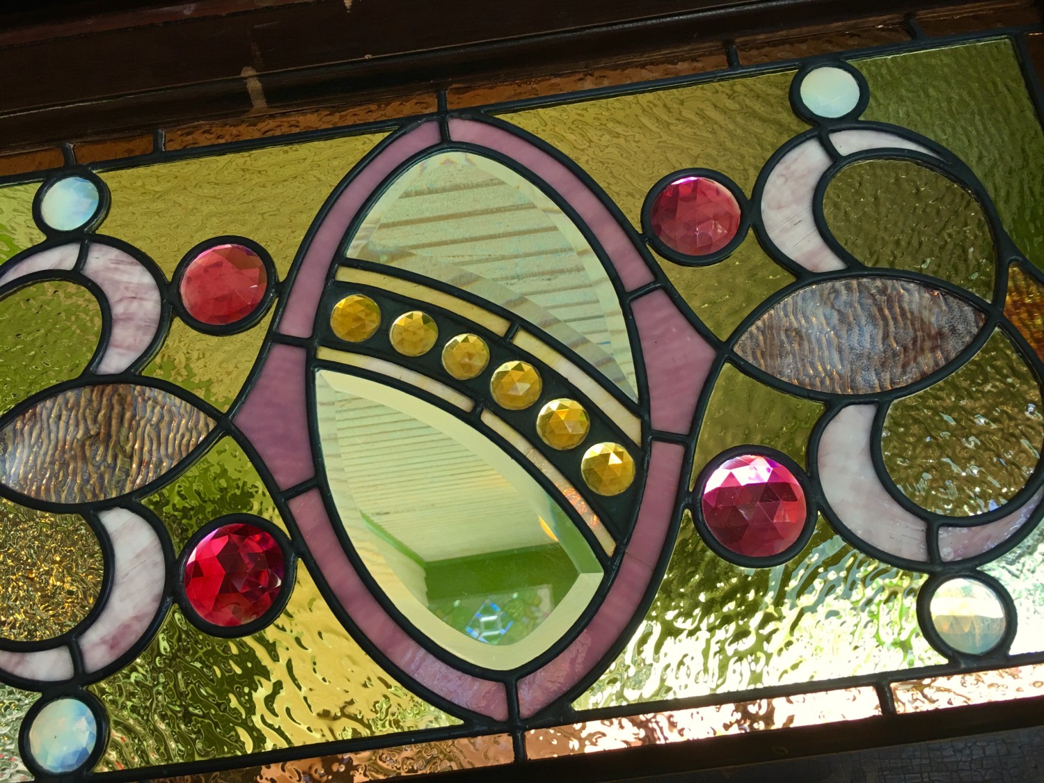
The design is unique among the 42 stained-glass windows in the house.
After each stained-glass panel is restored by Hoefer Stained Glass, the wood sash itself requires restoration and glazing. So, there is always a lag between when the stained-glass panels return to the house, and their reinstallation.
This is the second reinstalled stained-glass window in the dining room. Currently being worked on are the pair over the curved windows. Then the huge center panel!
The five stained-glass panels in the dining room were the last to be restored as part of the 2015 Heritage Trust Grant. A second grant, awarded this year, will finish the remaining third of the stained-glass in the house.

15 Comments
Leave a Comment
Your email address will NEVER be made public or shared, and you may use a screen name if you wish.
What a difference…I doubt that the stained glass looked this good in 1894! I am a little jealous…OK, more than a little 🙂 Have you chosen a color for the dining room walls yet?
I love really intense colors, and had planned on doing each room in the house a different color.
The dining room? I don’t know yet. Maybe a great shade of blood red? Or a luscious, rich violet?
Violet – yes!!
YES!!!!!!!! I actually started to suggest a dark red, it would really make those jewels stand out. We plan on doing dark red brocade paper in our dining room; it just feels rich and formal…you could also use gold/gilt as an accent color, it would go with the smaller gold jewels. I wish that we had more stained glass in our house.
Love the jewels! The red bevels are like rubies! Just lovely and the close-up shots are so fun to see!
Oh Ross, this is gorgeous!!!!
Ivote blood red.
I vote blood red.
if you use red, which seems like a good idea, make sure to have the primer tinted gray.
Guess I’m out voted … but I think you should at least TRY the violet. I believe it would really pull out those tones in the overall piece. In the pic, even the red has a violet overtone I think …
(Don’t tell anybody, but I am also leaning violet.)
Ok, no one can say that I’m not open minded, LOL. I could picture something like this looking right in the Cross House: https://s-media-cache-ak0.pinimg.com/736x/74/cc/13/74cc131d4d24dc2a25c9418583d01a9a.jpg
Hey Ross! T think your “3rd way” decorating strategy is so smart and your parlor is looking fantastic, by the way. If I had to choose one room in an old house to go purely period correct it would be a dining room. It’s obviously not practical in a kitchen or bathroom and would feel like sitting in a museum while in the parlor, but I think it WOULD be practical in a dining room and would be super fun to design. (I like the violet too!)
I’m curious if you know anything about who originally designed all the stained glass. It is all so beautiful! I’d love to know more about it.
Out of all your gorgeous windows this is the one that makes my heart sing the most. I have been waiting for this one to come back from the restorer, wow!!! The centre reminds me of a Faberge egg. Absolutely stunning.