
Porch Ceiling. Part II

I retained Zac to develop more photo-shop images. This image shows the porch ceiling the same color as the north chimney, which Zac cleverly included IN the image (left)! Also, I asked Zac to “paint” the porch lintel black, as opposed to a black pinstripe.

Here, the ceiling is a salmony color as per Patricia’s suggestion. With a black lintel.

Another salmon color. Black pinstripe.
Yesterday, Kizilod surprised me, delightfully so, with this photo-shopped image. The ceiling is painted gray, like the background of the gable above. I really like this! Very elegant and subtle.

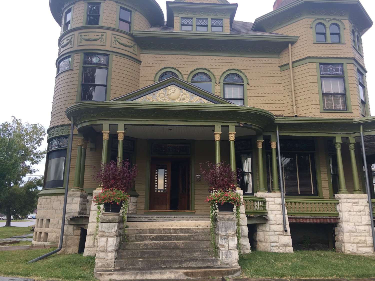
I think of this as Zac Blue, and I was leaning most toward this.

Sadly, in all these iterations, I was never able to “see” Eric’s #1 proposal.

10 Comments
Leave a Comment
Your email address will NEVER be made public or shared, and you may use a screen name if you wish.
I love the black lintel. The toasty color would be beautiful with a black lintel.
I agree. A shade of “Toasty” is my choice.
I wanna see Toasty! Of the ones pictured, I like the grey best followed by the Zach blue, and I think I like the pinstripe better. The salmon ones seem too pink to me, although I like the second one better. Finally, because I have too much time on my hands, I actually went to the Sherwin Williams website myself! #6331, Smoky Salmon is less “pink.” Also possibly #2854, Caribbean Coral is one of their historic colors and is a little like Toasty.
Also in their historic color section, #2831, Classical Gold if you aren’t already sick of gold. Now even I’m obsessing over porch colors!
Of all the images shown thus far, I am most engaged by the ceiling being shown as the same color as the chimney. On my monitor, it leans towards plum. An elegant color scheme, using complimentary colors.
I LOVE the blue. The salmon is lovely as well. Must say, I am not a fan of the black lintel, it separates it too much from the cornice, an makes the cornice appear to be floating without a base.
Thank you. Now that you see what I saw, I am content. Your choice, I just wanted to you to see it.
Porch ceilings were often blue because it helps keep flies and other bugs from congregating, from what the legend is. I don’t know if there is any scientific evidence to support that, but I do know there are not a lot of bugs hanging out on mine.
I too love the ceiling color matching the chimney. That first picture on this post is perfection!
I really like the blue, or either of the salmon options. I dislike the color-match to the chimney- the coolness of it does not lend itself well to the warm olive tones. Also, I’m leaning more toward a bold, black lintel instead of the pinstripe. But they’re both lovely.
When we built of 2001 “turn of the century” Queen Anne Victorian, it was suggested that we paint the ceiling of the porches “haint” blue, so ours is a pale teal. Supposedly, the blue keeps the spiders away.