
Repairing A Continuity Mess
Last year I discovered that I was not painting the exterior of the Cross House in its original colors, as I had supposed.
Oops.
It developed that while I did get the olive green trim color right, I was painting the walls the second color the house had been painted with. The first wall color was a very pale olive, almost cream.
Oops.
Oh well. At least the colors were period-correct. And that knowledge, plus a great deal of vodka, consoled me.
During the process of painting the exterior I have been using an 1895 image of the house as a guide.

The Cross House, 1895. Click on image to hugely enlarge (as with all images). While the black/white image does not convey color it does convey tone. One can see what is dark and what is light. (Walter Anderson Collection – from ESU Archives)

The shafts of the west columns were, I am guessing, painted the same as the light wall color. The capitals and bases appear to be the dark green trim color. So, I copied this in 2014. And hated the results. With the shafts the same as the light wall color they did not appear to, visually, be substantial enough to support the roof.

So I repainted them in their entirety the dark trim color. LOVED the results. The columns look substantial enough to support the roof load. Image from 2014.
The 1895 image has guided other decisions. The dramatic curved cornice on the house appears to have been painted in the trim color, and its elaborate scroll detail was painted the same. I copied this.
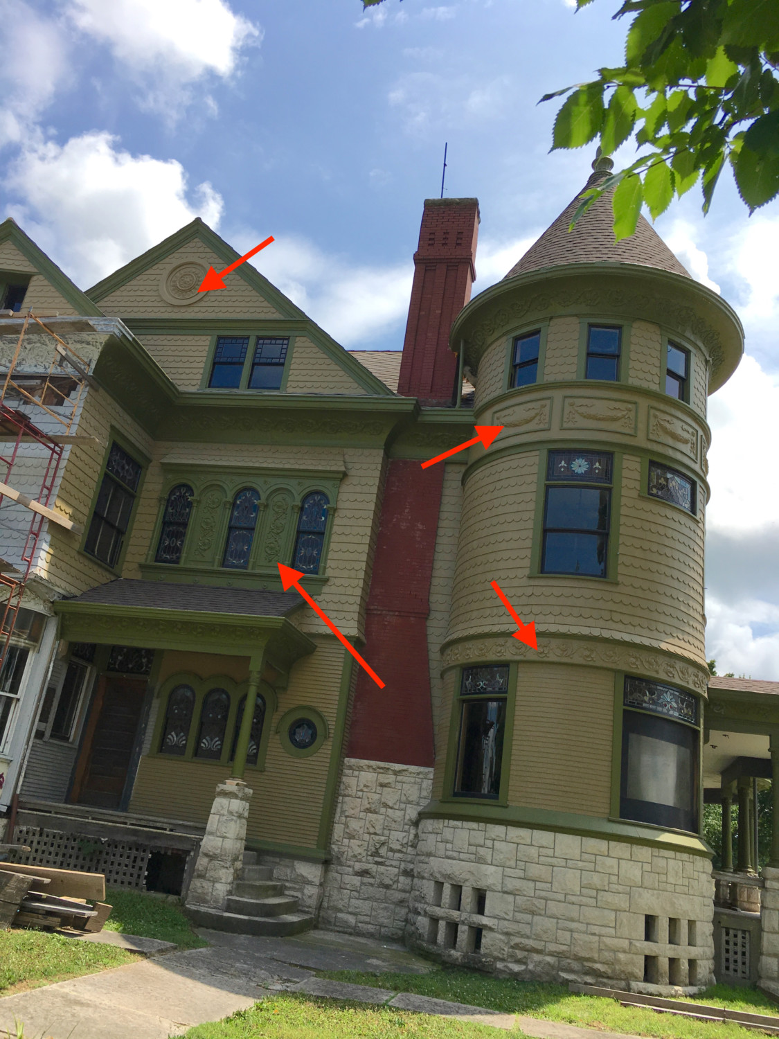
The 1895 image informed yet more decisions. The arrow lower right, for example. This is more scroll detail but in the 1895 image it appeared to have been painted the wall color, which I recreated. Ditto with the swags on the tower, above. Ditto with the huge round flourish in the top-most gable. However, when I painted the “diamond brooch” above the north porch (arrow lower left) I did it all in the trim color.

You can see here that my choices were based on historical precedent. Except…the diamond brooch. It was only after I painted it that I realized that I had gotten it wrong.

The brooch today.

The brooch in 1895. There are six slender columns. Their shafts appear to be the wall color. But their bases and capitals appear to be the trim color. Ditto for the arches. But above the arches the flat surface seems to be the wall color with the tiny flourishes picked out in the trim color. Then the horizontal trim at top is the trim color. I HATE THIS. It seems way too busy and disconnected.
THIS, to me, looks soooooooo much better.
Well, since finishing the brooch last year I realized that I had created a…continuity problem.
Bit by bit I was shifting away from what the 1895 image conveyed. I had NOT painted the columns as they were originally and had NOT painted the brooch as it was originally. Moreover, I had not even gotten the wall color right!
Geez. All my good intentions notwithstanding, I had created a continuity mess.
Sigh.
This issue has been percolating in my mind since last year. What to do? What to do?
And after much pondering I have made some decisions.
There are three things here to consider. #1 is the horizontal trim on the tower (lower right arrow). #2 are the swags, above. #3 is the huge round flourish in the top-most gable.
#1: I am going to paint the whole strip the trim color.
#2: I am going to paint the swags the trim color. But not the flat background. I am unsure about the latter decision. I mean, I painted the flat background on the brooch the trim color and love it. But doing this with the swag panels will create big green rectangles on the tower. I think the effect will be clunky. What I should do, for the sake of continuity, is to paint the swags the trim color, and their background, AND the flat background surrounding the rectangles. This will create a wide green horizontal band on the tower. But I fear this will look like a…girdle. So I am going to screw with the continuity paradigm by JUST painting the swags green. God help me.
#3. I am going to paint the huge round flourish the trim color.
To do most of this I am going to have to hire a bucket lift. So, an adventure.
Doing all this will resolve, mostly, the continuity mess. But the tower swags (#2) will assure that some mess will remain.
I think I can live with a small continuity mess.
CONCLUSIONS
There are limits to my desire in achieving historical accuracy with regards to the exterior of the Cross House.
- The roof was wood shingles. I have no idea if they were stained a color, as was common. Without recreating this HUGE visual aspect of the house I have already started down a rabbit hole.
- I got the wall color wrong. BIG oopsie.
- I am but guessing that the house was painted in a 3-color scheme: Wall color, trim color, sash color. There may have been an occasional fourth color. Or maybe an occasional fifth color, too.
- In looking at the 1895 image I don’t actually like some of the decisions made 122-years ago. Like the column shafts being (I think) the wall color, and the hyper-busy brooch.
What I have belatedly come to accept is that I may never be able to truly recreate the original appearance of the house. And this has caused me no small degree of pain.
With a dawning awareness though I have opened myself to…grace on the issue. If I cannot have an idealized perfection…I can still have beauty.
And so I embrace the latter.

17 Comments
Leave a Reply Cancel Reply
Your email address will NEVER be made public or shared, and you may use a screen name if you wish.
Ross, have you ever stopped to consider that what you are doing might be….BETTER than what was original? When the house was built, Mr Squires may have made recommendations, but the decisions were up to Mr and Mrs Cross, probably more so the latter than the former. While they may have been talented and successful people, they did not have your degree of style and experience. Don’t worry so much about matching what was original. The important thing is that you have saved the house, you are restoring and preserving the house, and for doing that, you deserve to leave your mark on it. Paint the trim to suit you. I know that Charley, Harry, and Susie are all pleased with you!
At first, I thought: Charley, Harry, and Susie?
Huh?
And then light dawned…
I ditto Mike. I think the look is fabulous & this is today. You tried to be true to the original but your sense of style is so much better. Yay Ross!
Regarding the “girdle effect” of painting the tower’s band of panels entirely in the trim color, wouldn’t that be ameliorated somewhat by the fact that the trim is effectively continuous with the cornice at the main roof line? It seems to me that maintaining that band of trim color makes sense, as it is otherwise essentially continuous, but shows other variations in that continuity.
Further, painting the entirety green would be consistent with painting the other trim (and the panels in the diamond brooch) in the trim color.
Oh, I know: “A foolish consistency is the hobgoblin of little minds” (Emerson) and “Consistency is more important than correctness.” (Mediocrites) But your mind is not little and there is no absolute correctness here.
Besides–at that height, it would be more a turtleneck than a girdle.
“…more a turtleneck than a girdle.”
That made me laugh!
I never noticed until today that the top left part of the brooch is broken or missing something.
Yes, the scrollwork on the lefts side is missing several pieces.
Original is great but not always fabulous! You are staying true to the ethos of the era and making your house beautiful!
It’s a bit like when a book is made into a movie — there is a line between recreating every little thing in the book and getting the spirit of the book right. One can go too far into the details and become a dead checklist or, at times, too far into the spirit of the book and have none of the details. But one needs both. And, I would argue, the spirit part is more important. It is much easier for me to forgive film adaptations that have the right spirit and miss some of the details than one that is simply a straight up reproduction of every single detail of the book and has no life.
So, bravo! Spirit and beauty unite, with homage to detail.
You are doing a wonderful job maintaining the historical integrity of this old house. Attaining historical accuracy seems an impossible task! Have you tried varying the colors of the exterior using photoshop or even just color pencils drawn over prints of your current colors? It might save you a paint job. Personally I really love your paint job; the lustrous and even paint on the columns and the choice of colors. At the end of the day she is all yours and an expression of your integrity, artistry and preference!
Oh no! Ross is not painting it in a scheme that is entirely historically correct! Someone call homeland security! Ha. It looks fantastic, and I like your ideas. It looks in the original picture that the panels with swags are painted the surrounding chunks are the trim colour. Anyways, I think the band around the first floor of the tower and the eye at the peak are calling out to be dark green.
These new ideas of yours are thoughts I’ve had since the first time you showed us the new paint job! I think that those small changes will make an enormous difference, visually!
I think if Mr. and Mrs. Cross had you to advise them, they might have made your choices. So I say continue in the spirit of 1894, bringing in the expertise of Ross in 2017. As long as you don’t go full-on painted lady (which I am confident you won’t), you cannot go wrong — not with your eye for color and design.
It’s possible that there are some elements we won’t ever know for sure because with a b&w picture shadows can make colors appear were there are none? So you are free to make up your own mind where to apply high lights and low lights.
I also noticed that the scroll work under the dining room widow is wall color too!
Yes! But I will be painting it green. And soon!
I love the paint choices and wonder how the house would look if her picture was taken in black and white.
You wish is my command.