
Stencilling…off a cliff.
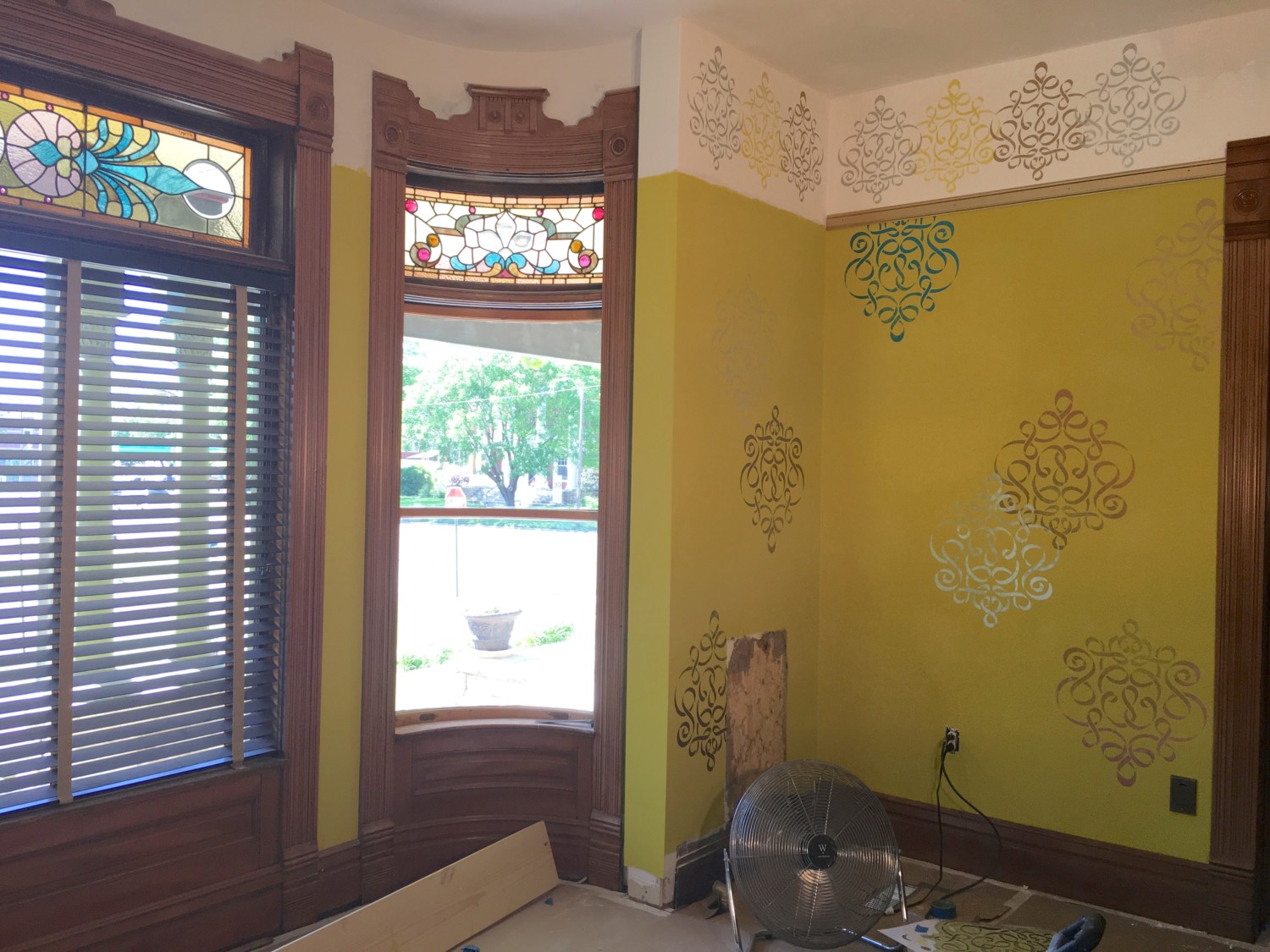
Today, I was SO excited to install some picture rail AND stencil the frieze!!!!!!!!
And my response to the finished frieze?
I LOATHE IT.
But I was not sure why. So I sent the above picture to Patricia in New Jersey and asked her opinion.
“Can I be honest?” she asked.
“”Please!”
“I LOATHE IT.”
Oh.
Patricia instantly zeroed in on the problem. It was not the colors or the spacing but rather the stencil itself, which is a custom-sized version of the wall stencil.
“I LOATHE IT.”
As soon as Patrica explained I knew she was right. She further explained: “The frieze competes with the wall stencils and the stained-glass. And it’s just too busy.” And all this, too, was correct.
Oops. Bad Ross.
We then went back/forth whizzing across the internet on our respective computers looking for alternative stencils. In the end it was decided that I would create a…

…hand-painted ribbon that playfully wandered around the room. Sorta like this. The color would be chartreuse.
And what will be my first task tomorrow?
Painting over the loathsome frieze.
My second task?
Thanking the Gods for brilliant friends.

14 Comments
Leave a Reply Cancel Reply
Your email address will NEVER be made public or shared, and you may use a screen name if you wish.
The walls are stunning but the frieze I agree does not look right. I have a question, do you have the baseboard to finish the ends right by the curved windows?
Yes!
I think the ribbon would really complement the main stencils because the stencils themselves kinda look like ribbon.
Now, I have no idea what I’m talking about, but at the risk of sounding like an idiot, could the white background be too much of a contrast with the chartreuse? What about a shiny gold background with a silver ribbon or would that be too dark and/or too much?
The white should balance out when the room is done.
The large center table will be white. There will be a large artwork on one wall with a WIDE white matting. And a pillow on the sofa will have white in it.
All the white is intended to complement the white shelving in the adjacent library.
It all should work in the end. It is hoped!
The ribbon is a great idea!!!! The frieze was a bit of a rigmarole. You are right– thank goodness you have artistic and brilliant friends to bounce ideas around! Can’t wait to see the chartreuse ribbon.
I agree that the stenciled frieze seems to be in combat with the walls. And I also agree with Kerri that the frieze should maybe be another color besides white, maybe silverish with the chartreuse ribbon.(?)
Now your doppelgänger in the not to near 2117, will think the painted over frieze was the original intent! You must remove the wallboard and then replace and repaint your new frieze!
That made me laugh!
And I actually did think: Somebody, a century from now, will slavishly recreate the painted-over frieze!
Thanks for being so open with the ‘trial and error’ aspect of finishing and decorating your rooms. It’s reassuring for those of us who have had to paint a room more than a few times to get it right!
Happy to oblige!
I have always been comfortable with the two-steps-forward, one-step-backwards approach.
I don’t think you need anything up there, but you just go ahead with your ribbon and we shall see how it looks. Good luck!
It was common to Victorian-era homes to have a wall pattern, a frieze pattern, and a ceiling pattern.
The Cross House had all three in the stair-hall (fragments remain) and likely throughout the house.
I am very interested in recreating this approach.
Love the ribbon idea! Also put me in the column that the white is too jarring . But will see when you make some more progress.
Oh good.
My reaction to the first picture was not loving, and I felt bad. But then I scrolled down just a bit further and felt much better.
I like the ribbon idea.