
The Mystery of the Missing Fifth Color
I wonder what color #5 was?
That is, if there ever was a color #5.
But now I will likely never know.

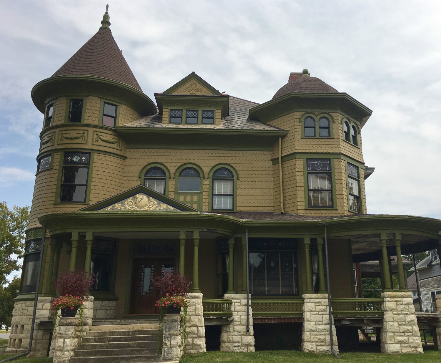
The 1894 Cross House when brand new. Click image to hugely enlarge. Then click again. (Walter Anderson Collection ESU Archives)
For three-and-a-half-years, I have poured over the above image, working to glean details from its embodied historic moment in time.
It was my great intention to recreate the original colors of the Cross House and, for a while, I thought I had. Then, in the spring of 2016, I discovered that while I had gotten the green trim color right, I goofed on the wall color, replicating the second color the house was painted rather than the first color (which I had assumed was primer).
Oops.
Another great intention was to also recreate the original color scheme. What should be the trim color? What should be the wall color?
I could tell in the archival image that the columns looked to be the wall color. But when I painted them as such they looked funny, like they did not have enough visual weight to support the heavy roof. So I repainted them the dark green trim color and loved the change. Also…

…in 2016, I painted the brooch on the Great North Wall. I looooooooved the results. However…

…I later realized that I had goofed again. The brooch was NOT a solid color in 1894, but was rather at least a two color job. I presumed the green trim color and the original wall color.

For months now I have been pondering this close-up of the archival image. Behind the tree to the right you can see the swagged garlands on the tower. The garlands appear to be the light wall color, and on the same light background. But these rectangles appear to be surrounded by….a darker color…another color. Another color? What????????
CONCLUSIONS
Today, I think I presumed too much about the Cross House.
I had thought the house was a three-color scheme:
- Wall color.
- Trim color.
- Sash color.
I now think the house had five colors, at least:
- Wall color.
- Trim color.
- Sash color.
- Roof color.
- Accent color.
The original roof was wood shingles, which were commonly stained.

Would you like a green roof?

Or red?

Perhaps gray?
So, the Cross House was not just a wall color, a trim color, and a sash color. It would have very likely also had a roof color.
But I have no idea what that color would have been as the original roof is long gone.
Back to this image. I now believe there was a FIFTH color. An accent color. That color may have surrounded the garland rectangles on the tower. That color may have been the background color on the brooch. And that color may have been used on the columns. And that color may have been used elsewhere, such as on the eye in the big gable.
But if my suspicions are correct, so what? While I know what the original trim color was (the green I am using) and what the original wall color was (a cream with a hint of green) and what the original sash color was (black) I have no idea what the roof color was and no idea what a fifth accent color might have been.
And what if there had been two accent colors? Or three?
In any event, as I have been finishing the Great North Wall, and standing on the corner sidewalk, pondering, I have been tugged by a nagging awareness:
No matter that I had goofed over and over again, I was also painting the house…duller than it would have been in 1894.
Oh, the horror.
Of late, I have become convinced that the house was more, ah, lively in 1894. There was more to it than a simple 3-color job.

Rest assured though, for I do not mean the Cross House was ever THIS lively. The above house has been done in a “painted lady” scheme, a look which became popular in the 1960s when hippies started painting their cheap Victorian-era houses in crazy colors. Sigh.
CONCLUSIONS MANIFESTED
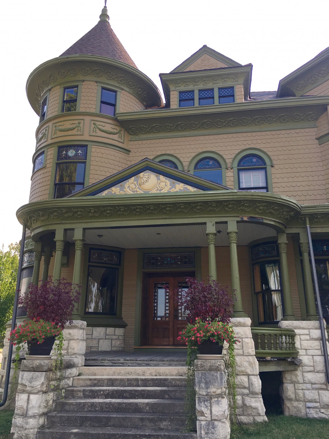
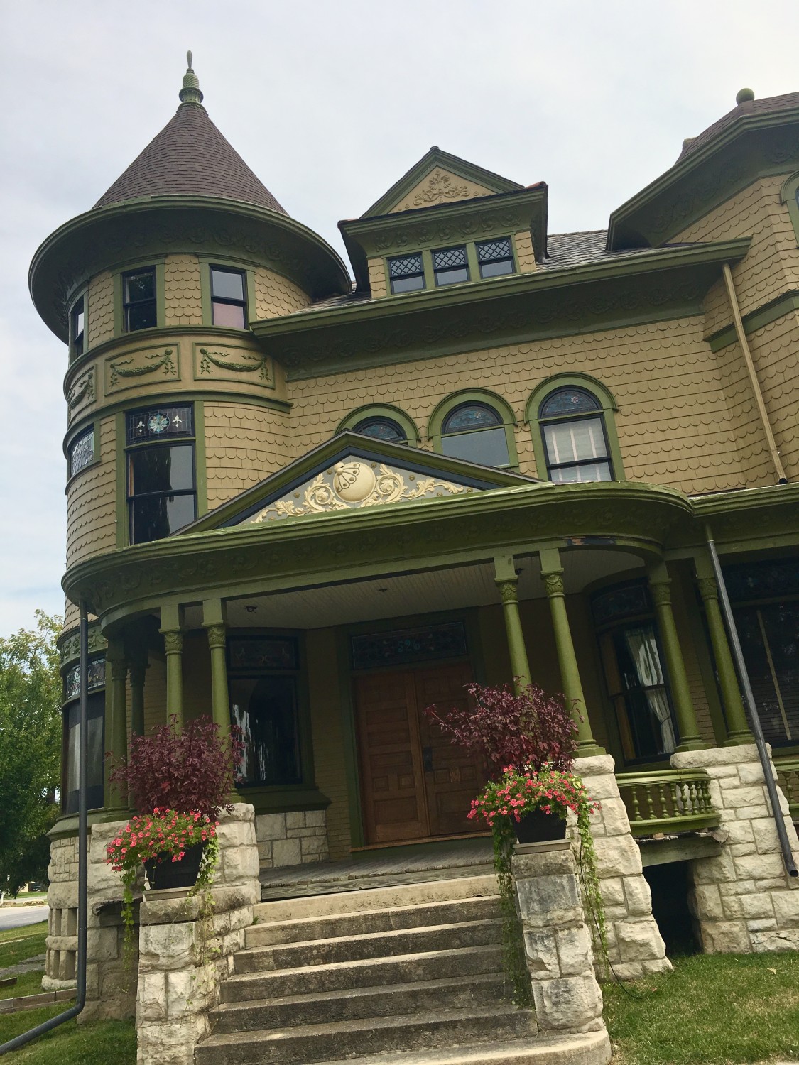
In standing on the corner, with both the west and north facades now almost fully painted, I can see that the Cross House is lacking a certain…something.
And I have been pondering this. And pondering.
And pondering.
This weekend I acted.
Wanna see?
Scroll way down…
ZOUNDS!
ZOUNDS!
ZOUNDS!
ZOUNDS!
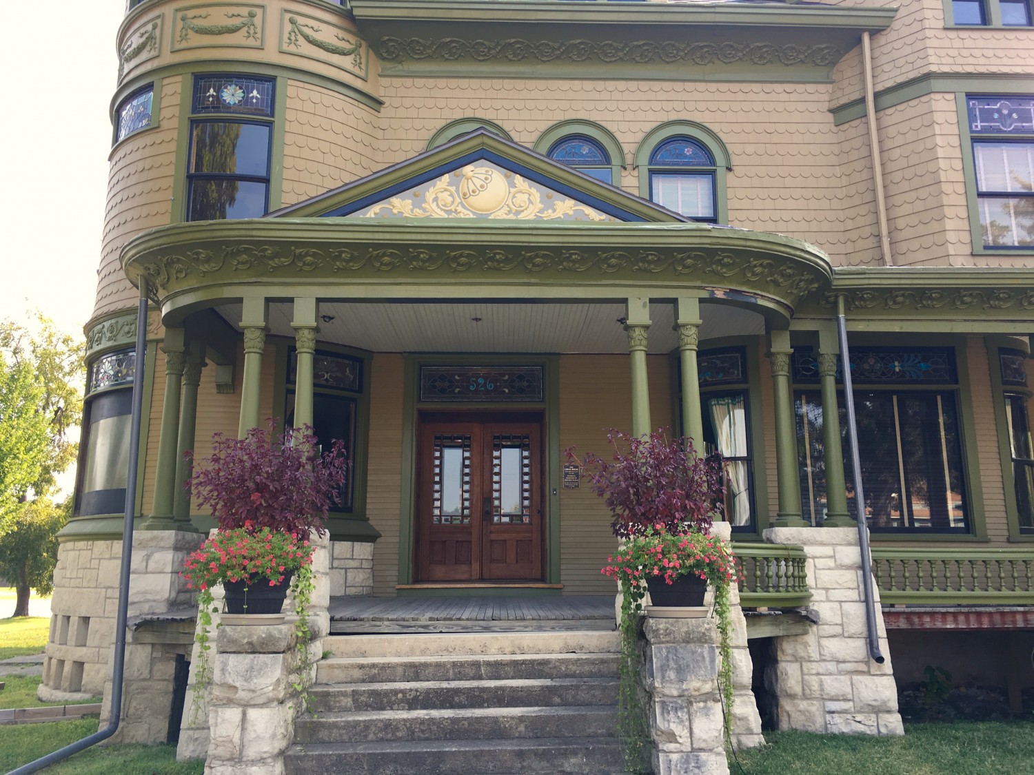
In staring at the house it occurred to me that the wide gable over the front steps was kinda like a picture frame. Inside the frame were details not repeated elsewhere on the house.
What if this “picture” was enhanced?
I knew I was entering dangerous territory. The wrong colors would look garish. And, I sooooooooo did not want a painted lady effect.
To avoid such a fate, I contacted my friend Eric, who has his own blog.
“Eric! You need to save me!!!!!!!!”
For Eric has a brilliant color sense, and a profound knowledge of how historic homes should be colored. I have recommended Eric to homeowners previously and all have been thrilled with the results.
“Eric! You need to save me!!!!!!!!”
So, Eric pondered and pondered. Then, yesterday, I received an email with his recommendations. Minutes later I called in an order to Sherwin-Williams. “I’ll pick up the paint soon!” Then I raced to house to begin the Great Experiment.
A half-hour later the experiment stalled. The sun had come around the house and painting in full sun is a bad idea. Then my brain had a thought…
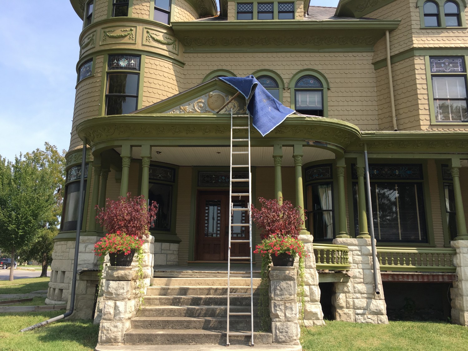
…and I draped myself in a tarp. Later, the whole gable was covered with just my legs visible on the tall ladder. Ridiculous, I know, but I just HAD TO FINISH!
Eric selected two colors which are seen nowhere else on the house. A kinda grayish background, with the details picked out in a creamy sandstone. There are tiny medallions scattered about (click to enlarge) and I decided to paint these the wall color. Eric’s masterstroke was deciding to paint some of the trim black. In a million years I would have never thought of doing this but the effect is perfection. The picture is now properly framed, thank you.
I had planned to also paint the gable above the dormer window but now I think I will leave it as is.
The gable over the front steps, by being highlighted, announces the entry. And this is good.
But why highlight the dormer gable?
SUMMATION
It is difficult to convey in the above images exactly the effect the newly painted gable has on the house. But as I stand on the corner the house now has a certain….vivacity. A vivacity which was previously lacking.
The change impacts but a minute portion of the massive exterior. But the effect delights me.
Eric has also suggested a solution for the eye. I am pondering this.

33 Comments
Leave a Comment
Your email address will NEVER be made public or shared, and you may use a screen name if you wish.
Wow! I love it! Now the house better connects to the foundation to my eye. It’s like a brooch on a regal lady.
It just keeps getting more beautiful with each refinement. The house is showing all the love you have put into its rehabilitation.
Astonishing!!!! ZOUNDS!!! Perfection! I really think the dormer gable would tie it altogether on the 3rd level w a small heat to roof color, limestone & just a taste of tying in the front & foremost gable. I think a portion of N afacade above the side porch & eye & further repeat the east & south facades in a sililar meaningful touch of the 4th & 5th colors!!! Just flourishes! The front & also west facade look absolutely beautiful!!!! Eric is masterful in his good eye regarding Victorian colors!!! Just delicious. Ross the Cross House & your masterful restoration are just getting more beautiful, emploria must be going nuts !!!
Good Lord so sorry about the typos! Sheesh!!
That made a huge difference Ross.
It’s perfect…. OMG, I can’t stand it! Ross please consider painting the porch ceiling the grey-blue background. I know it’s nit picking, but the color should, IMO, be repeated and the porch ceiling is the place to do it. After this master stroke, I get a jarring effect looking INTO the enclosure with the white ceiling. Simple, understated, but a unifying effect. Talk to Eric about it, please? Pretty please?
I have ignored the porch ceiling to date. But rest assured it will not forever remain white!
(Blushing Profusely) Glad you like it, Ross!
The cream color will fade slightly in time (has anyone else noticed that new paint isn’t as colorfast as old paint?) to more perfectly relate to the limestone porch piers. The intent was to get some of that limestone color off the ground and onto the house. I am also happy with the effect (even if not exactly historically correct). The paint will mellow with sun and time!
I can’t believe you got it done so quickly; I wish I had your energy level.
It looks beautiful. I especially love the “creamy sandstone.” Were you planning on painting the porch floor? Was it ever painted? If so, I was thinking the grey color would really tie the two together. Maybe even the sandstone color for the porch ceiling, or would that be too matchy-matchy?(see, I WAS paying attention when you were telling us about interior design)
I have been staring at the original picture of the house and there are areas which are clearly darker than the wall color, but lighter than the trim color, so I’m sure you’re on the right track. Your paint samples are even more proof that was the way it was done back in the day. Limiting yourself to just two colors may be the reason for all the back and forth and why you have felt that something just wasn’t quite right.
I am in NO way suggesting you change your paint scheme, but in your quest to just find out what the original colors actually were…If you look at the eye, doesn’t it look like the same color as the roof? Could that have been the original accent color? I know you said that there is no way to know what the roof color was, but wouldn’t the carriage house have been the same? Is there even a little bit of THAT original roof left?
Stupendous!
Omgomgomgomgeee I LOVE IT!! SO MUCH!!! i personally prefer the blue border to the black one but both produce the same mesmerizing results! I DEFINITELY like this change of heart. Its still nowhere near the tacky gaudy colours of the 1960s, but theres now a bit of playfulness. I like that. Of course I like the before too, but this is even better.
Truly stunning! Stunning!
Wow. It’s like a brooch on a hat — you didn’t know that was what the hat needed until you add it, but it takes your chapeau from hat to hattitude.
You just amped up your porch personality. It’s cheeky, in all the best ways. Well done.
I’m speechless…in a good way ????
Amazing! The new colors are just the bling the house needed. I can’t wait to see what else you have up your sleeve (or under your tarp).
I LOVE it! Great job on the color choices Eric!
What a startling and exciting change. Like the readers of the great serialized novels of the Victorian era, I will await the next chapter with bated breath.
it’s perfect. at first, it looked like gold leaf (which I, being an old hippie, would have done in a heartbeat) but the color combination up close with all those little medallions and detail is fantastic. One question – what exactly are the two items to the top left of the main medallion. I’m sure the whole thing has some significance but it escapes me.
ps – thanks for the link to Eric’s blog and I , in memoriam for their butchered church, am starting a fund to neuter people with no historic sense or taste so they are unable to buy old buildings. Just a little wire inserted in the right place in the brain means they can’t buy anything that doesn’t have vinyl siding or is over 10 years old.
ps – i think before i painted the 3rd floor gable, I would have one of your computer wizard followers (like the one that repainted one of your rooms in different colors of blue) do it on the computer as that will take a hell of a lot of staging or renting a big mother of a lift and then not liking it and having to go back up and paint it out.
Will you also power wash the cement steps? I think that will add to the house also.
From the questions being asked, I realize how often those of us who follow you in this blog forget that this is a project that is expected to take something like TEN!!!!!!!! years. As I understand it, there are whole sections of the house in which you have not even started working. I think that it would be wonderful if you did a blog with lots of pictures showing what those parts are and what they still look like. Such a blog might make me feel less inadequate at not completing all of my own projects.
Here! Here! What he said.
And, I like the change.
Wow! I heartily approve. Yes, it is alive. But every time I see those triple windows, they look like the odd ones out. They need to have metal trim like was originally planned. They look strange to me as individuals, not as an ensemble.
Love!
Zounds! Amazeballs! Have you tried to have the old picture computer colorized? Someone with more Photoshop experience than I have can do a pixel rendering that will apply colors to the various parts of the house. Or get with a color restoration expert for further analysis.
I’ve studied the pictures, and I think that the dormer highlights are exactly right for the house. I’ve also decided that, IMHO, the eye and the small front gable should get the same highlights. I’m not sure that I would put it anywhere else though, or it might end up detracting from the gables, defeating the whole purpose. I’m glad that you decided to move a little out of your comfort zone on this, it looks amazing without looking gaudy.
It’s perfect! I love it! Nice job
Yes, yes, yes!!! I’ve wanted you to add more color to this house from the beginning. There are so many beautiful details on this house that are crying out to be noticed more. You don’t need to go whole-hog painted lady, but the brooch, the eye, the pediments could use a little more oomph. Look at all the struggle over painting the eye and the garland bands around the tower. They were okay, but not wow makers. Neither you nor your readers were happy. A few more colors would solve the problem. This looks awesome!
Ohhhhhh yes! Looking at this, I might suggest more of the lighter colors on the porch columns as they look a little lost now.
I love it and glad you did it. I thought the same as Eric to paint that too but always knew you didn’t want a painted lady look. Now that looks really good.
Mary From Georgia
Perfect! As you have struggled through the garland issue, I thought picking it out was the wrong thing to do. It made the triptych of windows look blocky. And I thought the garlands were looking like the old cornice paint job with everything picked out. Perhaps accurate for an 1870s-1880s house, but just didn’t feel right for your beauty. The addition of the grey sets it off just perfectly! And if you can add some to the triptych, it should be lovely. Good job, Ross! Sometimes these things take time.
Perfect! That porch gable has been nagging at me for some time, and I’d decided that it needed an enhancement very similar to what you’ve done – Great job! Now I’m wondering if you might decide to repeat this treatment in other locations – it might provide the zing that has been lacking with the use of only the two predominant colors…
I agree probably five colors.
I think you need to consider the stone foundation. You need at least one or two lighter colors. Perhaps a lighter, creamier version of the yellow ochre and a lighter version of the olive.
You have the black on the windows.
So maybe a darker maroon or burgundy that would go with both the yellow ochre and the olive.