
Violet Kenny
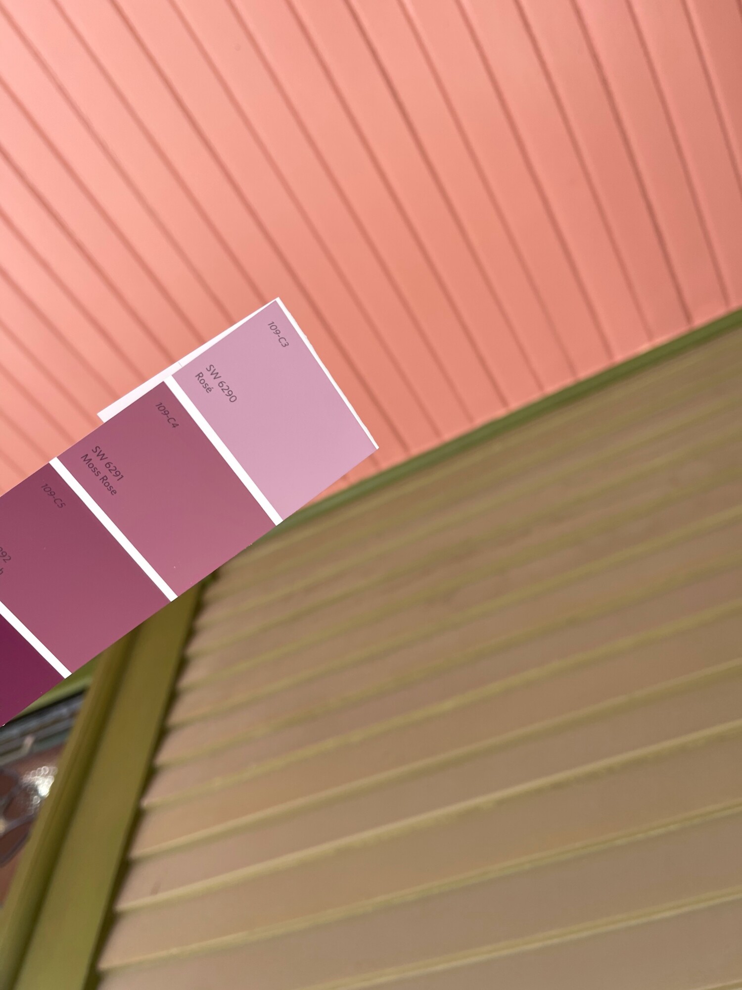
So, y’all saw this last week: my color choice (right) for the porch ceiling. I liked the color chip.
And in reality? EEK! I hated it!
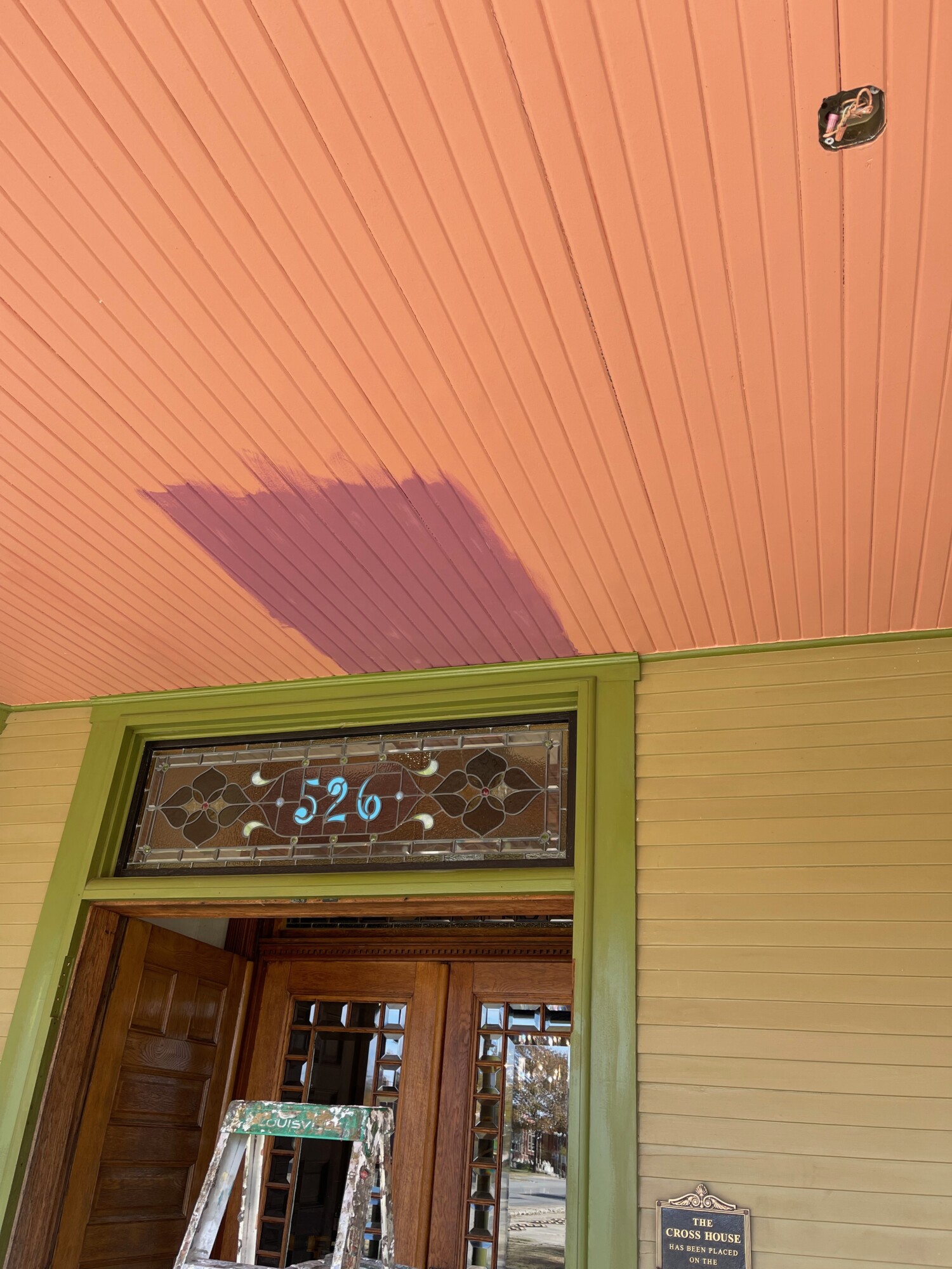
Thus, I went for a darker violet. Me likely!
Three iterations of color struggle. I have known for several years that the ideal color was eluding me.

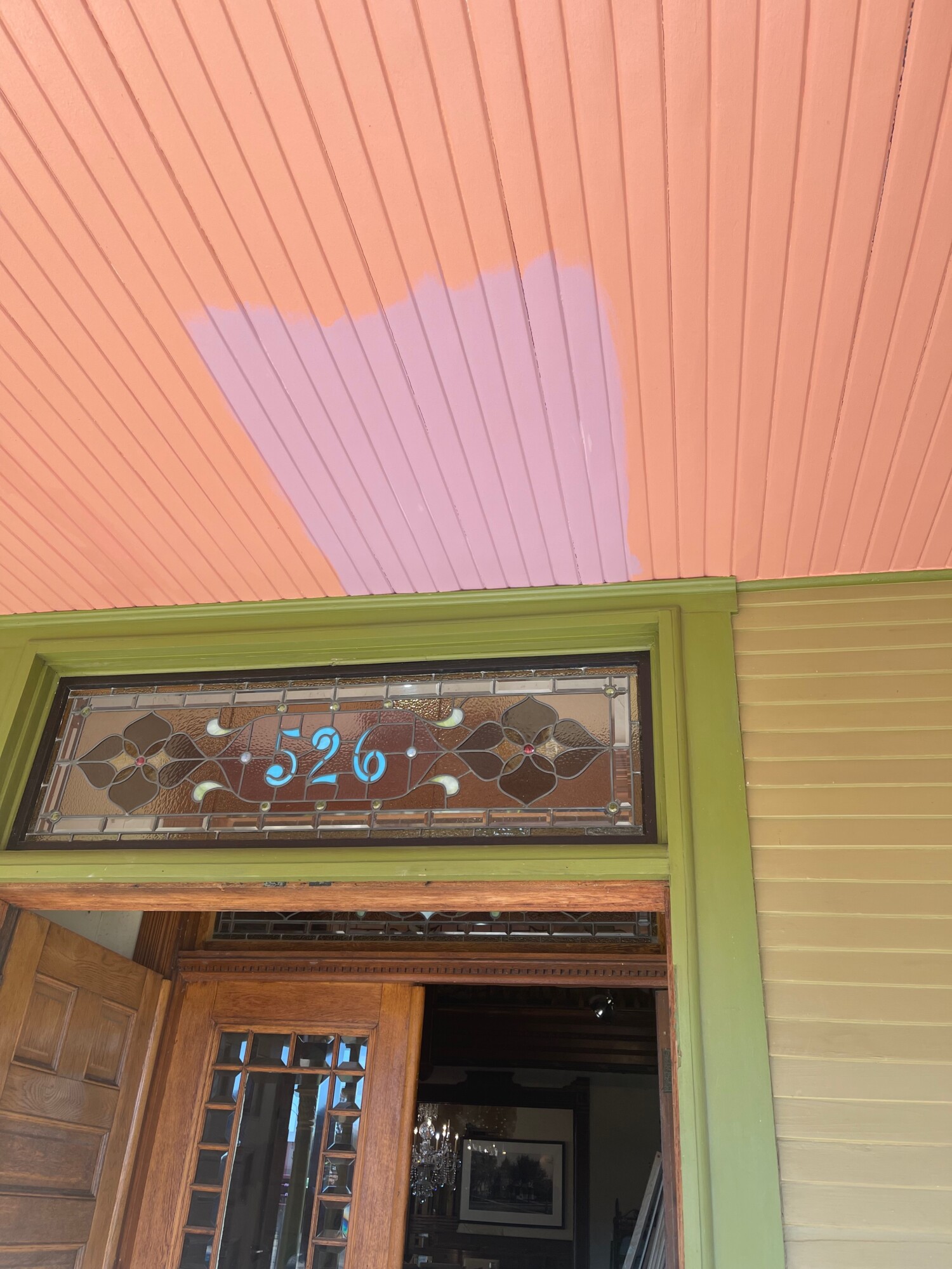
And now. Cameras are weird, and the color does not look so pinky in real life. This…

…is more accurate. Say hi to Kenny!
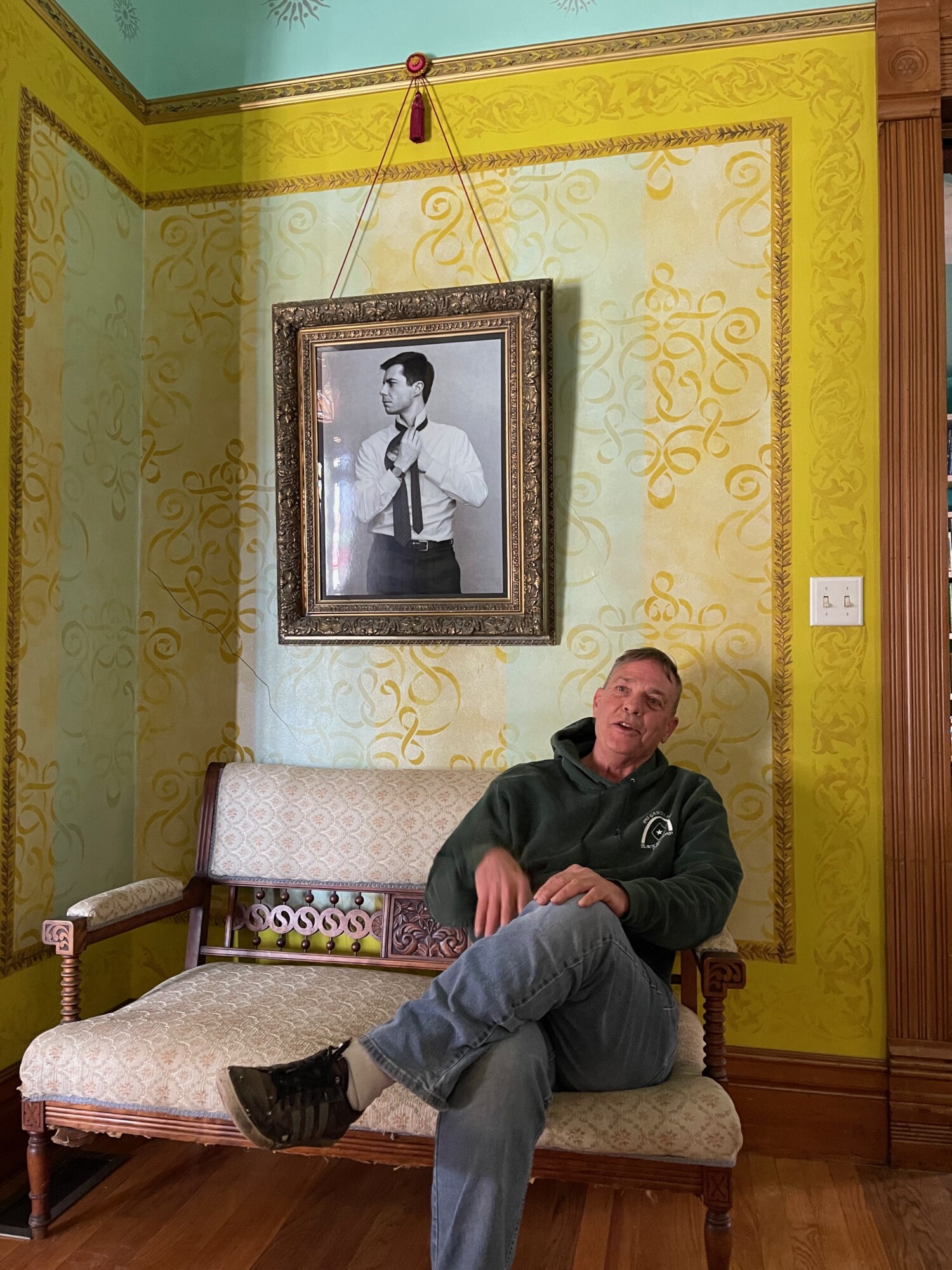
Kenny insists that the portrait is him in his younger days.
As stated previously, in the 1890s home owners were more adventurous with their color selections than is commonly thought today. In looking through 1890s color catalogs one is struck by the unexpected color combinations and variety of colors. For example, it was common for green houses to have their porch ceilings in pink, coral, or violet. I had no idea, and have been a bit obsessed with this ever since.
Blue became the default porch ceiling color in the 1920s but it was not THE choice in the 1890s. I wanted my house to reflect this.
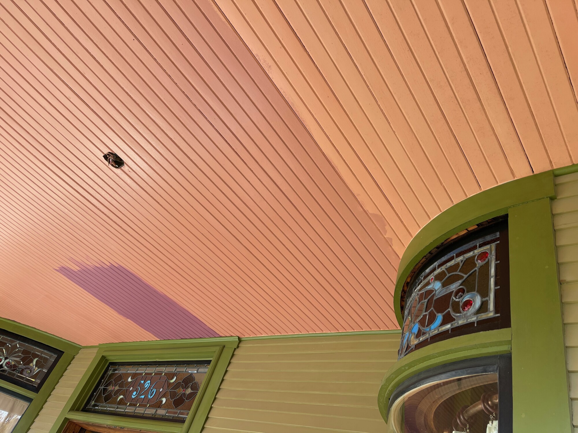
So, after much ado, and thanks to Kenny and his energy, by tomorrow the porch ceiling should be fully violet.
And, in a word?
SQUEE!!!!!!!!

14 Comments
Leave a Comment
Your email address will NEVER be made public or shared, and you may use a screen name if you wish.
Kenny is the best.
Wow I love it seen something similar on my travels and loved it than in Galveston Texas they have beautiful stately old homes there and the Ross house is a stately beautiful old home can’t wait to see it finessed great job Kenny!
Interesting. I’ve lived in Prescott, AZ and Eureka, California. Both have many beautiful Victorian era homes of various styles and sizes, and some are restored to the 1890s or so multicolors. They really are stunning and so are your choices!
It needed to be a strong violet to hold it’s own with the olive – it’s the perfect choice. A sleek new coat of paint, masterfully executed by Kenny – how great is that?! 💜 This house wears it’s beauty very well, indeed.
Hi Kennyyyyyyyy! So gracious of you to offer your time and energy to the Cross House. As for the black-and-white photograph… yea!
OH, yes. That darker violet is the much better choice. It kinda goes against what you’d think. It being under a porch, the lighter the better. But no, not with the other colors.
Why orange or purple? Because they are part of the secondary triad. Green, purple, orange are secondaries to yellow, red and blue. So if you have green your choice is either the direct opposite, red or one of the other secondaries, orange or purple. You figured out the orange (peach) wasn’t doing it so you go to the other, purple. Or in this case a complimentary violet. But which one? Well, you found it. Now the porch pops.
Hi Kenny! It has to be so rewarding to get to help Ross with this beauty.
I’m loving that darker shade. Can’t wait to see it finished. Beautiful!
Awesome Kenny! One more item off the list! 😻
Love the color!
Well done Kenny! It looks beautiful, Ross. A wonderful choice.
Great choice. Thanks Kenny for tackling a big project.
I admit to preferring the cheerful and slightly goofy coral, but the new colour is quite stately and grand.
In Halifax, Nova Scotia, the porch ceilings on late Victorians are almost always, like the Cross House’s first porch ceiling colour, an off-white tinted with the wall colour. My very favourite is a tan and burnt sienna Queen Anne with a plum ceiling, though. It has purple window sashes, too.
I love it so much! Great job Kenny. And the photo does look a lot like him.
Darker violet is just marvelous! Porch ceiling color is just exquisite!
Kenny is amazing