
Vivacity…Improved

Yesterday I was confused and disheartened why color #5 in the lower left looked so FABULOUS but the exact same color looked…less than fabulous in the upper middle and upper right.
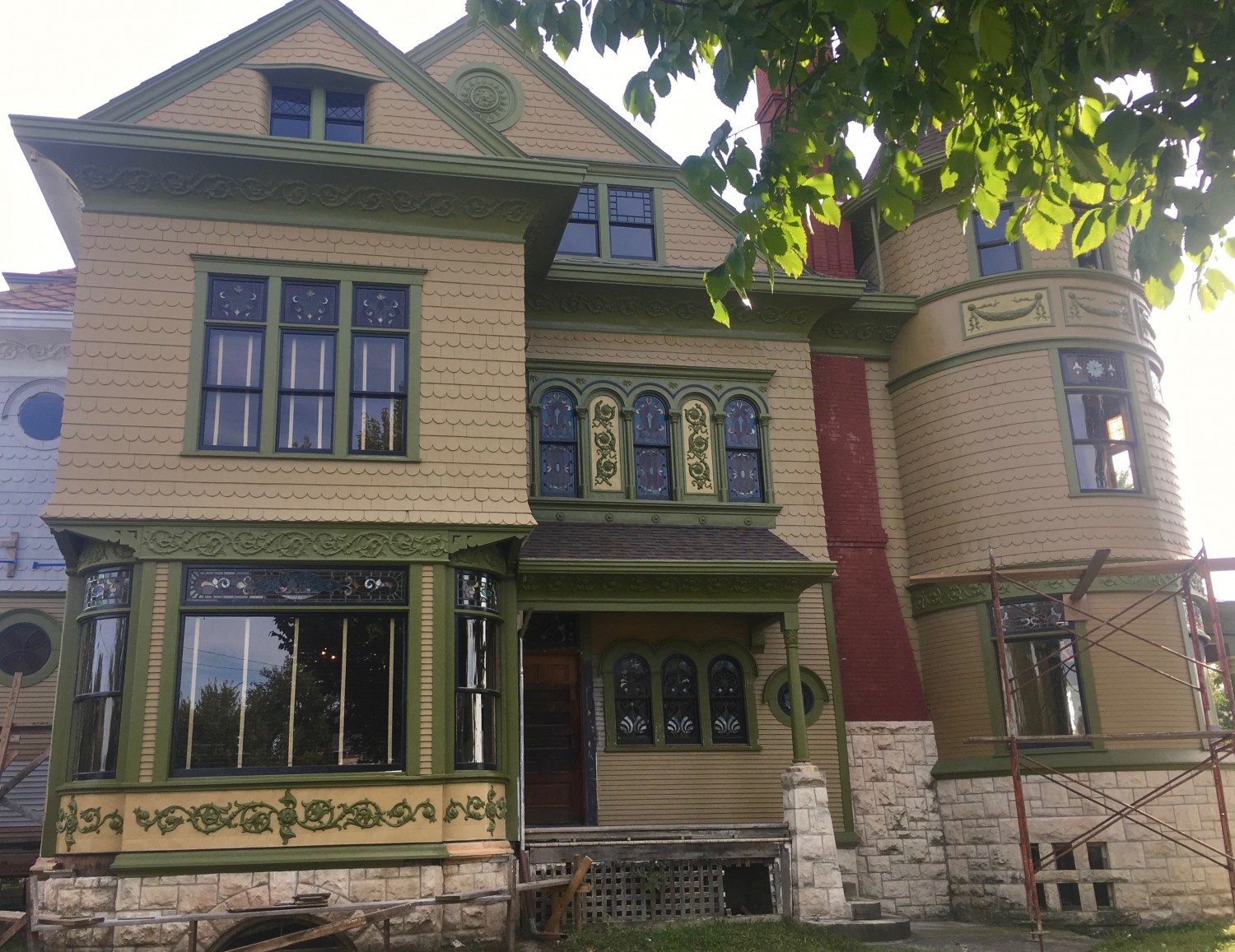
Today, I “fixed” the issue by doing a green wash over color #5 in the offending areas. Better! Tomorrow, the scaffolding is being moved over to the right a bit and I will paint another tower panel. Oh, by the way, I am LOVIN’ the scroll panels under the dining room windows! Wow. And this is all looking quite different than…

…this.

10 Comments
Leave a Reply Cancel Reply
Your email address will NEVER be made public or shared, and you may use a screen name if you wish.
Vivacity improved indeed! Looking scrumptious!
Wow is all I can say
I too am LOVIN the scrolls under the dining room windows. Zoweee! Honestly not sure about the triple window or tower panel. Seems now to be taking on a green tint which would be color #6. Perhaps a slightly darker shade of color #5? On the other hand, it’s very easy for me to sit here typing on my laptop while you are climbing all over the side of your house changing colors. Honestly, it looks so good, at some point it will need to be done so you can move on. I am almost sleepless waiting to see it in person. I’m sure the colors and details look much different than on my computer screen.
Very nice work Ross. I am exhausted every time I see your progress………………and think about all the things I did NOT get done today!
She’s Beautiful!
Have you noticed the white straps of the blinds in the windows are distracting? Ahem, it’s undergarments are showing… 🙂
The previous owner had some of the blinds installed.
I ordered more.
The straps are a dark taupe. I kinda like them! Can’t explain why!
Much better, IMO….Try as I might, I just wasn’t digging #5, the more I saw of it. It is just a little too bright, but the green wash tones it down and makes it fit. Keep up the good work!
The “vivacity” looks beautiful, and I’m sure you are already hatching some kind of plan for this, but pleeeaaase give that “eye” some of that vivacity! Every new addition to this paint scheme just pushes the “eye” more into oblivion and it deserves better.
Did you ever think of setting up a bunch of live Ross cams around the house inside and out so that those without lives of there own could peek in and see if Ross is painting, or standing back and contemplating, or fixing light fixtures, or………..
–
To those of you who want to write a rebuttal of the idea, please don’t, it is not meant to be taken seriously. If you think it is a great idea, please don’t write in favor either.
I love the way that the brooch looks with color #5! I didn’t think that area could be improved,so I’m impressed that this further brings out the beauty of that space.
I am probably the only one, but, I liked the Cross with three color exterior paint. Too busy for my liking.
With a pale blue porch ceiling of course.