
ZD presents….WOW…AGAIN!!!!!!!!
The Cross House, and its newly painted gable.

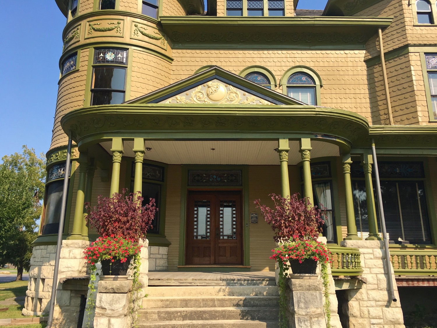
Yesterday, ZD (Zac), sent astonishing images of the house recolored to better suggest the 1894 color scheme. But are the columns too light to visually support the heavy porch roof?

Zac, obviously an exceedingly generous person, sent this. Which I really like! The column capitals and bases are color #5. I then wondered…

…about adding a horizontal pinstripe under the porch cornice in color #5. Oh! I then wondered…

…about adding a horizontal pinstripe under the porch cornice in black. I LOVE THIS SCHEME!!!!!!!!
Again, for comparison. Scrolling up/down between these last two images really shows how much the Cross House can still be improved without looking like a painted lady!
It develops that Zac lives only an hour away! So, I invited him for a grand tour of the Cross House and it will be an honor to meet him!
Thanks, Zac!!!!!!!!

21 Comments
Leave a Comment
Your email address will NEVER be made public or shared, and you may use a screen name if you wish.
Black horizontal pimstripe for the win.
Umm. Pinstripe.
Great work, Zac! I really like the effect shown in the next-to-last-photo… the highlighted column capitals and black pinstripe are the perfect amount of bling. The colors help to lighten the visual weightiness of the porch without turning the place into a carnival. Simply exquisite!
I like the addition of the black features. I’ve seen it used on other houses to break up large cornices, and I think it works well here.
It may look good elsewhere on the house too, when applied with the same theme (on thin cornice or soffit mouldings, for instance).
Love the black pinstripe – love the lighter trim on the porch columns. That allows them to still contrast with the body color. Yay Zac, you guys work well together!
Great! Even better. You are getting the hang of this subtle highlight thing!! Keep going… Black and gold stripes in other places too please!
On porch how about keep black pinstripe and put the gold color 5 under the black stripe on remaining wood above columns?
This is so fun!
Wow, I hope Zac is a preservation artist or designer of some sort. These ideas are excellent!!!!!!
By the way, I really, really, really like the 5th color around the garlands. It really makes them pop without looking cheesy in my opinion. I have no idea how you manage to keep making such amazing progress while still re-considering your past decisions, but you are creating a masterpiece for Emporia.
LOVE IT! I think that trying to make it all work without an accent color is probably why it never seemed quite right to you. The gold, green, olive, and black all go so well together that any combination of these colors would look good anywhere on the house. I also really like the porch railings with the gold accents. I think you’ve solved the puzzle!! I really admire the way you don’t just settle for “good enough,” but keep thinking about an issue until you get it all figured out.
Love the black line. It’s like a picture frame that accents these elements perfectly.
Zac and Ross for the win!
Wow!!! Just, WOW!
I’m going against the consensus here, but I like the horizontal pinstripe better in color #5. I also like the railing spindles in #5, and the lattice. I am going to have to learn how to photo-shop so that I try out colors on my own house.
There are apps you can use to try out a color if you’re not a Photoshop expert. I haven’t used one myself, but I have an acquaintance who swears by the Home Depot’s paint color selector. If you search on those words, you can learn more about it. It will apply paint colors to your indoor and outdoor living spaces. Maybe not with the precision you can get from Photoshop, but enough to get a general idea.
Yes, I’ve tried several of those apps/sites, the only problem is that the color we are planning to use (sort of a pastel mint green) is not available on any of them that I have found. Like Ross, I am trying to get a jaw-dropper without going whole-hog painted lady. I shared a picture of my house with a facebook old-house group recently, and some of the color suggestions were a little scary…
Not suggesting the subject needs to be changed. I am loving the exchange of ideas on the paint colors of the Cross House. I saw this house, posted on the Sept 8, OHD link and exchange and it seems to have the sort of sinks and possibly an original pull chain toilet that you are looking for for the Cross House. They will obviously stay with the house, but I thought you might enjoy seeing them. I am referring to photos 19, 24 and 25. There could easily be others that I missed. The bracket that holds the chain to the overhead tank indicates to me that it could be authentic. Don’t know.
Stewart, the house is FABULOUS!
And, yes, the bathroom vanities and the high-tank toilet are treasures! I am quite jealous!
17 you can see the toilet. That house is fabulous! Dreams right there.
That bedroom also has flame birch trim, pretty rare, but the house has a lot of different woods trimming different rooms
Ross, you do have an eye for beauty…everything about the pinstripe scheme is, well, stunning. If implemented you would take the Cross house from a very pretty lady that gets noticed by passersby to one that will positively stop them in their tracks- I hope you decide to go for it! (Besides, only small ladders are required, right?! 🙂
After looking back and forth, for some reason to me, the dark columns with #5 for crowns seems to not have that visual weight, while the light columns with dark crown seems to have that visual weight, quite curious as just yesterday I didn’t think so..
The black pinstripe is pretty sweet!
Agreed!