
Artful Discord
The parlor of the 1894 Cross House, as now decorated, is a carefully crafted mix of discordant elements. I like discordant elements as they, in my experience, help bring a room alive.
The trick though is the degree of discord. Too little and things just look dull. Too much and a room can appear a mess.
Cody, who just departed after a ten-day stay in the house, has never approved of my approach. Yet, on his last day, I was startled to hear: “I like the parlor a lot more than I did before spending time in it. It works a better in reality than in the images.”
High praise!
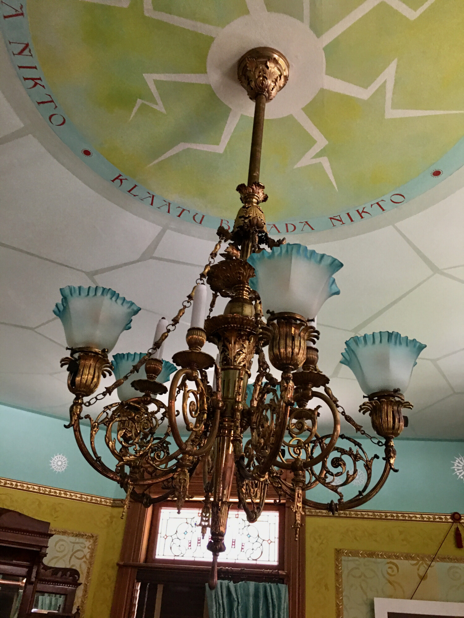
When Cody arrived, he asked, his first day, if he could take down the parlor chandelier and, at least during his stay, hang a chandelier he brought with him. “It’s been sitting on the floor in my apartment. I’d love to see it hang in a period room.” Sure, I replied. And added: “But, I may not let you ever take it down!”
I had expected to be soooooooooooo in love with the delicious-beyond-words chandelier that I really would have to beg for it becoming permanent. But, when I walked in the next day, the chandelier was hanging. And…ohh!… I did not actually like it in the room, to my great surprise.
It was…too much. It was far grander than anything else in the room, and grander than the all-important mantel.
So the room, suddenly, felt…off.
In discussing this with Cody, it turned out that he had a similar reaction. We both agreed that if the curtains were more elaborate, the hipster rug replaced by a vintage Oriental-style one, and the modern furnishings replaced by…and so on, the chandelier would likely look good in the room.
But, it would still not work with the mantel.
Many times, I have discussed a goal of mine: to only bring furnishings into the house that are:
- period-correct (early 1890s)
- or obviously not (like the 1950s center table)
- budget-correct, meaning neither too fancy or too plain.
And the Cody chandelier was simply too grand for the Cross House.
While I do not recall Cody’s exact words, during one conversation he acknowledged that the finished parlor was more artful than he had thought. “It really is a carefully crafted ensemble.”
This delighted me.

And all this brings me to: A whole lot of you have disliked the white Hillary frame.
Yes, it is a discordant element.
But, I was concerned that if painted it another color the white center table would then look too discordant. Like, too much discord. If I removed it though, would the rug, which has a lot of white, look wrong? And…well, you can appreciate the rabbit hole.
As the years with Hillary passed however I became ever more conscious that the white Hillary frame was, sigh, not right and needed to be changed.
That sound you hear? That is a whole lot of you cheering.
Well, wanna see what crazy Ross did? Scroll down…
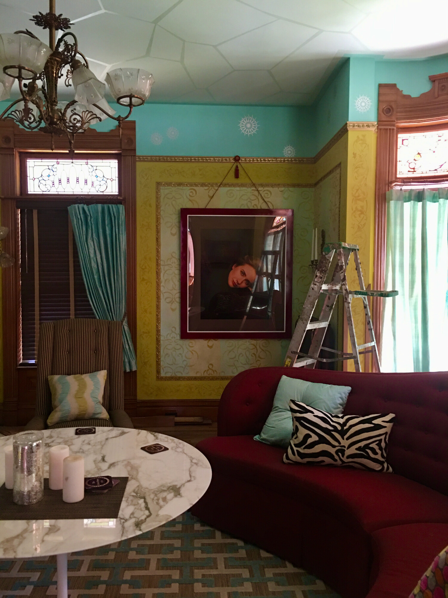
The image is poor but you get the idea. And, Ross likey! The new color was selected to complement the sofa, and stained-glass bits.
A huge reservation about redoing the frame color was that the whole would have had to be taken back to the frame shop, Hillary and the glass removed, the frame repainted, and then all put back together again.
Ugh.
While talking with Cody though a new idea presented itself: What I taped off the inner edge and just a narrow edge of the frame face, keeping it white, and then spay-painting the remaining frame?
Gadzooks!
This would be easy! And the white pinstripe would assure that the white center table did not suddenly become…oh, the horror…too discordant.
The color delights me. I had thought of many colors over the years but all seemed wrong. When a wine color popped into my head the other day my spider sense tingled. The color is also, squee, discordant! Save the sofa, there is no wine in the decor. Gold, for example, would have been too catchy-matchy. [The latter was autocorrected. I meant to type matchy-matchy. But, the way it showed up made me smile.]
I really like the new & improved Hillary. The corner now looks more…elegant. And Hillary, to my surprise, is now the focus rather than the frame.
All that said, I have a tiny reservation; a bit of pause. You see, the parlor is now slightly less modern looking and a bit more period. I need though to protect the former quality as I have always wanted the Cross House to appear as a modern old house. In short, there is a very fine line I wish never to screw with.

24 Comments
Leave a Comment
Your email address will NEVER be made public or shared, and you may use a screen name if you wish.
Wow it’s amazing how lovely that frame looks Ross. I love it.
LOL.
As I was reading about the frame I immediately thought “red” or in your case burgundy to match the sofa.
Why? Because I have the same colors going on in my dining room. I have ragged grey/green walls and I framed print of Madame X in red. It’s a blue red. The room does not look like Christmas. I have black and gold accents going on as well. I have some plaster pillars and scones for display of artwork that are the same red with accents of black and gold. They were all white which didn’t work once the walls were ragged.
So different shades and tints of greens and reds but still, I looked at that white frame and though of Madame X. Am I surprised you painted the frame burgundy? Nope. And it works really well.
I love Cody’s chandelier but not in that room. Is there another place it could go? Somewhere more central to the house? With less furniture perhaps? It is electric and gas.
As for the line crossed, have you considered a mid century modern vase on the table? Maybe with a single twisted branch of manzanita (with the bark)?
I like the new frame color, it does fit in better. I have my own red (cranberry) couch, but my decor is more upscale country than period correct. (Period correct is late 1980s, ugh, and I won’t be revisiting that era)
The frame looks great–always welcome when a difficult job turns easier! I love the Klaatu reference around the light fixture!
That room is delish!
I agree with Cody. But what I think the room is crying out for is Aesthetic Movement wallpaper, both walls and ceiling, with the triparate walls that were then in fashion.
Hi, Michael!
The Aesthetic Movement was popular in the 18970s and 1880s. Its influence waned in the 1890s. For example, the Aesthetic Movement interiors in the White House were removed in the 1890s.
And none of my hardware, doors, and mantels reflect the Aesthetic Movement .
The Cross House was VERY modern when built, and it’s unlikely that Aesthetic Movement wallpaper, which would have been considered a little dated by 1894, would have been selected. Indeed, the original papers discovered in the house are not in an Aesthetic Movement style.
The repainted frame looks great! I think toning down the wide, harsh white frame, but leaving the thin band really makes it feel like part of the composition, without feeling like an imposition in the rest of the walls and decorations. It’s a great little improvement!
The 1st thing that struck me was about Cody’s light – how many recent college grads have a light like that??!?? Love the new frame – looks very rich. Maybe it was the photo, but the white table actually looks richer also. Excellent as usual! 🙂
I’m a resourceful guy, and diligent about chasing down good leads. I rescued that chandelier from the basement of the house it was originally installed in. The owner was considering scrapping it or putting it on the curb! For payment, I restored a few other old lights that the owner had that he wanted to keep. So, essentially I got it for…free.
Cough…
It’s one of my best pieces.
I LOVE, LOVE Cody’s chandelier with the aqua tinted edge on the shades, but alas you are right, it is a bit much for the room. The picture frame looks much better painted the burgundy shade, it blends in nicely. Another easy fix, genius. But for your dilemma period versus modern, mlaiuppa’s idea with the mid century modern vase would be a good fix, although I personally like the more period look. It’s your house and you should live with what you love though.
I wonder Ross, if there’s an experienced photographer in Emporia who would take some photos of the parlour for your blog? The photos you take of the facade, in natural light, are breathtakingly beautiful, but interior photography is much harder without proper equipment. It occurs to me that us readers could then see what Cody has seen in person – lucky Cody!
But what happened to the first chandelier? I love it!!
Ginger, the first chandelier is now back in place. See last picture.
Now I’m confused. Which one is up? The one with teal/green glass or all clear glass? I’d kill for the one with teal glass….it would fit in my house quite nicely. 🙂
Ginger, please see the last image.
That is my chandelier, back in place.
The teal chandelier is Cody’s. It’s now back in storage.
I LOVE the new frame color. I also love Hillary and as a blonde of a similar age—I would never wear stark white! I also prefer your chandelier over Cody’s. I do wish him well in finding a home that he can afford where the chandelier will be just right.
I am a little late replying here but it all looks great! Especially klaatu barada nikto with lightning/electric bolts on the ceiling. Yes!
I think I have seen this before and I may be repeating myself, but those were the first words we taught my daughter.
I do like Cody’s chandelier with the teal edges, but I do understand Ross’s design ethic.
Being a fussy art director it is wonderful to read and chat with like-minded folks who obsess over details. Some people say the devil is in the details, but I am in the G-d is in the details camp.
And yes, the Hillary frame update is great. The white inset stripe truly makes it work. Nicely done!
All lovely. Thank you Ross and Cody.
Hugs!
I was always a little disturbed by the white frame — it took away from the picture. Now the picture is my first view, not the frame. So much better.
The chandelier is amazing, but not for the Cross House. Perhaps Restoration Nation (see them on YouTube) will find a house in which it fits.
I was lucky enough to see that chandelier in person! And wow, it was spectacular. I love the change you’ve made to Hillary Clinton’s photo’s frame. Subtle change with a big impact.
I really like the Hillary frame but the ladder looks a little discordant. But then again with everything else in the Cross house…….. maybe not.
Now, now, Doug. You know perfectly well a ladder is right at home in all finer establishments.
Now, I still don’t LOVE the room….it’s very loud and exuberant, whereas I would have reached for more subtle earth tones and a lot more metallic accents to bring color into the space. But it absolutely SCREAMS “Ross”. Those of you that know him in person know that he’s just that kind of guy. Loud, colorful, and energetic (most of the time).
However, personal taste aside, I’ve never thought that the room as a whole didn’t “work”, because it actually does – quite well, in fact. It’s a clever ensemble.
When I steal the deed to the joint and redecorate one day – rest assured that my chandelier will once again grace that parlor! With a leather chesterfield sofa, a better *wink* rug, and a nice antique side table or two, the fact that it’s slightly higher end than exactly budget correct wouldn’t bother me. Once surrounded by a closer-to-period decor, it wouldn’t stick out like a sore thumb as it does with Ross’s wild taste.
But I’m not Ross. *winks again*
I know that my comment is late to this party but… I just love Cody’s chandelier! The color is so gorgeous! And I don’t think it’s too much for the Cross house. She can wear jewelry if she wants to. But anyway, the frame also looks nice. Good job.