
Before. After.
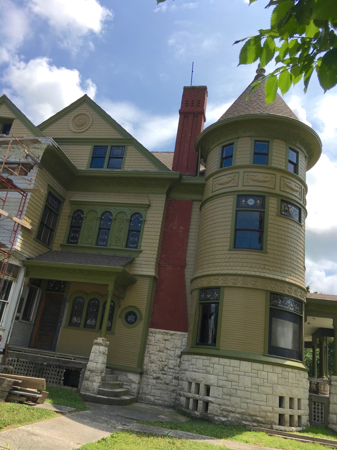
So, last month I decided to paint green several areas of the stamped-tin flourishes.
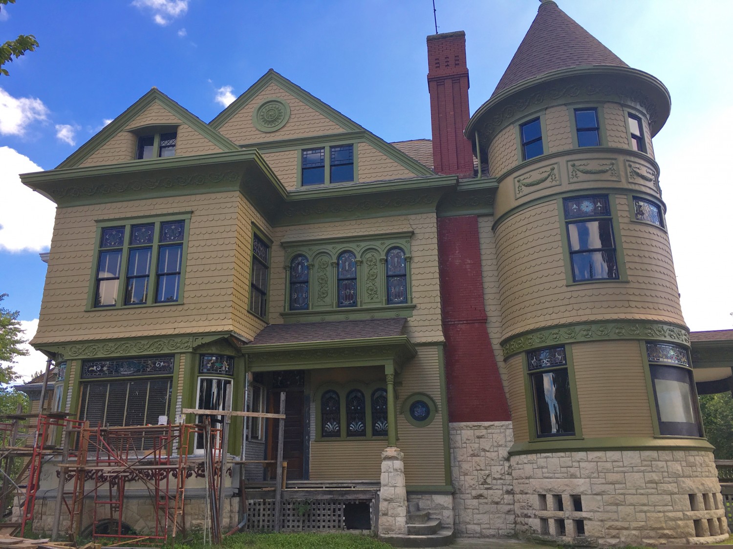
And this is the result.
Not everybody is happy though.
Ross is not 100% about the eye being all green, and he is pondering options.
Others think the “garland band” around the tower should be solid green. I, too, thought this would look good until Alex sent in a Photo-shop rendering…

…which I thought looked ghastly.
A solid green band made sense to me intellectually. But not, as things proved, visually. Such a disconnect, between idea and result, always fascinates me.

30 Comments
Leave a Comment
Your email address will NEVER be made public or shared, and you may use a screen name if you wish.
I agree. No solid green. Love the green flourishes only. Also, the eye just paint behind the flourish burst the color of the house and leave the flourish green and the trim band around it green. This way it stands out but not too much just like the flourish on the tower. All would be subtle but enough to show the delicate detail Mr.Schwab put so much into.
My Two Cents. $.02. 😉
Mary from Georgia
Since I can’t give 2 cents, as I’m Canadian and we no longer have pennies…. here’s my nickel opinion: I’m thinking the green is taking over rather than being an accent. If green is supposed to be the main colour then yay, it’s doing what it’s supposed to. But if it’s supposed to be “just an accent” then I’d say just here and there rather than whole columns wrapped. $.05 done!
Hello, Ms. Davis!
The green is not intended as an accent color. It is the trim color.
I think of an accent color as something occasional.
I think you mean to say “Mr. Squires.” No sure what a Mr. Schwab has to do with this blog…
I still love the green band. You’ll never convince me!
I know that you will be thinking about the color choices every time you look at the house, as would I. What works for me is to move on, letting the thoughts pass through my mind without dwelling on them, and say to others who express contrary opinions something neutral like, “That’s a thought”. If the choices that I have already made aren’t right, the right choice comes to me, as so many things have, when I am not trying.
–
I often find myself verbally sharing my thoughts on what I am planning on my current project and then have a better idea later. Of course I use the better idea, but am not averse to having an even better one later and changing things again. It amazes me how many times that those to whom I have told an early idea find it frustrating that I changed it. They want to hold me to the first idea. “But you said…..”
–
I wish people would realize that the creative process is a result of extrapolating one’s experiences and what one has been exposed to in order to come up with a work of art rather than just more work.
–
Ross, I believe that you get it.
Hi Stewart
I smile every time I see one of your comments. There was a radio program on CBC (Canadian NPR) called vinyl Cafe. The hosts name was Stewart McLean. Maybe you’ve heard of it (not likely unless you’re Canadian or leave in an American border state)
It was mostly about a fictional family – Dave and Morley and their two kids.
This is my favourite story- http://www.cbc.ca/player/play/2522567159
Hi Jackie,
I had not heard of it and thank you for telling me about it. My father was Stewart McLean, I am Stewart Jr. When he and my mother were first married, they lived on the same road as another Stewart McLean for a brief time. The mail got confused, but they were only there a short time. After they moved, there were no reoccurrences. I believe that the other one was quite a bit older, so may have died shortly thereafter.
Although our name is often often spelled differently by those whose names sound the same, our spelling came straight from Scotland when great great grandfather Robert McLean married Rebecca Stewart of Baltimore. Thus the name as we spell it. Probably TMI for you. I am glad I bring you a smile when I comment. Hope you find my comments of some interest too.
Hi Stewart
Not at all! I’m in the midst of filling in the gaps in our family tree so I always find these types of stories interesting.
This Stewart was from Montreal. The radio program always had a traveling Christmas concert. For several years we took my parents and my in-laws to the show and supper. It was a holiday tradition. Unfortunate he passed away last year.
I hope you enjoyed the story!
Hi Ross! I think it looks great just as it is, but, if you’re not 100% happy with the eye, I think I’m with those favoring adding some black. I would just paint the flat ares in between the two outer rings. I think that would be super subtle, especially from the ground, and would avoid falling into the slippery slope of “picking out” details. Whereas painting the sashes white draws attention to the sashes and painting the sashes black draws attention to the windows, I think that maybe just a small amount of black would draw attention to the eye without highlighting any particular part of the eye. Does that make sense?
New here, and really hate to open a can of worms, but looking at the 1894 image and the B&W current image, I’m convinced there were 3 colors in the original paint scheme.
That said, I also hate the way the original lighter walls looks when tried out in PS. There is the letter of the law and there is the spirit. Strict letter means Ross lives without electrical sockets, AC, rips out all the renovation baths and has a rotting piece of wood beneath the center front window to replace in a few years – again. Riiiight.
Personally, I’d much rather see what the peacock wallpaper looks like than stress about the eye. As with the frieze, the answer that will make Ross happy will show up. Painting the exterior was supposed to be a vacation, not more creative drain.
I’m with Stewart. The ‘right’ idea usually comes when you’re not watching the pot boil.
Wow – sorry for the wall of text.
Nice to “meet” you, Robyn!
I looking at the 1895 archival image, I think there was (at the very least) a five color exterior scheme:
1) Trim color.
2) Wall color.
3) Sash color.
4) Roof color.
5) Accent color.
I have confirmation what colors #1 and #2 and #3 were.
I have no idea what color the original wood shingles on the roof were stained.
And it seems that, seems, there was a color #5. The columns may have been #5, as with the flat background in the “brooch” and the rectangles surrounding the swagged garlands on the tower.
I suspected there were more but thought adding a 3rd was a bad enough suggestion at this point!
Thank you SO much for NOT going the Painted Lady route. There’s trend and there’s style. You have a wonderfully stylish paint scheme.
Assuming that the rented cherry-picker has gone back, I think that you should wait until the whole north face is done, then live with it for a while before you make any further changes. It’s hard to determine what individual pieces should be when the whole is incomplete.
I don’t think anyone has said this…but if you paint any of the eye rings any other color(s) wouldn’t it start looking like a target? Just a thought.
I think the whole concept of things that work intellectually but don’t work actually says a lot, especially when I think back on some wardrobe choices over the years. (Mine, not yours:)
Oh, mine, too!
I like the green band but the “plaques” as having a light green background” if that makes sense.
Hi, Alice!
Having the “plaques” as a different color would look, I think, kinda choppy, as Alex showed in this post.
The trim-painted “eye” and garlands are better than they were when body-colored–more now to be enjoyed than paused over with a “Wait–shouldn’t that have been picked out with a different shade?” I believe a previous commentator said “The perfect is the enemy of the good.” A real improvement should not be dismissed because it might be–might be–made better, but enjoyed for its own present attainment.
So I will chime in too! Solid green bands look too much like a barbers pole! Leave as is
Suzanne,
Your comment made me laugh. It brought an image of a round Queen Anne tower actually painted as a barber pole. I suppose that if you cut hair from your home, it would be a great draw.
Also, I had a close look at the 1932 picture of Cross House. They changed the paint scheme from 1894. Interestingly the band on the tower was picked out as a series of darker squares framed by lighter paint. Also the eye appears to be just the flower detail picked out in darker colour (although it is hard to tell). I think the 1932 Cross house avoids being too busy (ala painted lady) because they chose to paint all the window frames and even some of the narrow bands on the tower in the wall colour.
Good eye!
I have looked at the 1932 image a thousand times but never once noticed the colors!
Basically, the whole house seems to be painted one color, with some elements picked out darker.
I thought I would throw in an idea. When looking at the whole and the garlands accented w the darker color, I wondered about the eye being the wall color in the center & the darker green around the circle. It lookas as of it would provide balance. Just a thought & only my opinion, however I think someone else said it first.
Maybe photo-shop first to see if that is something you would like to do. 🙂
I was wondering if the two panels on the second floor between the three stained glass windows should be the lighter yellow-y color instead of the green color. In the original picture, it looks to me like it is lighter than the color around the windows. Either way, I enjoy following this journey and seeing how the process unfolds!
I just scrutinized the original black and white image again, and I think the area above the second-floor windows may also have been lighter: the part above the five arches.
Less is more … I liked the upper gable all one color. It seems like highlighting features here and there takes away from the main attraction, the windows & the brooch … I do like the way you did the phone room window, but it is matched to the beautiful porch trio and so does not really draw the eye AWAY …
Ross, two words: your house….
And a nice one it is.