
Mea Culpa
This morning I did a post which…made y’all mad!
Mad!
I just felt crushed. I felt terrible. I felt devastated.
It was not my intention to cause anguish. I just wanted to let everybody know why updates on the parlor had ceased.
So, to make amends, rather than a Big Reveal next week, I will go back to posting incremental updates.

This is how things were left last week.
For several days I sat in a chair and stared at the above corner.
Stared. Stared. Stared.
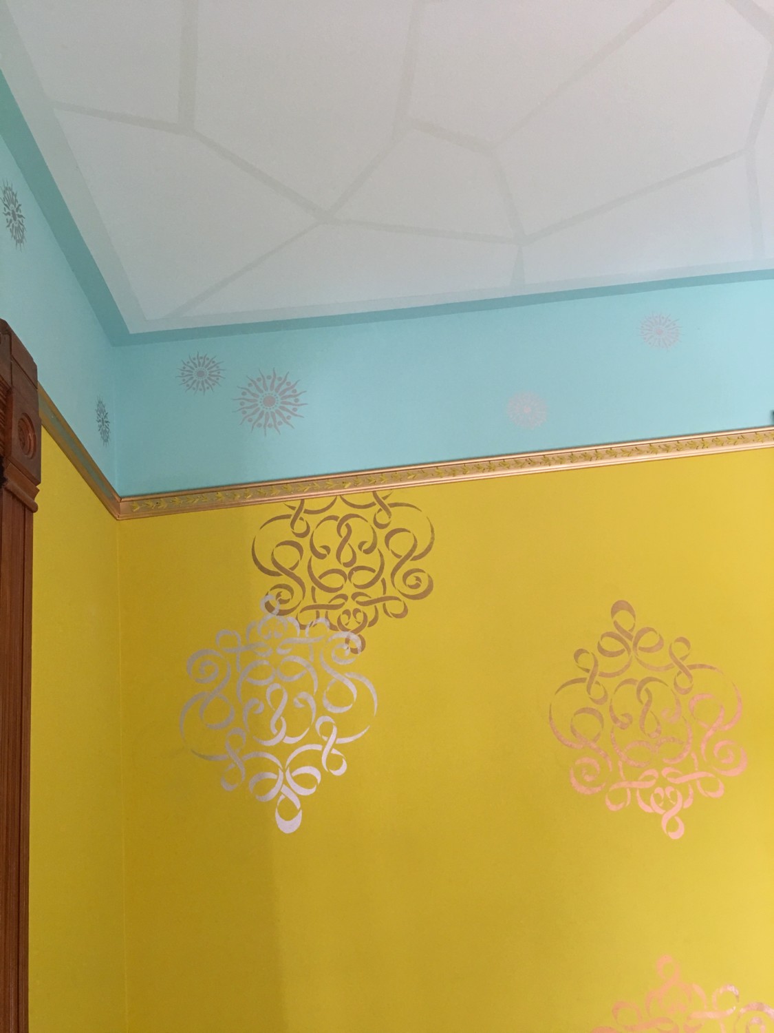
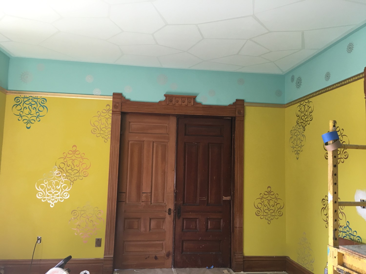
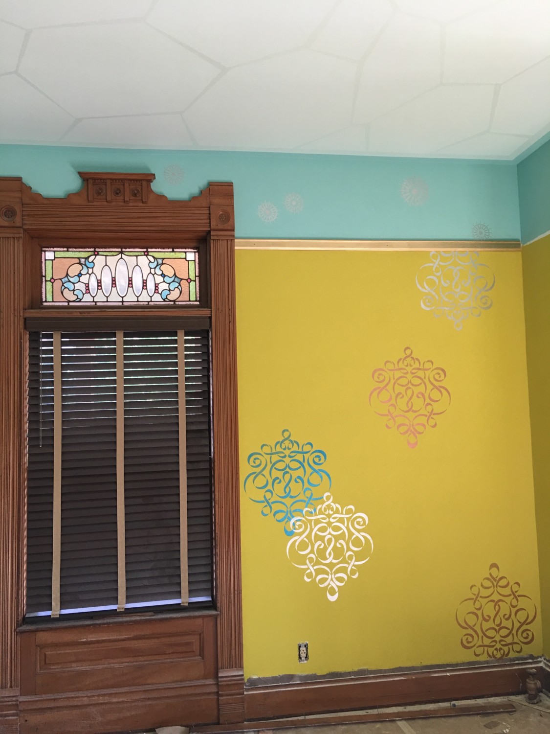
My heart sang at the chartreuse wall and ribbon stencils.
But…it did not sing with the antique white frieze and ceiling. It did not sing with the hand-painted Dr. Seuss-like ribbon in the frieze. While my mind appreciated the frieze and ceiling, my heart was not singing.
And that is an alarm bell to me.
My heart was not singing.
And, the instant I recognized this, I knew I had to rethink what I was doing. Standing in the room I called my friend Patricia with the news. After a pause she replied: “Oh. My. I think you are right.”
Wanna see the results?
Scroll way down…

ZOUNDS!
I know! It looks completely different!
Several readers had suggested a blue frieze. And they were right!
What happened is that I realized that I am SO not an antique white kinda guy. I love color. Rich colors. And the Cross House seems to cry out for rich colors.
In trying to figure out how to press delete on the antique white, I held up the teal silk curtains and realized that THIS color would look great. Sherwin Williams did a great match, and the results are shown above, and below.
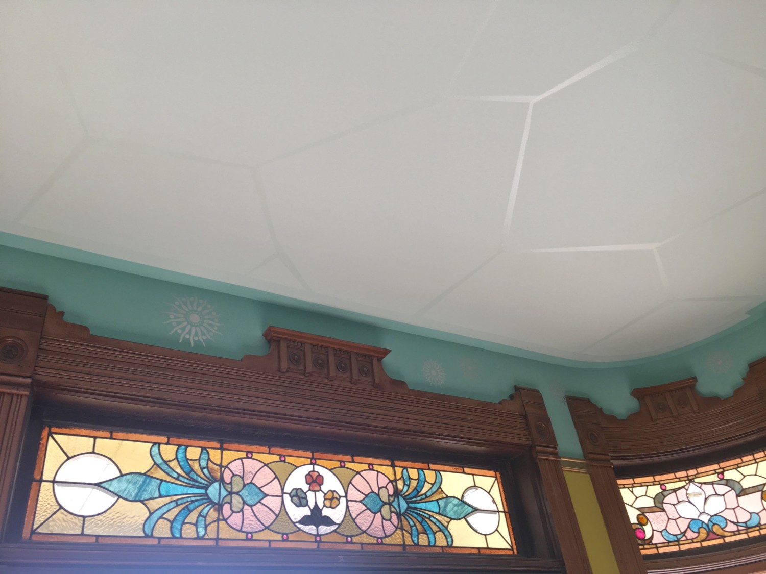
I painted the frieze and ceiling teal. But it was too much. So, back to Sherwin Williams and they made up a very pale teal for the ceiling. MUCH better! The ceiling looks white in the above image but, rest assured, it is a pale teal.
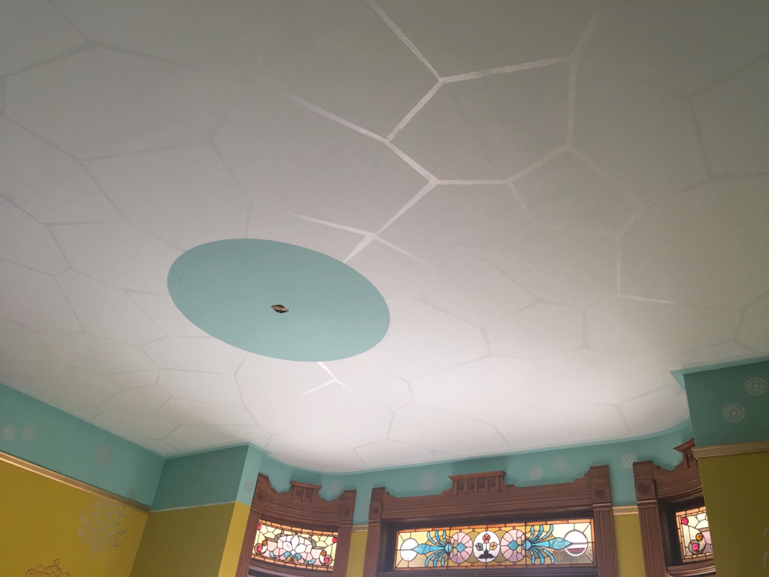
I also decided upon an “oculus” for the center! This is going to have an amazing hand-painted effect (lightning!) but this will not be done till next week. The cracked glass ceiling effect proved incredibly tedious as it is all hand done. Each line was taped and then painted with clear gloss polyurethane. Each damn line!
I had NO idea where the idea for cracked glass idea came from. Until yesterday. I was looking at everything and realized that the new ceiling pattern mimics, at a vastly larger scale, the background pattern of the stained-glass. See? I must have subliminally picked up on this.
Something which made a HUGE difference in the cracked glass lines was to vary the width of each line. They go from thick to thin.
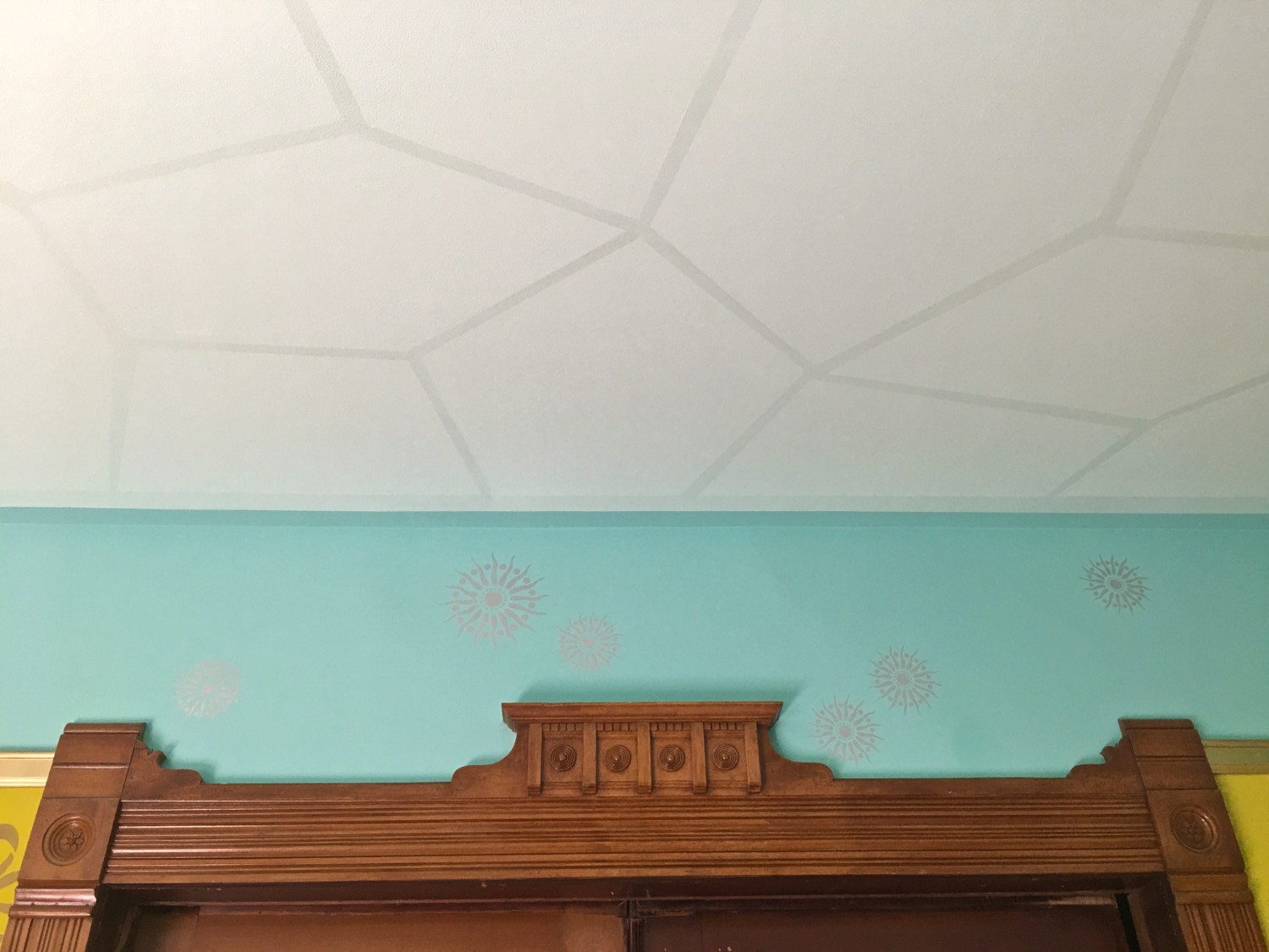
For the frieze, I moved the ceiling medallions down. They are metallic silver. They change in intensity as one walks around the room.
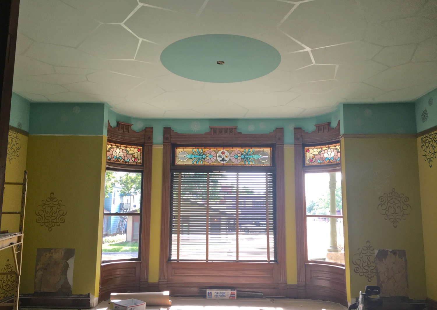
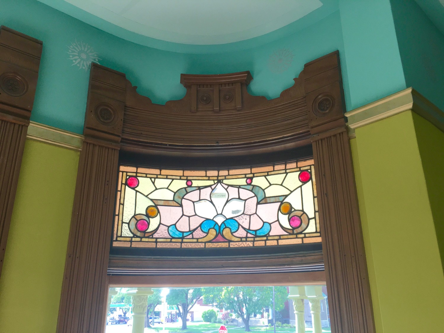
The overarching priority was that everything would complement the stained glass. I think it does…
…beautifully.
A previous concern was the the newly reinstated picture rail, in exactly the 1894 location, might look funny as it was higher than the horizontal door trim. But the end effect looks fine to me.
The never shown before south wall.
The fireplace corner is not done yet so it is not shown. I am eager to see the restored mantel back in place against all this glorious color.
Most of this was finished yesterday. Exhausted, I sat down in a chair and looked at the room. And my heart SANG! My heart SOARED! The 123-year-old room looks fresh and alive and contemporary! Yet it is still very much a room from the Victorian era. This magical blending of eras is what I have most yearned for and it is now a reality.
ZOUNDS!

Well, I hope this post will help mitigate the sound and fury I caused this morning! I apologize!

39 Comments
Leave a Comment
Your email address will NEVER be made public or shared, and you may use a screen name if you wish.
I forgive you, Ross. Sing on!
Fantastic..the blue is so right
All the colours are coming together! This looks fantastic! I think the before looked ok, but this is feeling more “right”. It grounds the room, makes the colours make sense, the fabric colours will also make sense…. it’s all making sense! What a lot of work for you. You’re awesome!
Thank you!
I so agree. You took the words right out of my mouth. But what I would like to know is how do you do those lines on the ceiling? All the work before and after, how is it done?
Beautiful! We have become way too much about “instant gratification” these days, but…..????
Delicious! Your approach is absolutely true to the spirit of the period: Too much is not enough! I’m not normally a fan of blue, but here it really is a wonderful complement to the chartreuse. I think that the circular motifs work much better on the frieze than they did on the ceiling. And I love the way the blue creeps into the ceiling like a two-dimensional cornice; it’s quite striking. Congratulations on a successful merger of past and present – mission accomplished!
Thank you, Mr. U!
The teal creeps onto the ceiling for a simple reason. The line where the wall meet ceiling is wavy because it is plaster. If I changed color RIGHT at the inside corner, this waviness would jump out. So, I brought the teal onto the ceiling by 3-inches. Problem solved!
Stunning! I can hardly wait for the rest of the reveal…
I know! I am breathless with anticipation!
Yay! I really hesitated to give my feedback last time, and now I’m so happy to see the changes! What a difference! The walls are TALL again! Looks much better.
Your adding the sides and corners to this puzzle. Congrats!! But I personally like the cracked ice look. I hope you may find another area of the house to use those techniques.
Hi Carole!
I changed the name of “cracked ice” to “cracked glass” but the idea and look is basically the same. I did change the technique. The “quickie” way ultimately proved sloppy looking. Really, it just looked unprofessional. Hence, going with tediously taping all the “cracked” lines.
Wow! What a difference! Before, I loved the walls and picture rail and liked the frieze and ceiling individually, but not as much together. It looks great Ross, but what makes me the MOST happy, is how happy it makes you! You’ve gotten so much done since last week, and I know that it was a ton of work. Well done!
Perfection! That is what this is. Vast improvement over the white. And I LOOOOOVE the oculus. Can’t wait to seeit all pput together with furnishings and such
Oh my gosh, this is so much better. Now this room really makes a statement and that blue is so perfect with the color in the stained glass. Good job, Ross!
it’s a pleasure to witness the evolution — there’s just no skipping steps in design, you know? Couldn’t have arrived at this moment in the parlor without an interlude of gold curlicues 🙂 🙂 well, I feel inspired to get to the design project I’ve been putting off today. THANKS FOR SHARING 🙂 super fun
Wow! I thought for a minute that the blue and chartreuse would overwhelm the stained glass, but instead they make it pop. Can’t wait to see the room with the furniture in it!
Now THAT’S what I’m talkin’ about! Perhaps the ceiling cracked in anticipation of all the singing? I love the blue frieze, it lifts the walls right up to the ceiling and pulls the stained glass colors all around the room. And we weren’t really angry… we are just impatient children.
Fabulous!!!! You have outdone yourself! I loved the morning post–like waiting for Xmas???? But was thrilled to see the sensational changes:-)
You have such an amazingly creative mind. This room is gorgeous!! I am in complete awe. The way the stained glass just stands out now.. I mean it really shines in this room. I was worried the colors would be a distraction from the windows, but man was I wrong. And im so happy i was.. It is simply perfect. ♡
The new version is incredible! i love love love it! it really compliments your stained glass coulours. Love also the darker blue outline between the wall and the ceiling. And the cracked glass with poly is just genius. I love your bold choices! I’m so happy you did this post after the teasing one previously. I think many of us just had a tiny heart attack. nooooo why would Ross do that to us? 🙂 Anyway, to sum it up: GOR-GEOUS.
Fantastic! Thank you for helping us out with our agony of suspense. I love how the blue field for the oculous picks up the center circle in the stained glass. The height of the picture rail makes the door trim look like it has arms reaching out to the room. It looks just right. I love seeing your process. Here at home I am trying to pick out one color for my interior and it is so difficult.
Beautiful, Just beautiful! The new color pulls out the blue in the stained glass perfectly. That makes my heart sing too.
You knocked it out of the park on this one, old man! 🙂 I try not to give an opinion unless someone asks for it, but I like the blue much better! Before, when the frieze was white, I thought it looked…incomplete? This is a hundred times better, and I agree with everyone else, it really ties the 1890s room to your contemporary style.
While I noticed the quiet time from Emporia, I figured it was because you were just busy outside rocking on the Great North Wall!????
I am astounded at the changes you’ve brought to the parlor, gold stars all the way, Ross! ????????????
A vast improvement over the white. It looks to me like it works, but I want to point out that since you did not choose a period monochromatic scheme, the opposite of the yellow tint on the lower walls would be a shade of purple. The opposite I am referring to is that of the color wheel. Since you have the book ‘Victorian Interior Decoration’ you will note there is a chapter on the subject. I think the concept is called ‘harmony by contrast’.
I am an Aquarian.
We are kinda rule phobic!
I don’t know what to say except “Mea maxima culpa”.
So very beautiful! The blue adds an emotional element that was not there with the previous color choice. I hope that makes sense? I don’t know the proper terminology for what I am trying to say.
I did LOVE the Seuss ribbon! But what you’ve chosen now is far, far superior. Keep listening to your heart, because it’s making very good decisions.
It’s staying true to period, and modern at the same time… Beautiful work, Ross!!
I love the Seuss ribbon, too. It had a lot of energy and gave the room a fun, casual vibe. Maybe it will work in another room — like my dining room, perhaps. It needs something, God knows.
That teal is SO FUN! Thanks for changing up your reveal plans for us! 🙂 Your interaction with your readers is part of what makes this blog so enjoyable to follow.
The new color of the frieze makes all the difference! It is GORGEOUS! I LOVE LOVE LOVE the colors. They make the trim and their details go POP and the windows go POW! The simplicity of the surface treatments versus busy traditional Victorian wallpaper just makes the architecture ZING!
That blue took my breath away!
I am new to your blog, so I have been reading all of it. I actually liked both of them! Great job!
Long time lurker, first time commenter. This is so fabulous I can’t stand it! I’ve always loved your choice of chartreuse for the parlor. I love your eclectic approach — in keeping with the ‘historical narrative’ but budget-conscious and fun and full of personality. I appreciate your trial-and-error approach and look forward to each reveal. I admit I was skeptical about the stencils… I wasn’t feelin’ the ceilin’. I was meh about the frieze… but then when I saw the teal, with the silver stenciling, and the pale-on-pale cracked-glass ceiling… I said WOW so loud I scared my cats! The stained glass windows POP! Great job!
I can’t believe how great it looks. You managed to do something new and modern yet keep the spirit of the architecture. I admit I was deeply skeptical at first, but this looks marvelous. And I say this as someone who prefers Old Everything! 🙂
Also I have been pondering why the stained glass in the phone closet was of a shell. Maybe because when you put a shell to your ear you hear incredible sounds? Like with a phone?
Amazing improvement – Well done!