
Small Excitements
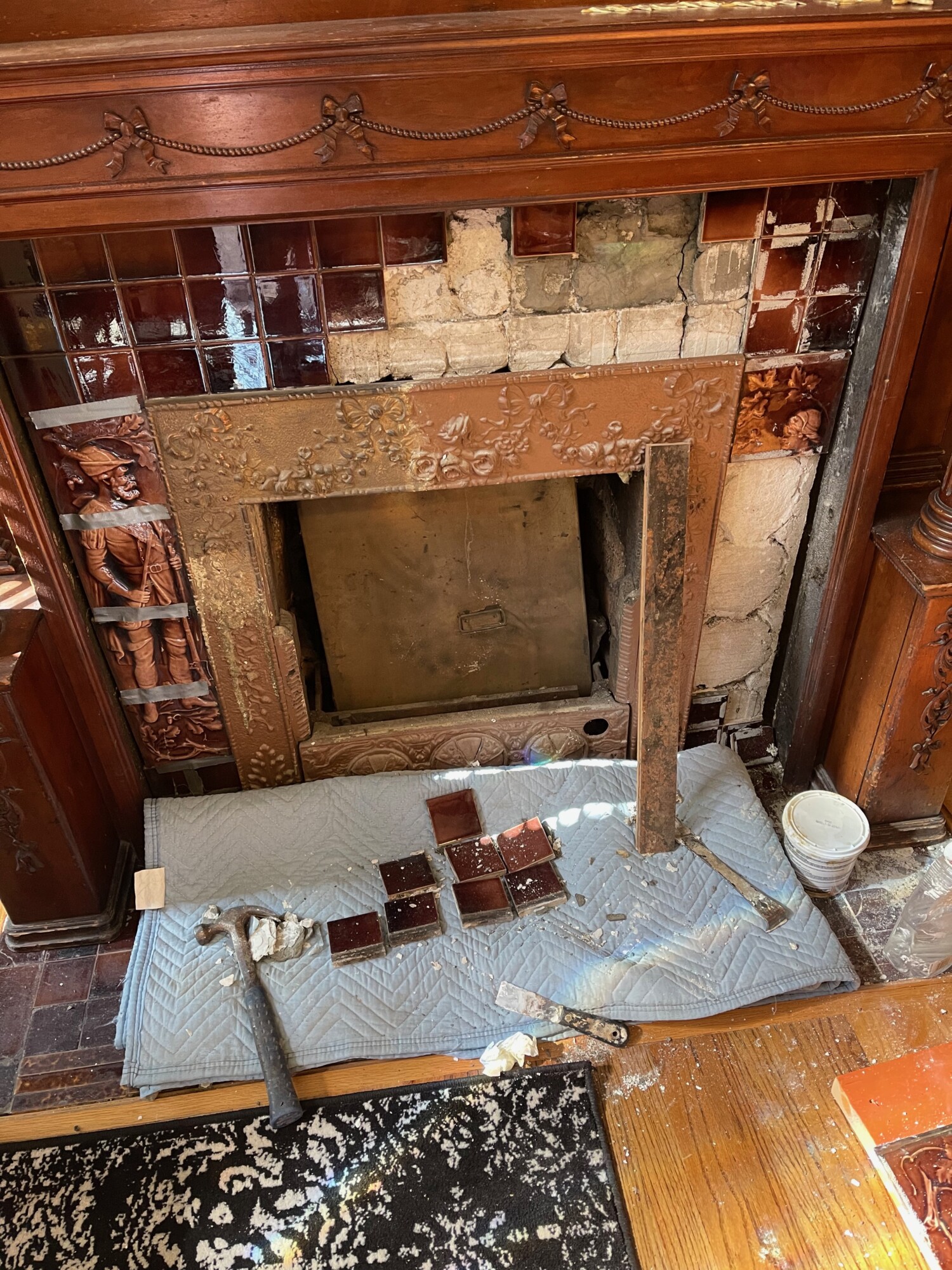
At last! At long last! I have started to reset the tiles in the library!
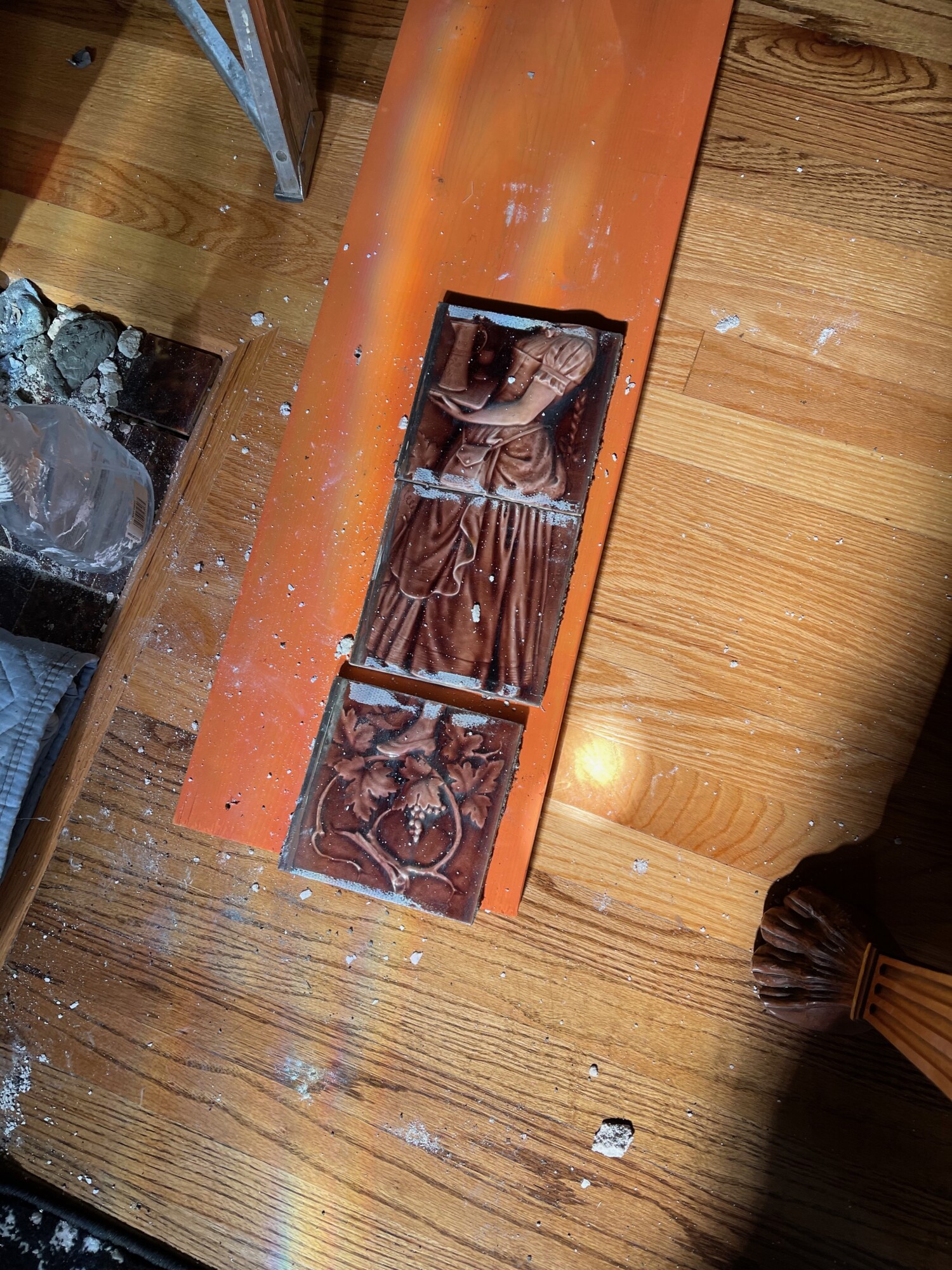
Tragically though, milady was decapitated.
Remember this?
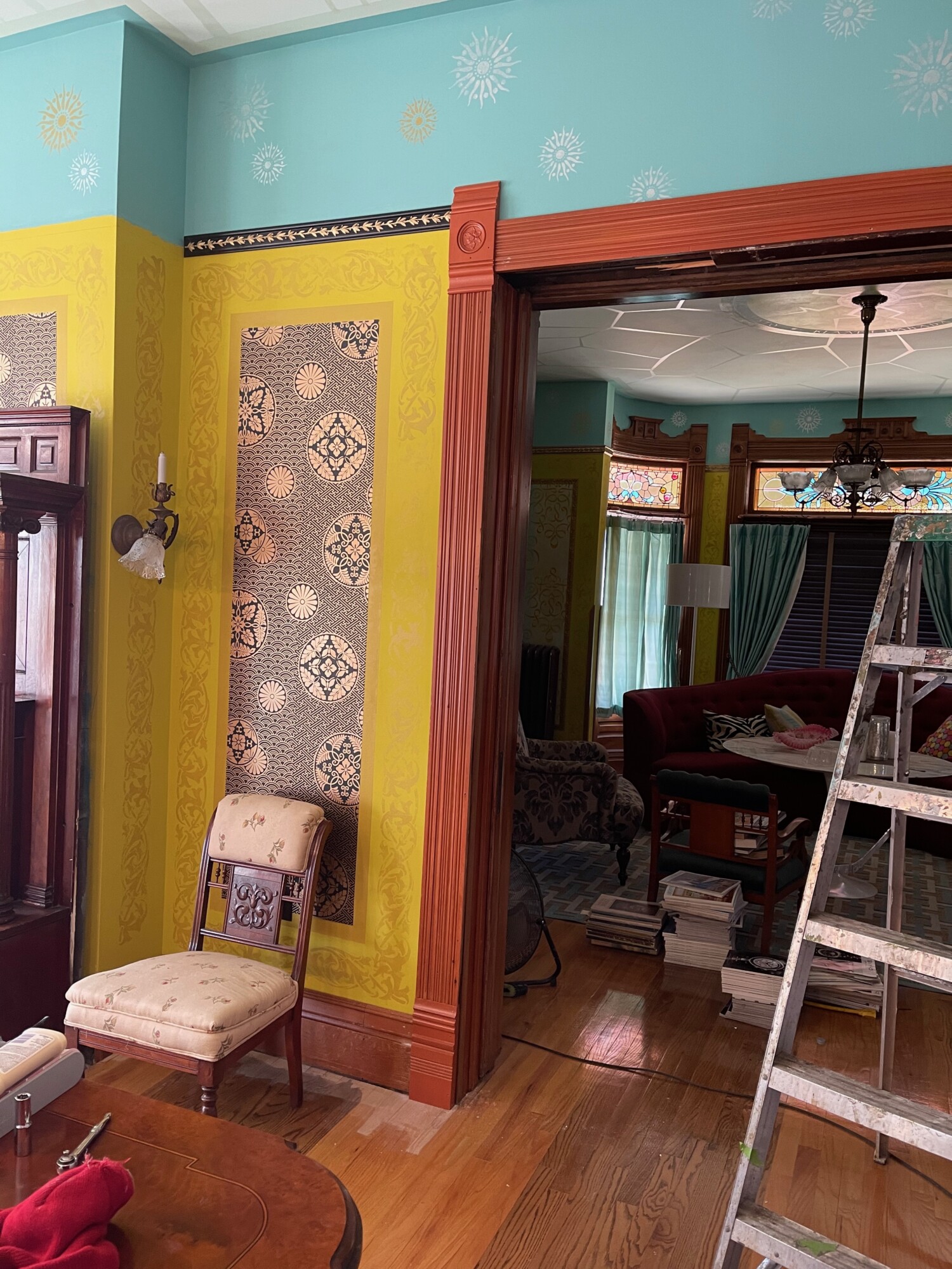
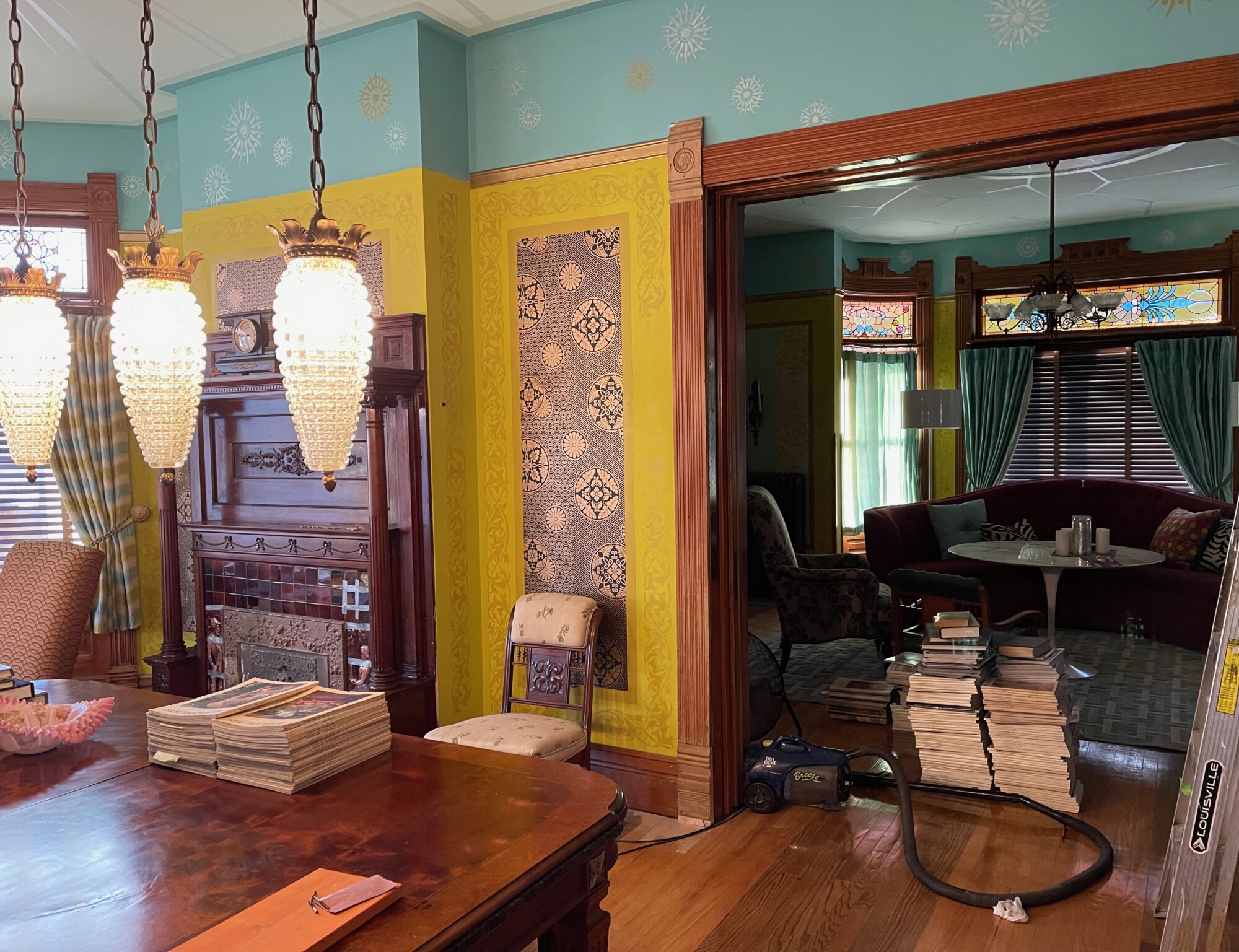
The door trim has a new faux bois ‘cherry’ finish! I also installed a length of picture rail. I had planned to do the rail in gold but this looked too anemic (see previous image). I thought black would be ideal…a thought proved wrong. I hate this. It is too harsh. In pondering options I had a crazy idea. Which…as you know…never happens to me. So, umm, what about silver? I am kinda excited. Stay tuned.
As I learned from Bo way back, 1890s picture rail was not intended to match the trim in a room. Because 1890s rail was not installed by finish carpenters but, rather, by wallpaper hangers to complement the wallpaper. Who knew?
The aim, thus, is not to match the wallpaper but to complement it. And the black (which should work) does not do that.
Luckily, I have but this short length to redo.
And, while the world is in serious trouble, dagnabbit, I cannot fix it.
I can though come up with the perfect color for some picture rail.

13 Comments
Leave a Comment
Your email address will NEVER be made public or shared, and you may use a screen name if you wish.
What about gold picture rail?
Exciting that tiles are going to be reset!
The library looks just lovely! Bravo! I know additional touches are forthcoming, but these baby step are stunning,
I agree that the gold picture rail by itself is anemic, but what if the overlaying filigree was black? That wouldn’t be quite so harsh and would meet its intended paper hanger’s schematic.
You will get it right. We trust you. The house trusts you.
I’d try a blue that is the same as the wall but darker. Then I’d try various greens because that’s my default 🤣
The gold was too light, the black is too dark. I would try a midtone green which matches in color but is slightly darker than the lime green beneath—
What about bronze or black with a gold glaze.
Yes, a bronze or burnished brown color, perhaps with a tiny bit of black accent to pull up the colors from the wallpaper background?
Exactly what I was thinking; a dark bronze with maybe lighter copper highlights. It would accent the wallpaper and also pull in the colors from the wood and the fireplace tiles.
The tiles will look lovely reset and in their place. Those tiles are stunning. I agree with Jim, the gold picture rail would look very nice with a black overlay filigree. I’m not so sure about silver, but you’ll never know unless you try it.
The faux bois cherry finish looks great.
Rather than continuing to repaint- what if you tried a photo editing software. You could play around with changing the picture rail color to at least narrow your options down before you go to the trouble of repainting again…
The gold too weak and the black to strong. I think the silver is also going to end up too anemic.
Have you considered a burgundy? To compliment the fireplace tiles and the dark red in the chairs? With the gold vine on top it might be just the “middle” you are looking for. Or perhaps a silver vine instead.
I think the black is too strong because the dominant color in the wallpaper is actually the gold, with the black reading (to me) as a negative space. I think you want something in a darker color but softer than the black. What about a bronze (like a metallic brown)… you could get the effect with brown base coat and dry brush gold details on top to bring the dimensions of the trim out.
I got the idea from looking at the tarnished brass color of the sconce.
I know you will find the right color!
I am going to have a prowl around the Internet to see if I can find a photo of the lady’s head. I want to know what she looks like, whole.