
Stencilling…INSANITY!

A Victorian-era parlor.
It was common for rooms in a Victorian-era home to have:
- A wall paper
- A frieze paper, normally 20-inches high. [A Bo Sullivan update: “common friezes were 18″, and only the better ones were 20”. Thanks, Bo!]
- A ceiling paper.
In the 1894 Cross House, the 2-story stair-hall has fragments of all three such papers, and I assume each room in the house was similarly papered.
I have been very interested in recreating this 3-part visual scheme. But not…

…like this.
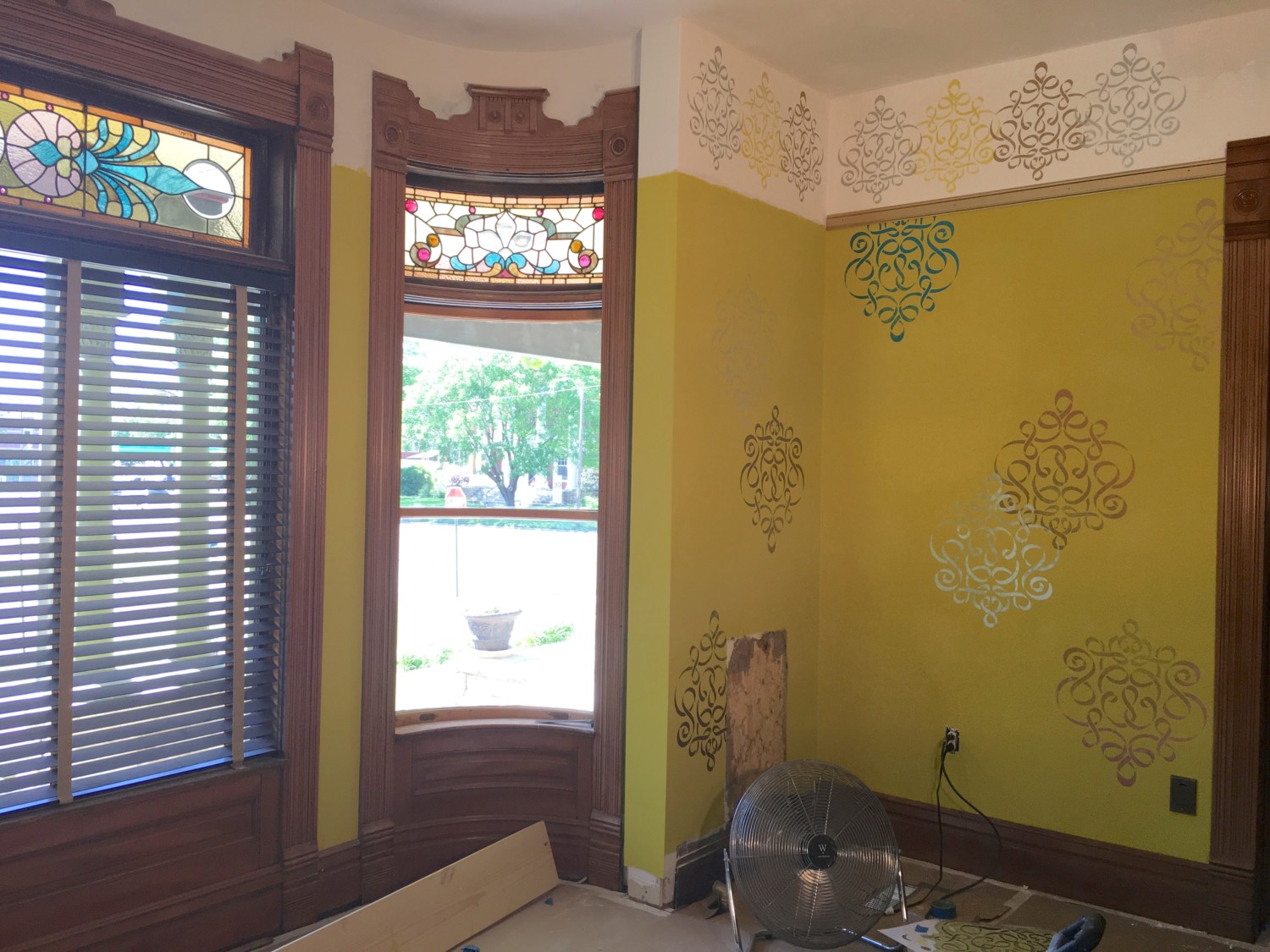
What I wanted was the 1894 idea recreated, but in a contemporary manner. I wanted a wall pattern, frieze pattern, and ceiling pattern, but I wanted the finished effect to be very modern looking.
This has taken some fussing and adjusting but I think I have one corner finished.
Wanna see?
Scroll down.
And prepare to be…startled.

I know! Insane!
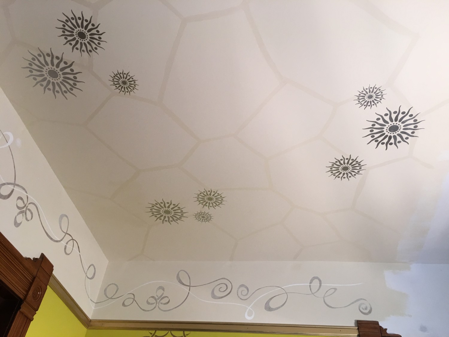
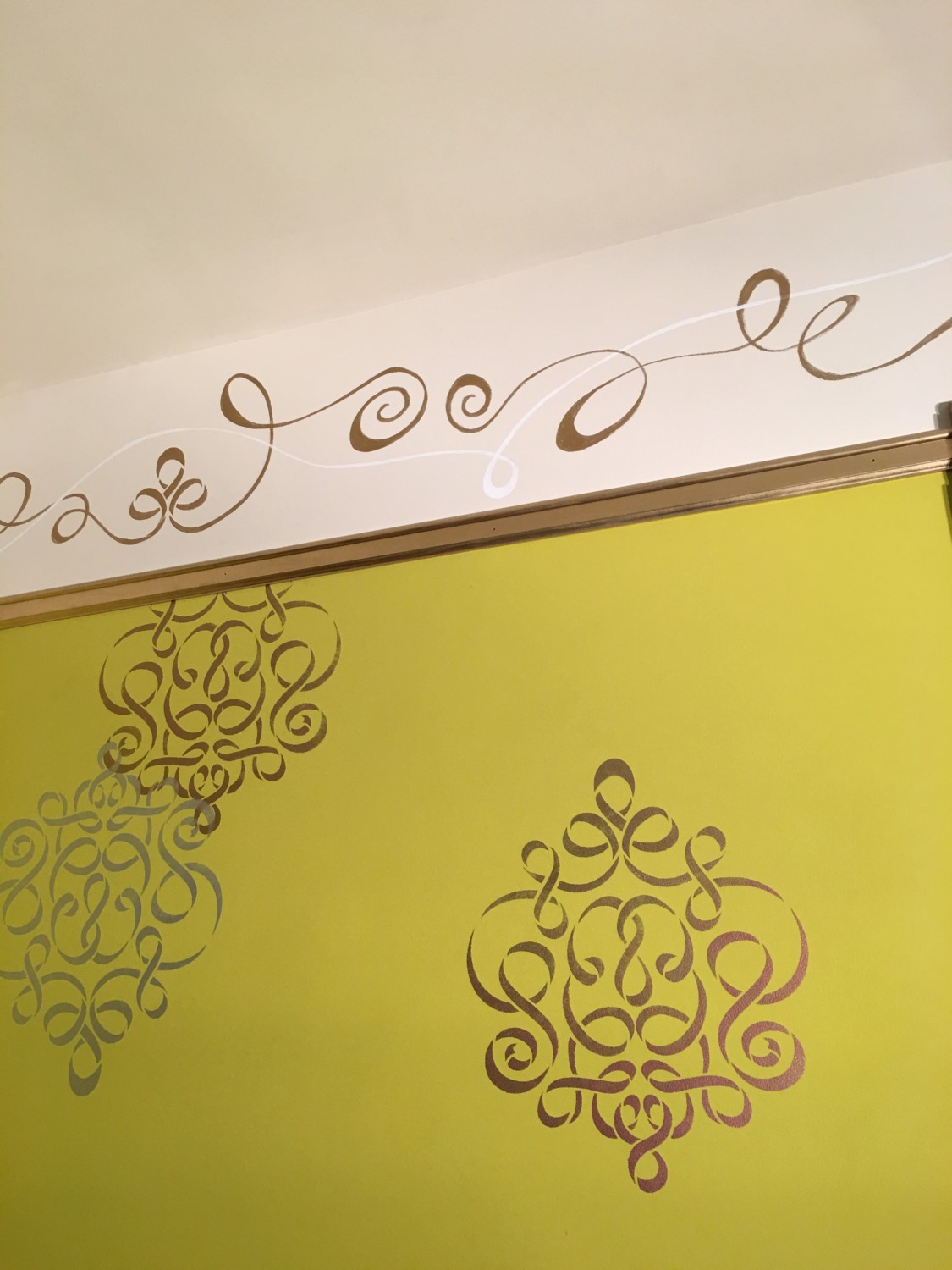
The ceiling. Insane!
INSANE!
And I think I am delighted.
There is NO mistaking this craziness for an 1894 decorative scheme. Yet, the 3-part Victorian-era look was resurrected. On LSD.
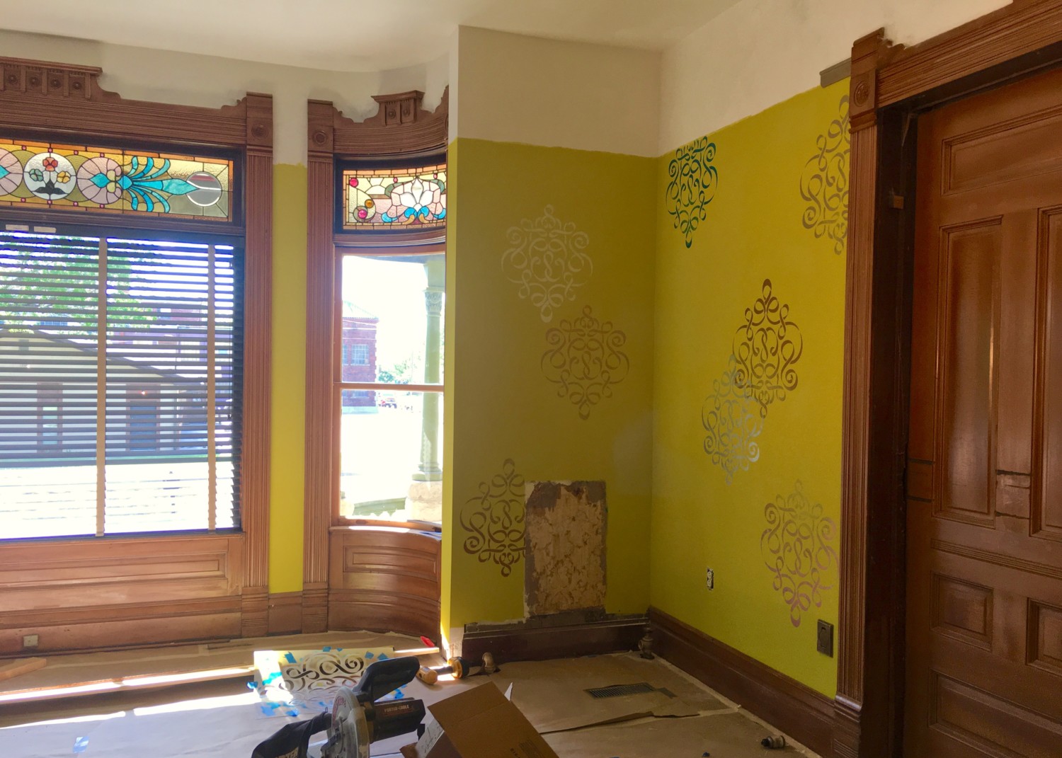
This corner is not done but it is important to remember that the colors and patterns have been selected to work with the all-important stained-glass.

Standing back. You can appreciate how the architectural elements in the room also dominate.
A THIRD APPROACH
I have never seen anybody do what I am doing.
It seems that people take one of two approaches when doing over a Victorian-era house.

APPROACH #1: White out the room and install hip furnishings.

APPROACH #2: Do a period-correct decor. (Image Bradbury & Bradbury)
But why not an Approach #3?
To my eyes, the finished corner respects the Victorian-era three-part scheme but in a decidedly contemporary manner.
Part of the decision-making process was financial. To do a Bradbury & Bradbury treatment would cost a ton of money as the papers shown above are like $200 a roll. Ouch.
Also, fragments of the 1894 damask-pattern wall paper exist and Bo Sullivan thinks this paper can be recreated. Thus, I wanted to do something inexpensive with the idea that later down the road I might recreate the 1894 paper and install it.
A significant part of the decision-making process was my age, sixty. I needed to do something I could do. I could not, for example, do a meticulous pattern on the ceiling required dozens of colors and minute measurements. No way, man! The ceiling had to look fabulous for a minute amount of time expended. Ditto for the walls.
I hope that the finished parlor looks really fresh, inviting, and contemporary. I am also hoping that people will then realize that one can have a modern look in an old house without painting everything white, without knocking down walls, and without installing hundreds of ceiling can lights. In the 1894 parlor of the Cross House, all the original trim is being restored. The missing picture rail is being resurrected. No can lights are being punched in the ceiling. Thus, the original architecture of the room is being respected. But, by having fun with the decor, the end effect should be the best of both worlds: vintage and contemporary, but with the latter respectful of the former.
THE ROAD TRAVELED
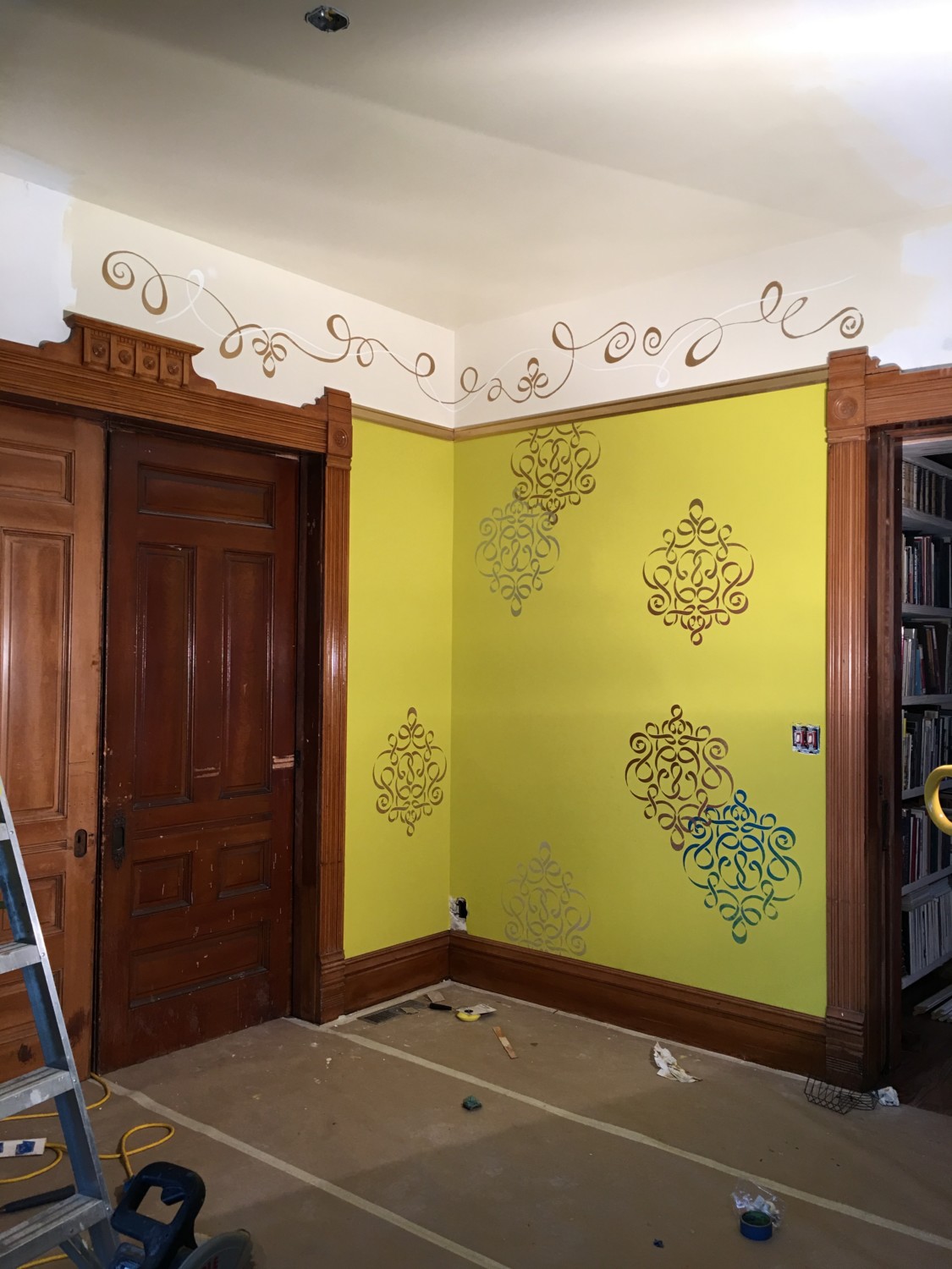
In my last post on this continuing subject I revealed the frieze. Which I loathed. After much ado, Patricia and I came up with…

…this. Which is hand done. I was not sure however that this was the solution, so I…
…then added a white ribbon, which can be better seen…
…here.

After finishing the ceiling, which made a HUGE difference, the Dr. Seuss frieze looked better. Still, I realized that I had to tone down the frieze…
….like this. As soon as this was done, I stepped back, and the room “clicked”.
The finished results are, yes, really insane.
But I smile at the effect. The metallic colors on the wall medallions shimmer and change as one moves around the room. The fanciful frieze dancing above the picture rail makes the room seem alive.
The whole while all this is being done the stained-glass windows are kept in mind, as are the architectural elements of the room, the furnishings, and the delicious and very blue curtains.
Decoration is like 3-dimensional chess. Every move matters. And until all the parts are installed it is not possible to truly know the effect.
So, I am keeping my fingers crossed that the insanity works in the end.
THE HOW
The ceiling was stunningly easy. Thank God. I was looking for a “cracked ice” effect. But how to achieve this? Well, this tool…
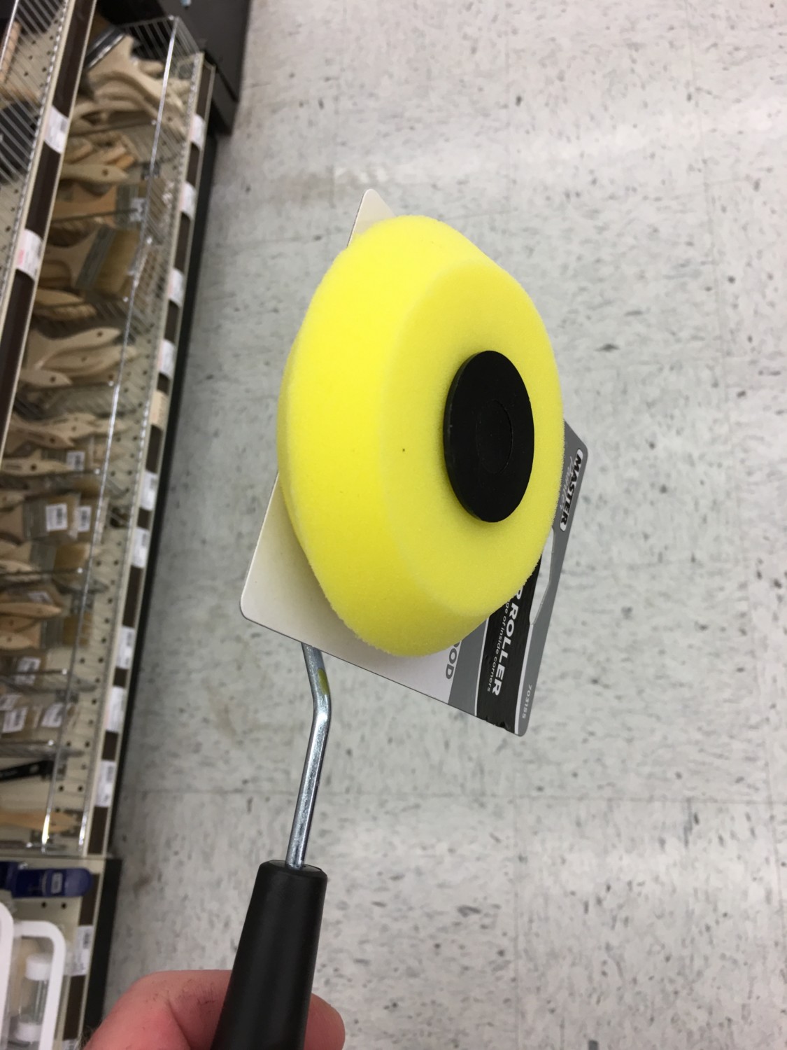
…made it possible. This is a standard corner roller. I simply rolled it in gloss latex Polyurethane, and then applied it to the flat ceiling color. I was unconcerned if some lines were wide or thin. I was wholly unconcerned if the lines were straight. Would the clear gloss lines be visible though? Yes, as it proved! The ceiling stencils are from the Stencil Library. The small and large ones were in stock; I had the middle one custom sized. The stencil color is metallic silver.
The ceiling is actually kinda period-correct, although the cracked-ice is scaled much larger. The wall medallions are, to my eyes, a modern take on the original damask wallpaper. The frieze is, well, just nuts!
I had planned on keeping the frieze and ceiling white but several readers thought this would be too harsh a contrast. These concerns were pondered, and then I became curious what a not-quite-white would look like. I ran down to Sherwin-Williams and purchased a quart of Antique White and painted that on.
Oh. MUCH better!
Just before leaving the house today I sent an image of the finished corner to Patrica, in New Jersey, and then called her. As I sat in the parlor, we spoke for a while and then Patrica suddenly burst out laughing .
“What?”, I asked.
“Oh! Sorry! I just thought that nobody who knows you could mistake the results for anything but your house! It’s so you! It’s unorthodox, kinda silly, and bold!”
I think this was a compliment.
I think.

36 Comments
Leave a Reply Cancel Reply
Your email address will NEVER be made public or shared, and you may use a screen name if you wish.
Refreshing & bold!!! Yay Ross! It is SO YOU!!
It’s looking good, and fun! Maybe you can consider adding a trim color or some other definition between the top of the frieze and the ceiling, or have the frieze be a different background color like the inspiration photos. Having it the same antique white color as the ceiling seems to have the effect of lowering the ceiling height and gives a “caved in” impression rather than tall grand walls?
I’m seeing the same thing Jamie is seeing. The ceiling sort of falls into the wall and jars my eyes as it crashes into the beautiful wood at the top of the doors and windows. I keep wondering what it would look like to paint the frieze that blue color used in some of the stencils or a color akin to the blue in the stained glass? I must tell you though I love the stencils on the ceiling and walls and the ribbon on the frieze. I’m looking forward to each reveal, keep up the good work.
I am planning one more thing which will change the effect.
Stay tuned!
First thing I thought as well. Agreed.
I just love it as it is. Well done
I absolutely love it! The “not quite white” i so much, I mean solo much better. It just all comes together. And you were right on toning down the frieze, the darker competed with the woodwork and now it complements it! Bravo!!! It’s perfect so don’t go changing!!!
SO many typos in my post but you get the gist. And I shall not comment at 1 am again!
Can you translate this: The “not quite white” i so much, I mean solo much better.
????
I admire your steadiness of hand to do the Florentine glass-like ceiling crackles. My favorite part is the weightless, floating trompe l’oeil wall stencils–puts me in mind of “…tangerine trees and marmalade skies…” Complain about your age all you like–you were still a bit young when “Yellow Submarine” came out. 10? 11?
Twelve.
I like how the ribbon responds to the top edge of the wood molding – like they are chatting, each using the vocabulary of their time, and understanding each other rather well. I feel invited to enter the room and enjoy the conversation– like the present is as warmly welcome as the past. I appreciate how the frieze ribbon incorporates an element of the wall stencil, and that the medallions painted on the ceiling are round like the circular carvings in the moldings. Subtle repetition makes it feel fun not busy. The whole process is inspiring. Thanks for sharing. I’m excited to see someday how a light fixture plays into all of this! I imagine the gloss shine of the latex spiderweb on the ceiling works well with the metallic paints — and that both shimmer and shine when one walks around in real life — enhancing the effect of the stained glass windows. Seriously Fab.
Wow. Great comment! A delight to read Thank you!
Christ that is beautiful!! You keep surprising me! I agree with the commentors above who think there should be something framing the ceiling pattern. However, as you have proven, you know best.
A bold band of the metallic paint that is used on th picture rail ro seperate the frieze and ceiling to raise the ceiling height up. Maybe 8 to 10 inches.
The frieze just makes me smile! How could it not?
LOVE, LOVE, LOVE the effect of the ceiling design!
I agree with those who’ve suggested trying a bolder background colour for the frieze. As you’ve already demonstrated, you’re the poster boy for colour experimentation.
Oh, it just feels so happy! Wonderful!!!
This is just amazing. Wonderful. Inspiring!
And I don’t just mean the finished product (although that corner with all the elements is all those things): I mean your design process. I always thought designers knew how to put a room together and just did it: the “TADA!” approach.
There’s a lot more experimentation and choice involved than I realized. It makes the process less intimidating, somehow. Once again, I learned something important from your posts. Which is why it’s always so much fun to read them. A progress update, with a side order of teaching attached. Thanks, Ross.
My daughter’s response to the effect was “Wow, they have low ceilings.” so I concur with the need to differentiate the frieze from the ceiling somehow. Our ceilings are lower than yours, but she thought yours were lower than ours from the photo.
Pictures are deceiving!
The ceiling does not appear low in person.
Nor can images convey the scale of the parlor, which is 20-feet-long.
Ross, historical prudence is important in a restoration of historical properties, I agree. But I also agree with keeping the finances in check. You are adding a ZIP to the house with paint for now OR for always. Historical prudence has its place and time. I would much more see you lift the spirit of the house with paint and stencials and use your current funds for more structural updates/upgrades than silly “correct” $$$$$$$$ wallpapers. You are keeping check on you finances, instilling a modern interpretation which adds fresh air to this antique and staying the course. You are showing us how to go forward to s semi completion of a room do it is usable for YOU the homeowner. I applaud you creative thinking. I’ve been to Vic’s that are historically correct and they lack light, inspiration and to me are stieffing to be in for more than a few moments per room. I want to sit down and enjoy your tales about the house reno in that room! Keep going . . . .
Especially thank you Ross for the step by step recap! There is just SO much to learn by a study of your creative process. For example, “toning down” the frieze color seemed to me to accentuate the picture rail rather than dominating it. So many lovely surprises, and the Cross House just seems to glow brighter with every step!
I think perhaps the biggest (subtle) change for me has to be the reintroduction of the picture rail. Of all moldings, throughout time, it is deemed as fussy, and usually the first to go, and decades later, people can’t quite figure out why the rooms in their old house feel out of scale, not realizing that that itty bitty detail makes such a big impact on the overall appearance of the room itself.
Hi Cody!
The picture rail is just tacked up for now. It soon gets some decorative trim!
I keep imagining a white rabbit with a giant stopwatch hopping through the rooms, singing:
I’m late I’m late
For a very important date.
No time to say Hello! Goodbye!
I’m late, I’m late, I’m late.
Since Alice in Wonderland is my all time favourite book, I would not mind this effect 🙂
Dear Ross,
I love the ceiling pattern, I love the ribbon, not to mention your colour choice. I agree that something to set off the ceiling from the frieze with more contrast could be something to think about and I am very curious what you are planning. I love the faded stencils. I will try to do this in our house too at some point.
Keep on running! I am sure the final result will be awesome and reflect both, the house and it’s history as well as the acual inhabitant. Oh, how I wish our house had only 1% of the Cross House history !
All the best from Vienna, Austria
Lis
Hello Lis from Austria!
Thank you for your kind comments!
Ross
That ribbon frieze, the cracked ice on the ceiling are just so . . . so . . .awesome! Yes Victorian Modern Dr. Seussianism is a thing. How cool to have been the one to invent it! Thank you for challenging convention and for sharing the amazing results.
Ross, I think you are fabulous to say the least. To take on such a huge project shows just how much love and passion you have for this home. Sometimes I wonder where all the love and understanding for raising this home from the dead has come from? The only thing that comes to mind is that this house had been yours all along. Perhaps if one believes in reincarnation that is anyway. In theory, perhaps, this is what it meant when you had stated in your interview when you said: “I don’t know how to say this. I feel like my whole life I’ve been waiting for something and I’ve been aware of that. And the minute I bought the Cross House that feeling went away.” Just something interesting to think about. The restoration and ideas that you’ve done to the Cross House had caught so many imagination in what true love is. Thank you so much for sharing you an amazing journey with us. When it’s all said and done with you can rest assure that the CROSS home will now be known as the ROSS home. Welcome home!
Thanks, Emmie, for your comment! I enjoyed reading it!
I adore this. You are a brilliant interior designer.
Brilliance? Insanity?
I suspect there is a fine line between the two!
The “On LSD” version! Well, it’s hugely better than the whitewashed version. Right now it looks like a party room, not a parlor! I need to see this in person. How will one know if it all works (or not) until after the flooring is uncovered and the furniture is placed? I believe that something can be simultaneously brilliant and insane. I hope that’s the case with your finished parlor.
Hi Grace!
Yep, it is all pretty crazy right now but it should all balance out in the end.
I hope!