
Inching Along. Wild & Crazy!
A few days ago.
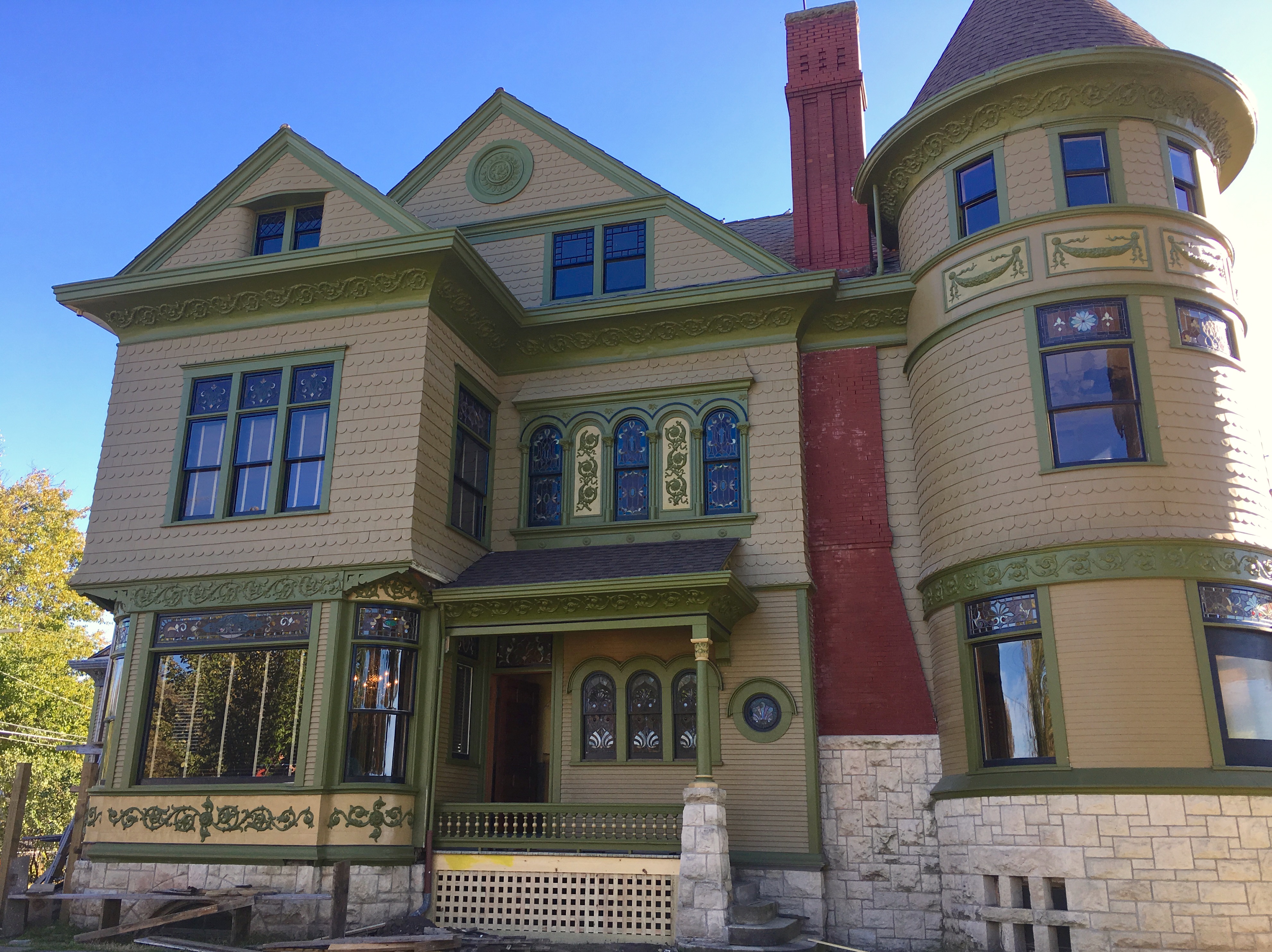
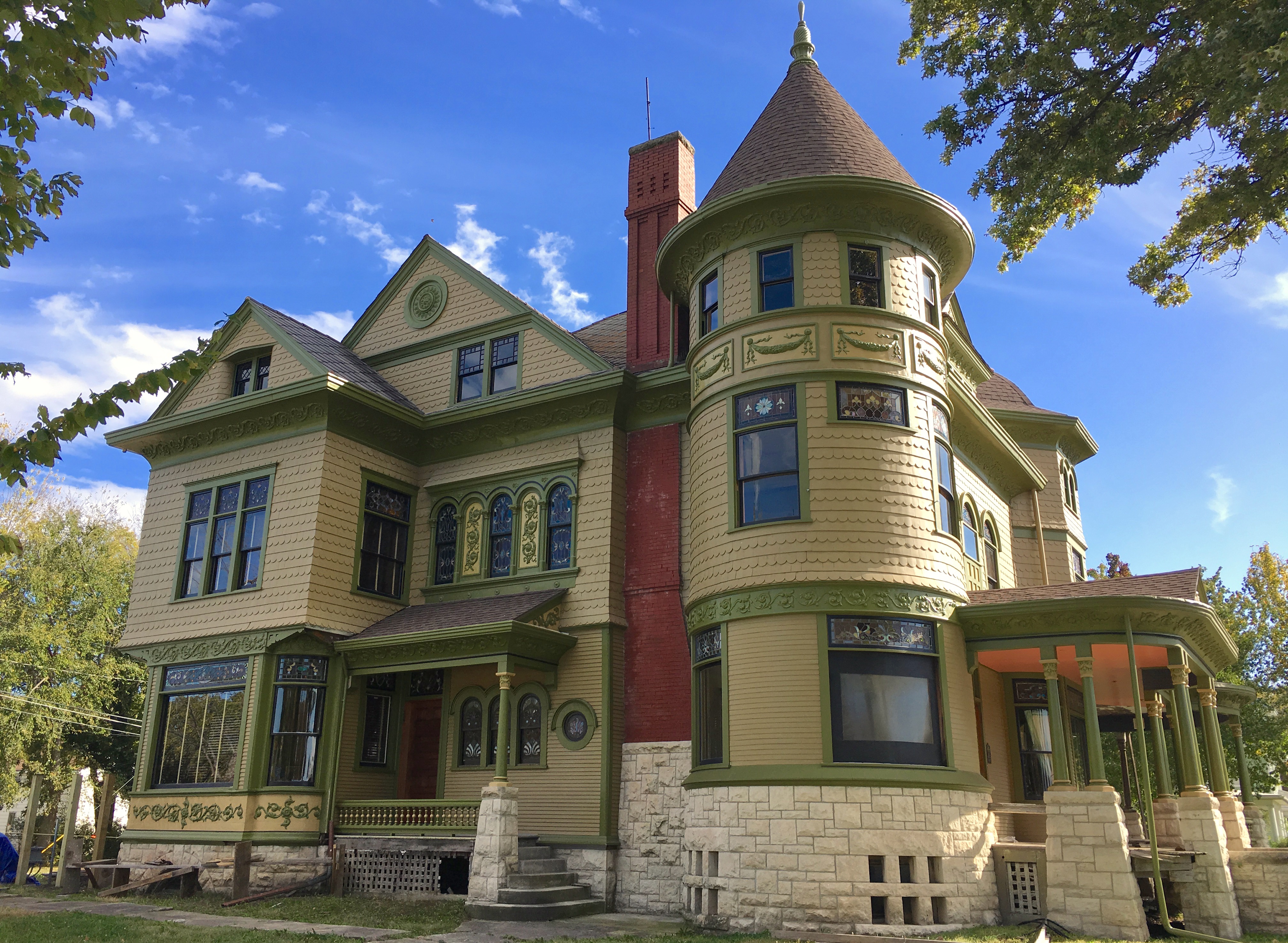
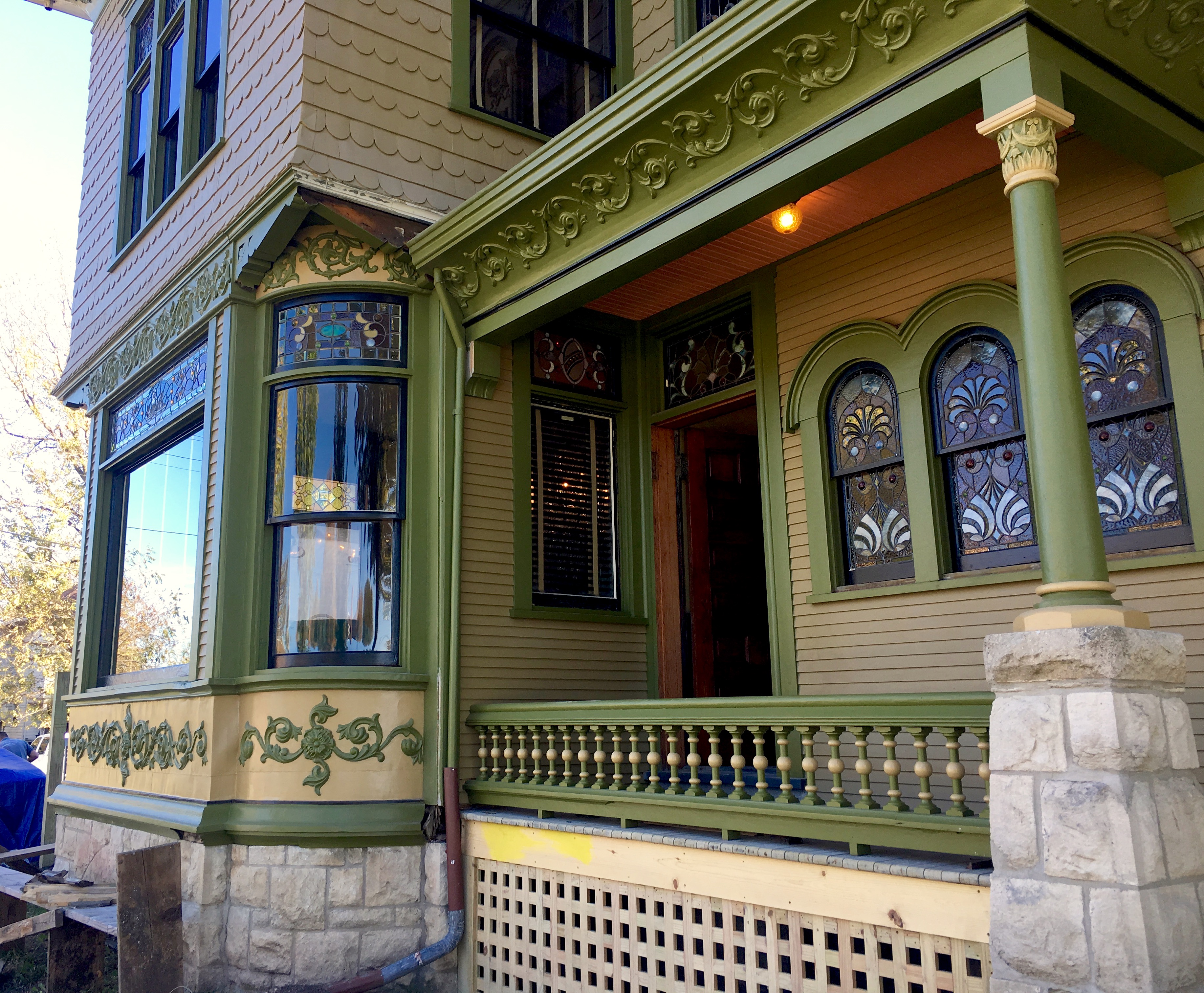
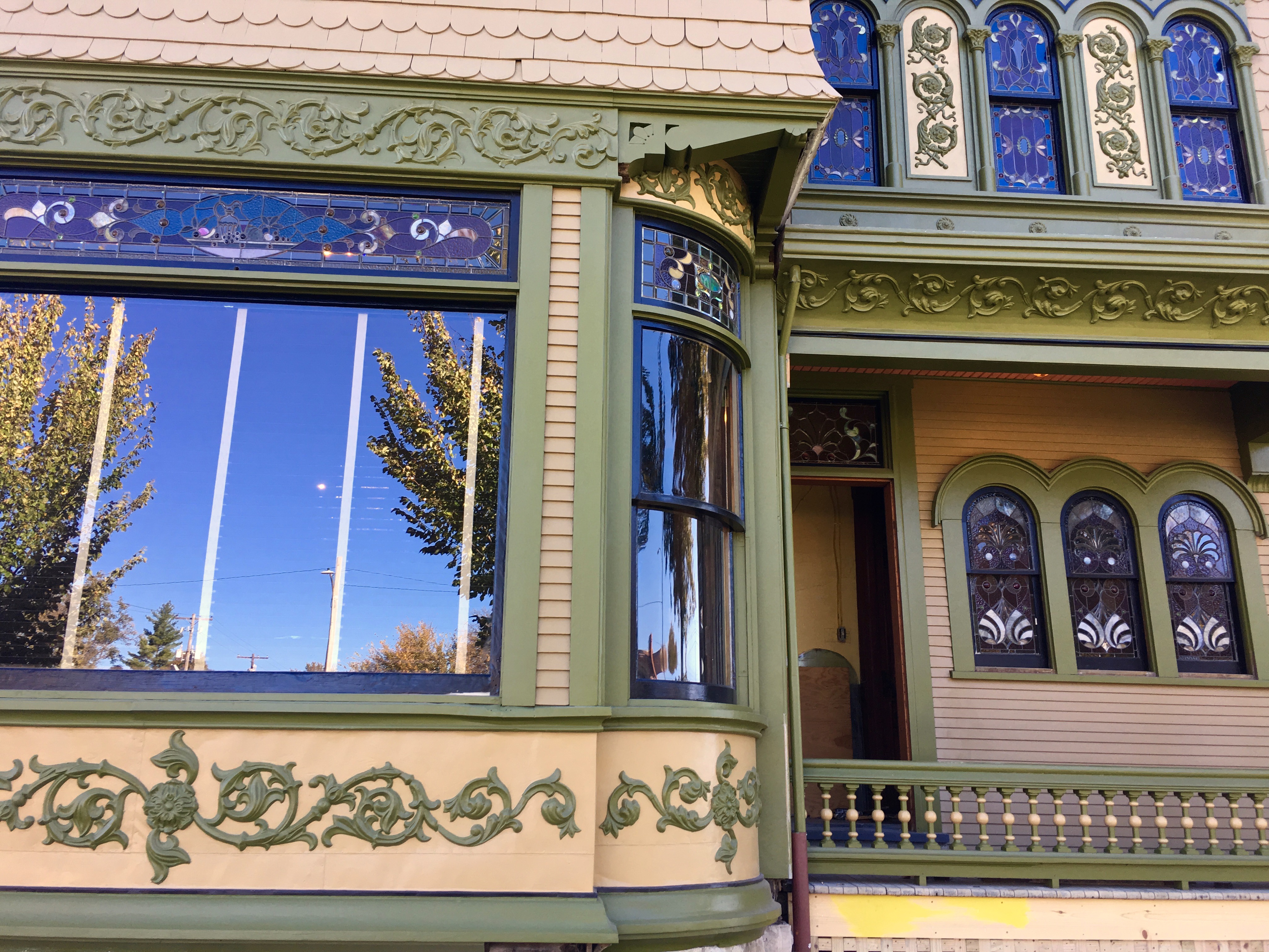
Today. I did something wild! See the big dining room window? See the curved window to its right?

I added color #5 to the scrollwork above the curved window!
See?
See?
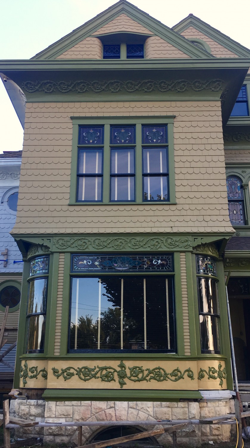
A few weeks ago. I have stared at this image a long time. And I have stood on the sidewalk staring at this view. I liked having color #5 as the background for the elaborate scrollwork under the windows. This looks fabulous! But…but…it seemed as though color #5 should be added to the scrollwork ABOVE the widows. But I felt that this would veer the house into the dreaded TOO MUCH category. So…I pondered…what about doing JUST the curved scrollwork?
And I think I like the change. The change also enhances the fabulous brackets! And this is good.
My mind says: If you paint the background of the curved scrollwork in color #5, you should do the same on the wide scrolled panel above the big window.
My eye says: No, What you did today is unorthodox but it works. Trust the eye! Trust the eye!
My mind says: Harrumph!

20 Comments
Leave a Reply Cancel Reply
Your email address will NEVER be made public or shared, and you may use a screen name if you wish.
I vote for go with your mind, however then MY mind questions whether you might apply the same to the scroll work around the turret? And from there, where does it end? This is a conundrum for sure. Where is the photo shop expert??? I know you do not want to create a “painted lady” but the house has so much beautiful detail, I would have a hard time restraining myself.
Thus, you appreciate the rabbit’s hole.
And this is why I am letting my eye overrule my mind.
I saw it right away and I love it. I think you should the rest. It feels like it’s more balanced to me.
Also, I’m living for the railing and lattice.
I think it’s the perfect way to accent the upper section without being too much. The other issue is that if you start doing more of the background as an accent to the scrollwork then you put yourself in a position where you may have to do it all. And you worked so hard to be scaffolding free. But I do have one question about the brackets in that area, does one of them need to be painted? Okay two, are you going to add another color for the decking of the porch?
The bracket on the very far right is being worked on. It will be done soon.
I am wholly undecided as to the porch flooring.
I love it, and I agree that little else shall be done to the majority of the scrollwork. One must ask themselves when the line must be drawn between eccentric and perfect. I say this is practically perfect.
I definitely think it’s a slippery slope. If you paint the scroll work above the flat window you might then think you should paint above the porch and, before you know it, you’re painting all the scroll work. If everything is an accent, then nothing is an accent, and I think it would detract from the beautiful scroll work under the dining room window.
I like the way it is with today’s new accent on the corner above curved window only. I would not do the middle section above main window. When I look at it straight on, the scrollwork above the big dining room window flows with the scrollwork above the north porch. The corners only gives it just the right touch. Your instincts are so good it’s scary! I am watching your work progress daily thinking each advancement is another improvement-then you proceed to change one little detail and I just say “wow”!
Love it!!!! Stunning!!! Stick w your gut feeling!!!
I think that’s a great compromise. It balances the contrasting schoolwork below the window, and also really serves to highlight the brackets and window details. One way to look at it, is that it gently highlights details in an area that were previously hidden in the shadows. The scrollwork above the big window is already prominent, and also provides crucial separation between the window and light siding color. Painting it color #5 would lose this.
Trust your eye!! Period.
I think we can appreciate the scroll work if it is all green and the whole panel draws the eye to the horizontal green panel on the turret. The #5 surprise above the rounded windows is just enough surprise and humor.
I’m in the camp that you should paint the background of all the scrollwork the lighter color (too much be damned!) but I understand why you don’t want to do that. And if you don’t, I think this is an excellent happy medium. Looks very nice!
This has nothing to do with painting the scroll work Vs not painting the scrollwork, but I LOVE the way the coral of the poach ceiling brings out the red of the brick on the fireplace chimney running up the side of the house. Both in the pictures and as I drive by. Completely off the subject I know….sorry!
I think it adds a little bit of sunshine to a dark corner, and it emphasizes the lovely curve of the window underneath. The bracket stands out a bit more, too. Go with your eye!
The EYES have it!!! It looks fabulous!!!!
… I liked it better green. The shadow cast by the bracket brings out the bracket in a subtle way that is lost with the new paint job. My eye and mind both like that the curved bracket is now painted with #5 in the same manner as the side of the north porch awning. But… still… I liked it better green. I think #5 in this location tips the balance just slightly into the too much zone, and diminishes the subtle beauty of all the green painted embossed metal, which relies on shadows.
Hmmm how exciting! Now I might have been inclined to the subversive and switched the colours just there…#5 detailing on green background…..But your ideas are better!
Late again, but I think adding the extra two-tone detail adjacent to those gorgeous stained glass windows battles with the glass details to the detriment of their beauty and impact…
And just for the record, all of the incredible windows in this house are just breathtaking. It seems as if the house was designed to showcase those windows, rather than vice-versa…
Hi, Barbara!
The stained-glass windows kinda disappear on the outside during the day. They just don’t register.
At night though, lighted from behind, they dazzle.
And, at night, you don’t see the exterior colors.